Designed by: Xiangaopeng | Market Region: Asia
Before I talk about the awesome packaging design of Yogurt Nut Oatmeal by Lao Mo Nong, let me make a few quick points. The world has taken an unbelievable leap forward in terms of technological advancements. If someone from fifty years ago were to travel to 2022, he would find the earth to be an alien planet. Wait, but how does it connect to the packaging design of Yogurt Nut Oatmeal? Well, it does! While people have progressed technologically, we have also taken a few steps backwards in terms of health and food.
Fast cars, fast life, and fast food are what define the modern world. While the modern lifestyle has its perks, it is not without its drawbacks. An unhealthy lifestyle has given birth to new diseases, which only worsen over time. However, there is good news. People are now beginning to realize the importance of healthy food; and what could be better than Yogurt Nut Oatmeal! While yogurt is a natural source of probiotics, oatmeal is known for being a rich source of soluble fiber.
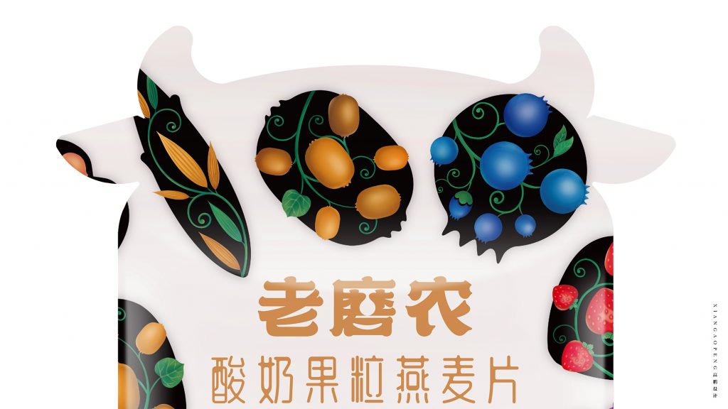
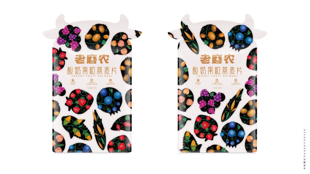
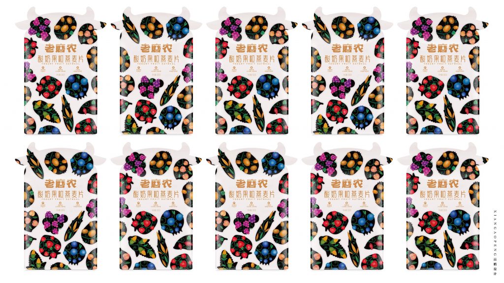
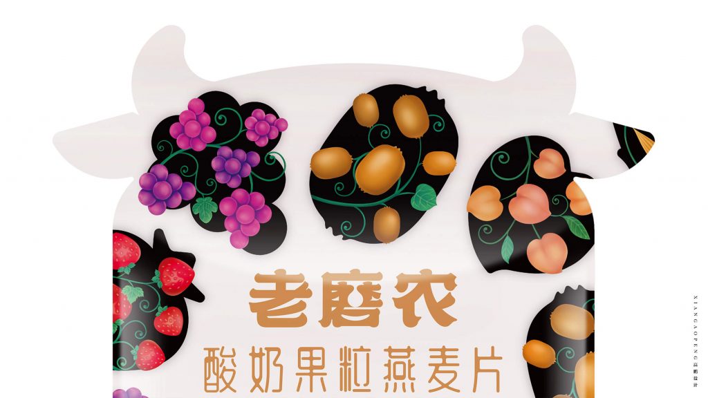
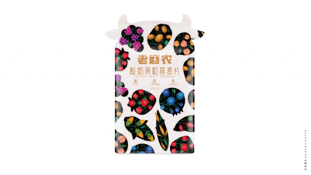
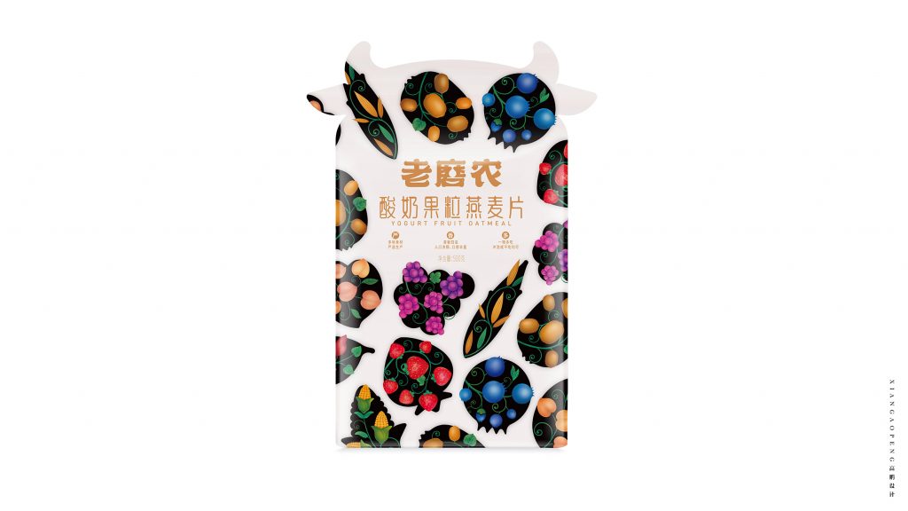
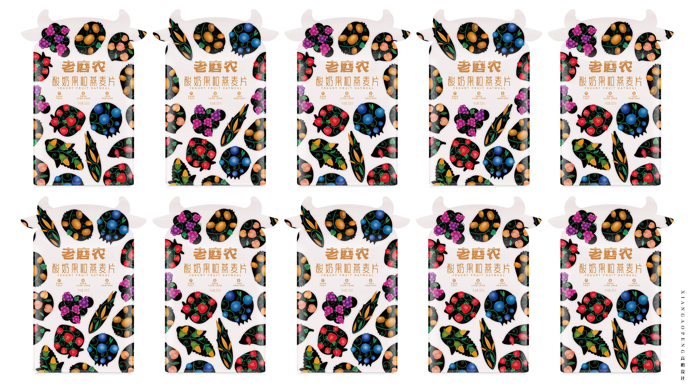
Created by branding agency Xiangaopeng, the packaging of Yogurt Nut Oatmeal is designed to attract customers and communicate the benefits of the product.
The design house mentions:
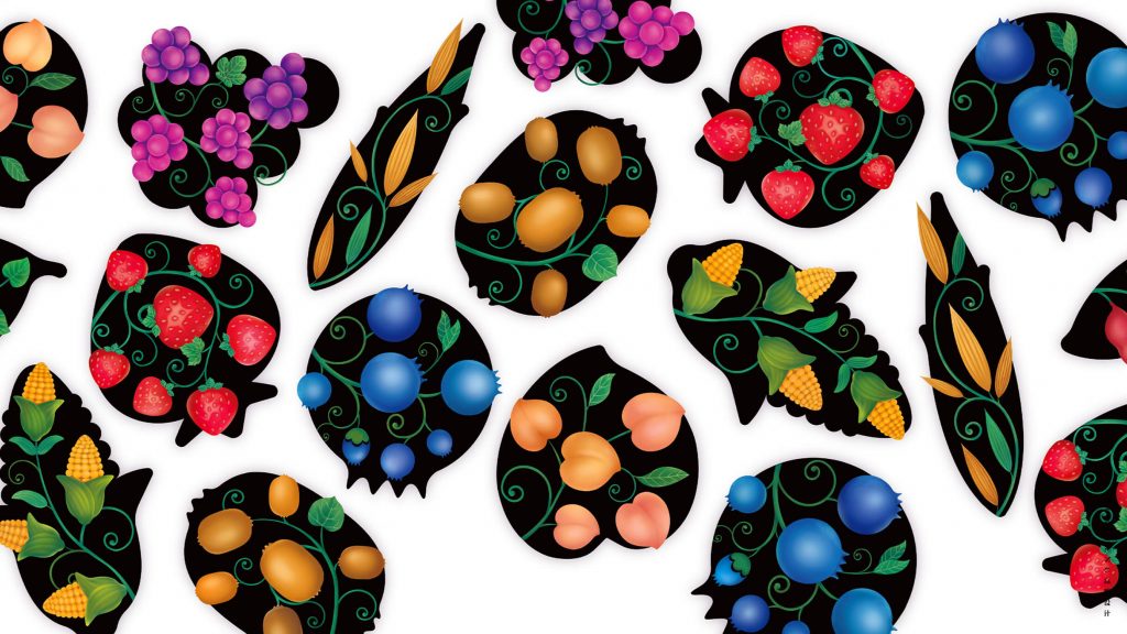
“The overall packaging is based on the reflection of a variety of ingredients. The ingredients are used as illustration patterns to be alienated into two groups of different cow body patterns. Presented on both sides of the cow-shaped packaging bag, Under the premise of satisfying visual recognition cognition, To meet the shelf matrix display, Help its brand communication and product sales.”

