Designed by: PepsiCo Design & Innovation
Country: United States

Food Spa Spotless Packaging Design

Designed by: Craft Mark Studio | Country: Lithuania

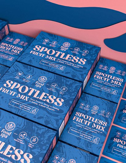
Spotless by Food Spa, a health brand, was developed by a team of scientists to help individuals achieve their health and fitness goals. The packaging design was created to highlight the naturalness and premium nature of the products.

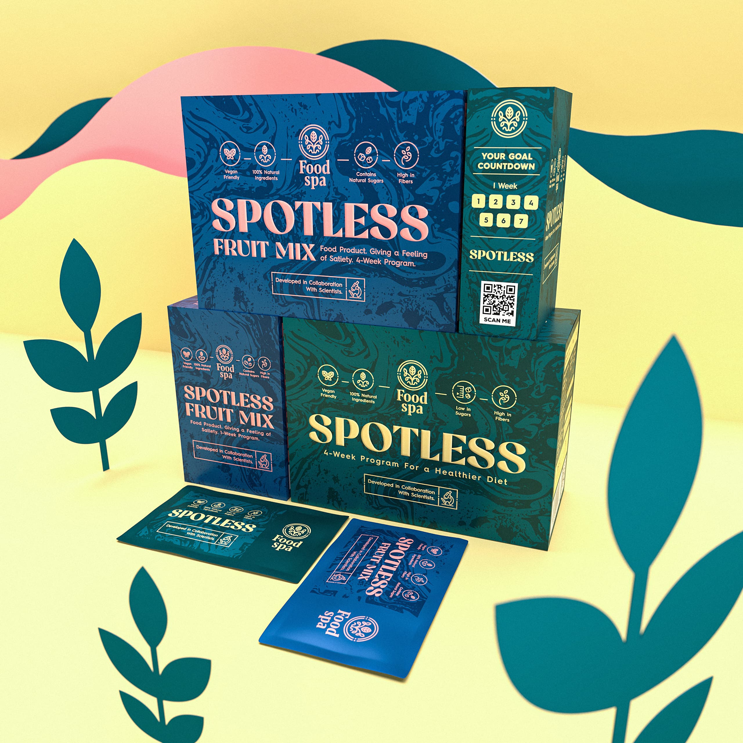
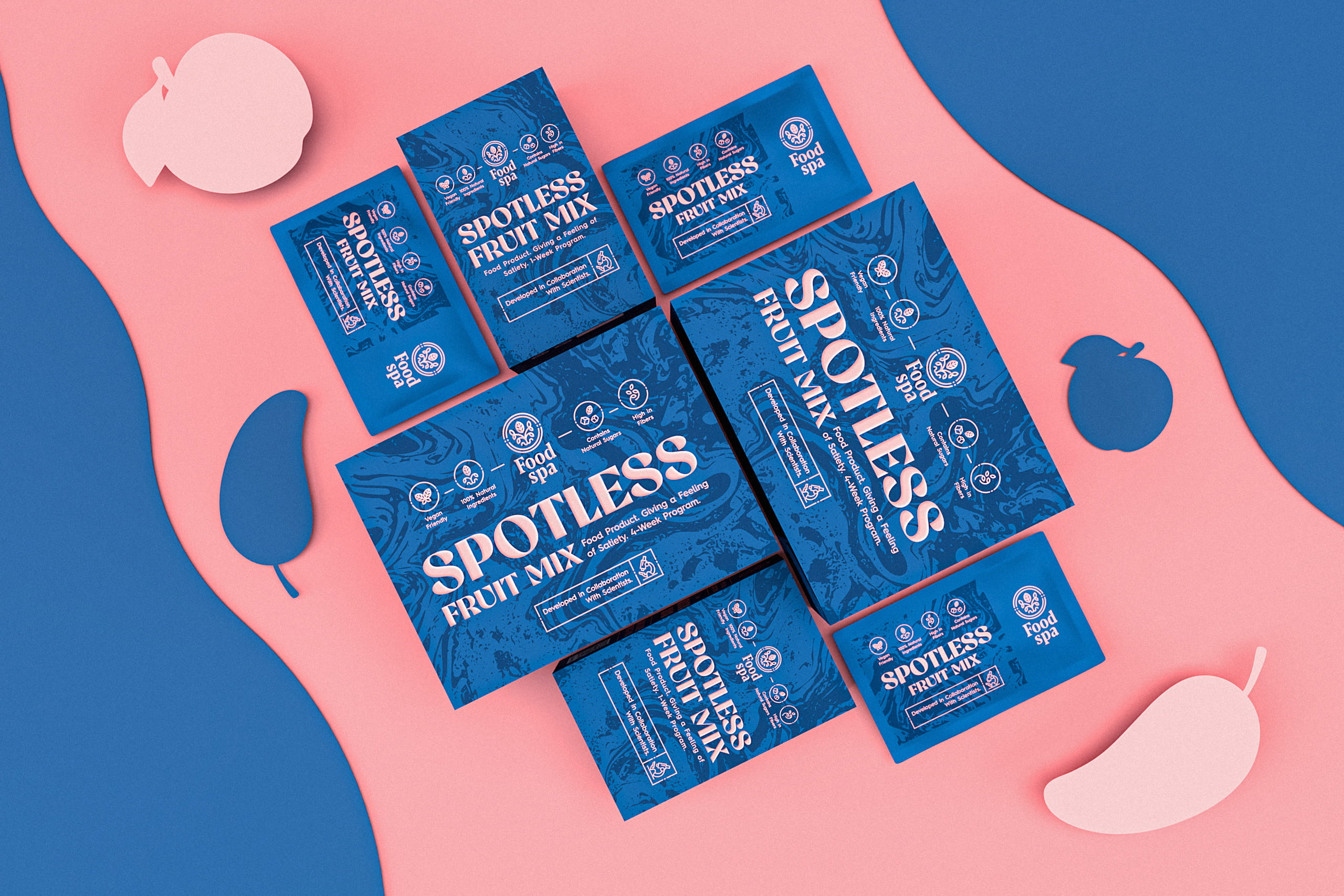
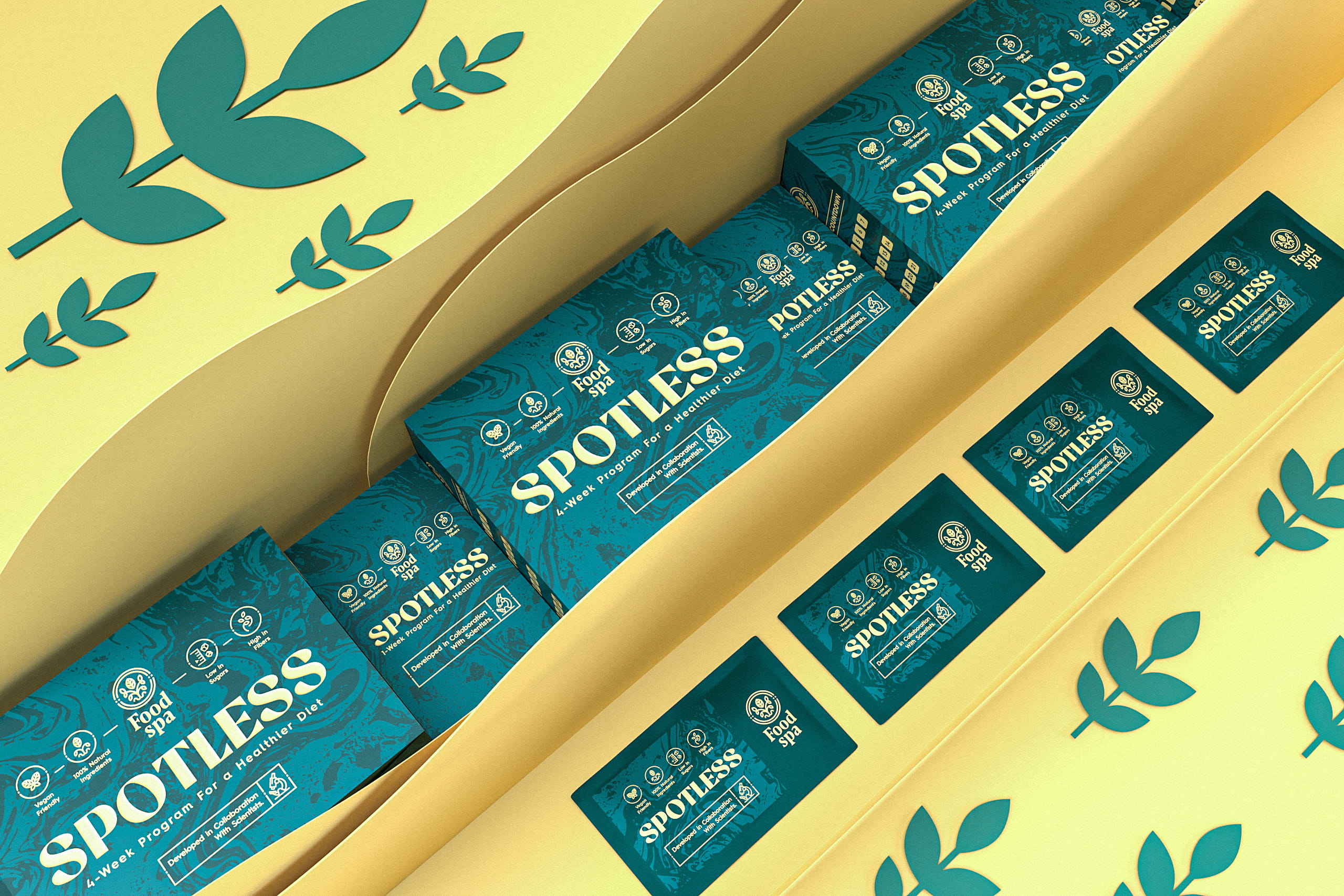
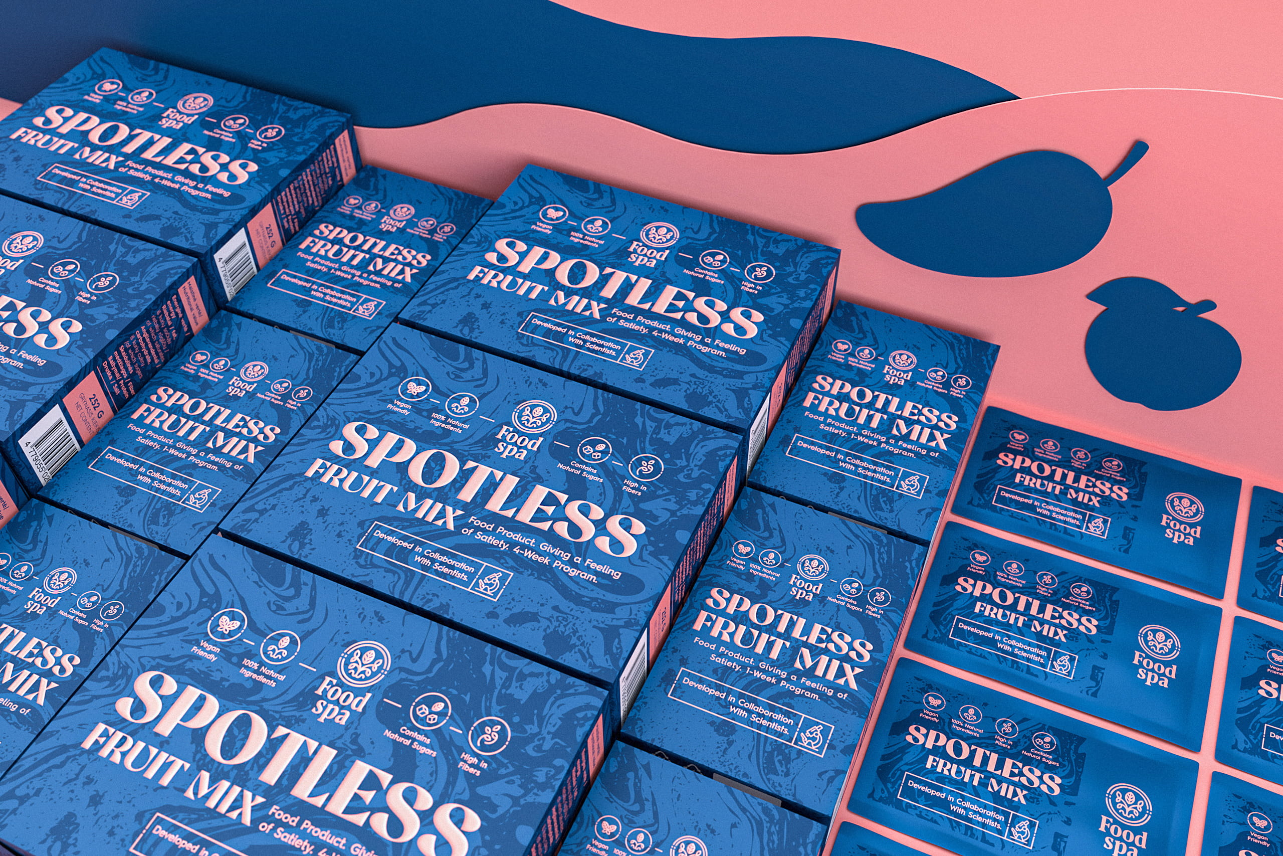
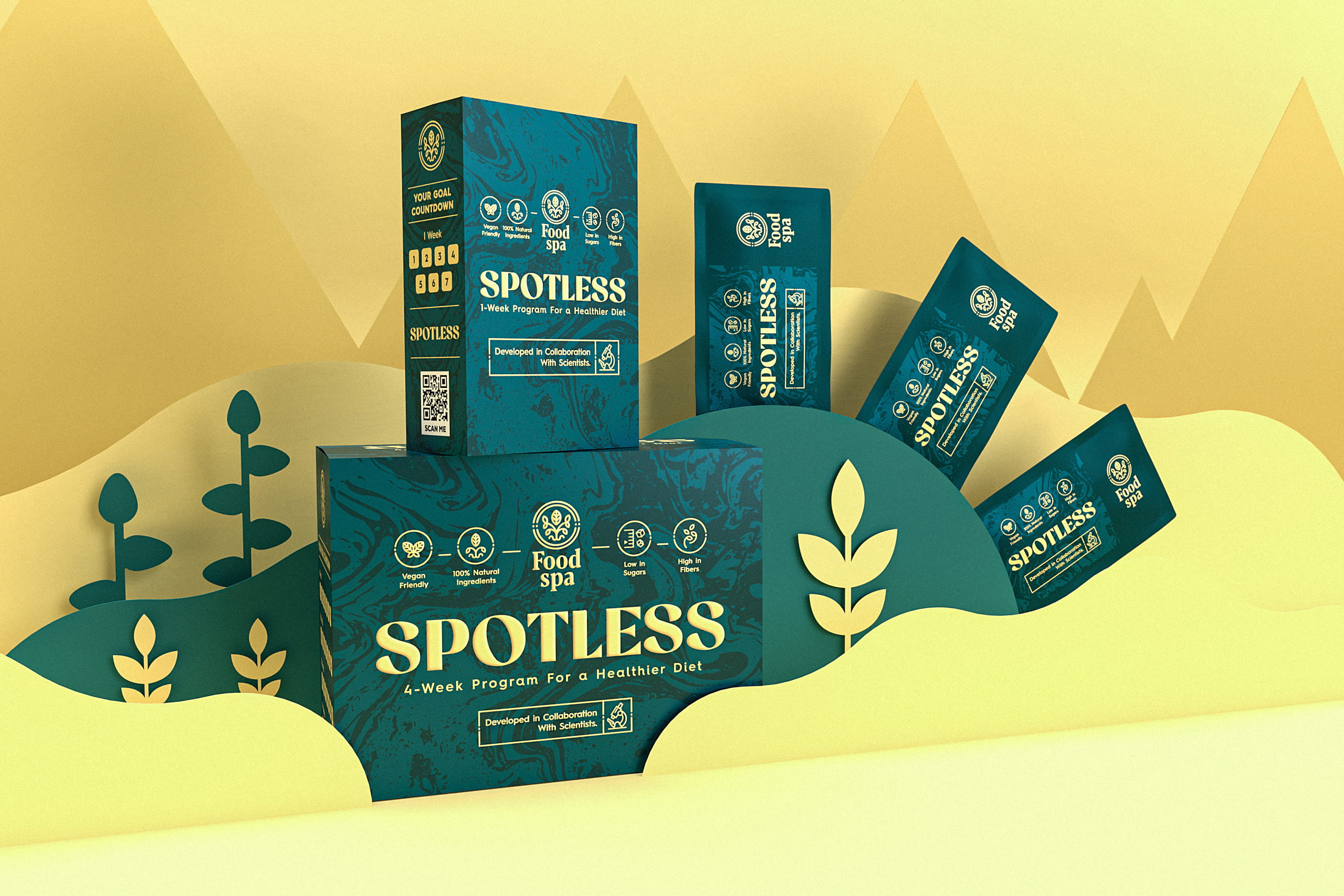
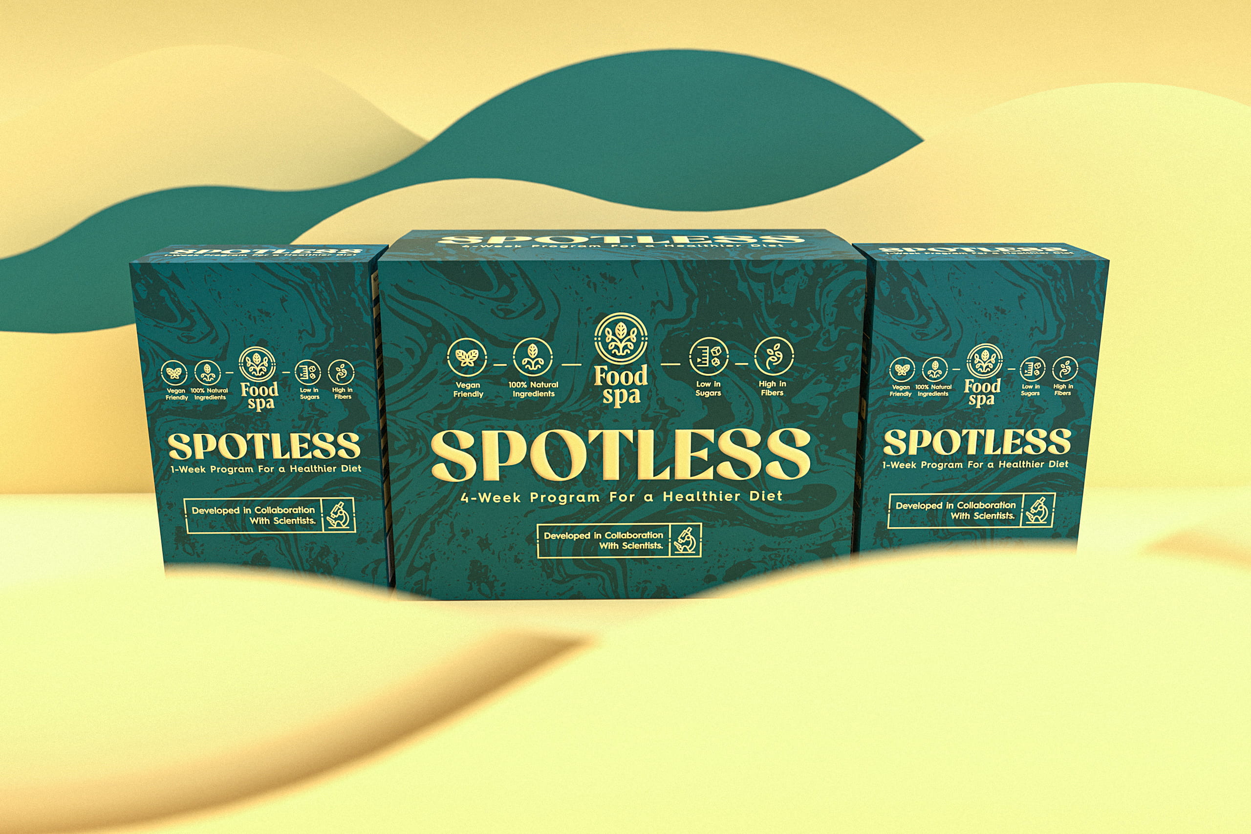
The “Spotless” product line was developed in collaboration with scientists and is aimed at helping achieve personal health and fitness goals. Smaller and larger boxes of the products are available for one or four-week programs. Each box contains 7 or 28 individual packets of the product for the utmost consumption convenience. In addition, the products contain only natural ingredients for the highest nutritional benefits.

Food Spa Spotless Packaging Design

The packaging

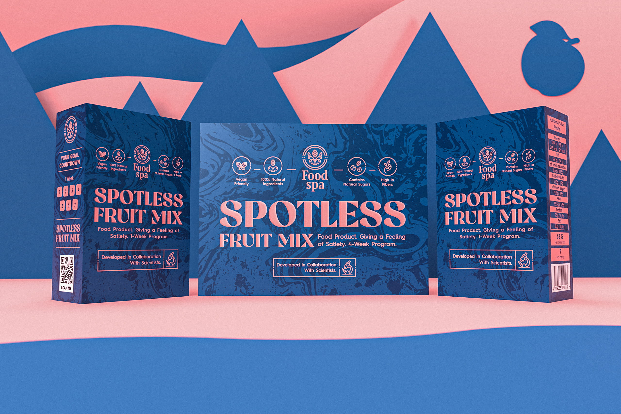
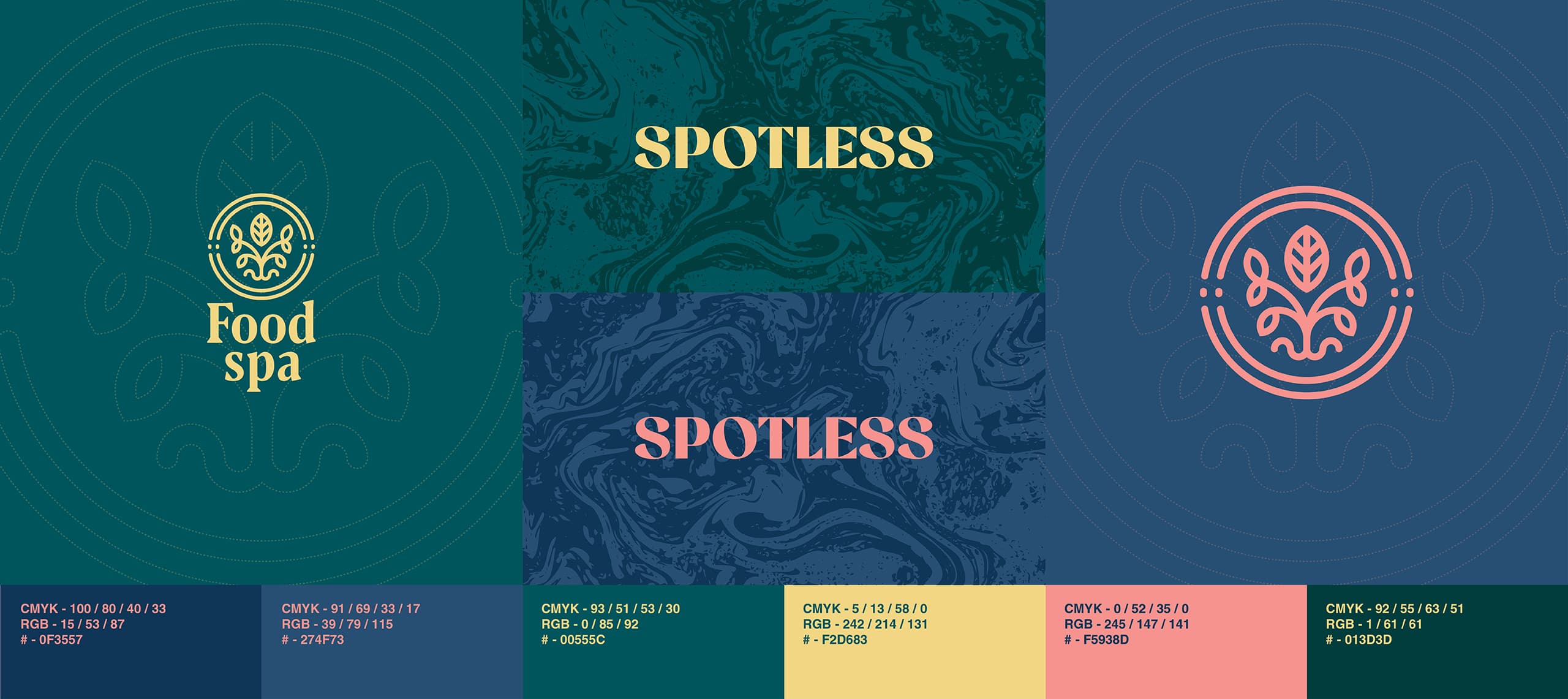
Food Spa combined its efforts with Craft Mark Studio, a Kaunas –based design agency, to create the packaging designs for Spotless. In addition to creating the packaging designs for the brand, the creative studio designed the logo for the brand. Apart from the use of bold colors, a section of the label is dedicated to the goal countdown, which adds richness to the overall design.

“We’ve chosen rich and solid base colors and enhanced them with abstract background ornaments. Also, we decided to use bold and exquisite typography, making it one of the main accents of the design.

Various interactive elements, such as a goal countdown checklist placed on the side of the product packaging, add some extra oomph to the overall design and make the product more fun to consume.”

Get the latest packaging design inspiration in your inbox:

Popular designs

The Port Vodka Lemon Water

Overview: In response to my client’s vision for a Cape Cod themed beverage brand, I embarked on the journey to create The Port

Pure Persian Honey

When we look closely at honey packaging, they are almost all in the usual format, and the ultimate in creativity is that

Burma Love Rebrand

Love at First BiteAs an extension of the Burma Superstar restaurant in San Francisco, Burma Love Foods gives diners an opportunity to

Over the wave

This Kombucha originates in Lombok, Indonesia, where its paradise beaches attract hundreds of surfers eager to ride the waves. When you surf,

Designed by: PepsiCo Design & Innovation
Country: United States

Food Spa Spotless Packaging Design

9-Spotless

Designed by: Craft Mark Studio | Country: Lithuania

Spotless by Food Spa, a health brand, was developed by a team of scientists to help individuals achieve their health and fitness goals. The packaging design was created to highlight the naturalness and premium nature of the products.

The “Spotless” product line was developed in collaboration with scientists and is aimed at helping achieve personal health and fitness goals. Smaller and larger boxes of the products are available for one or four-week programs. Each box contains 7 or 28 individual packets of the product for the utmost consumption convenience. In addition, the products contain only natural ingredients for the highest nutritional benefits.

Food Spa Spotless Packaging Design

The packaging

Food Spa combined its efforts with Craft Mark Studio, a Kaunas –based design agency, to create the packaging designs for Spotless. In addition to creating the packaging designs for the brand, the creative studio designed the logo for the brand. Apart from the use of bold colors, a section of the label is dedicated to the goal countdown, which adds richness to the overall design.

“We’ve chosen rich and solid base colors and enhanced them with abstract background ornaments. Also, we decided to use bold and exquisite typography, making it one of the main accents of the design.

Various interactive elements, such as a goal countdown checklist placed on the side of the product packaging, add some extra oomph to the overall design and make the product more fun to consume.”

Explore more great package design

Get the latest on packaging design in your inbox: