Designed by: PepsiCo Design & Innovation
Country: United States

Force

Force

Designed by Mountain | Country: The Netherlands

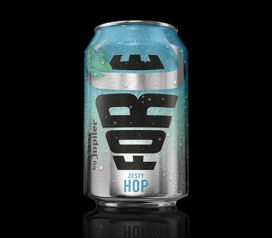
“Jupiler has become the iconic beer brand for ‘real men’ in the Benelux. But sometimes, even ‘real men’ want to enjoy a refreshing drink without the sweetness and without the alcohol.

Jupiler Force is a real innovation in the soft drink category. A naturally brewed soft drink with a familiar taste that only Jupiler drinkers know and love.

Mountain attacked the challenge by asking ‘how can the bull step into the world of soft drinks without loosing its identity as a real man’s beer?’

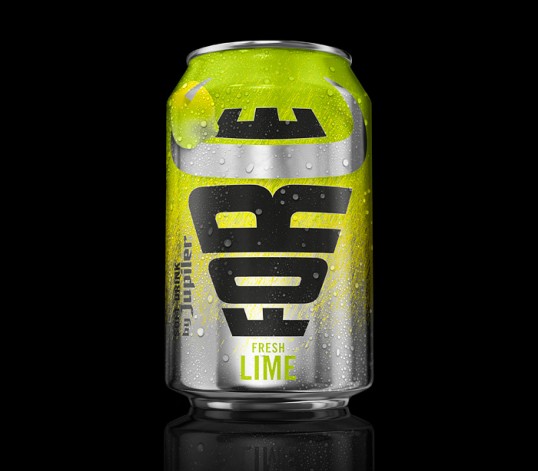
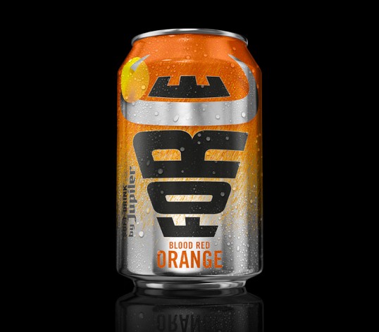
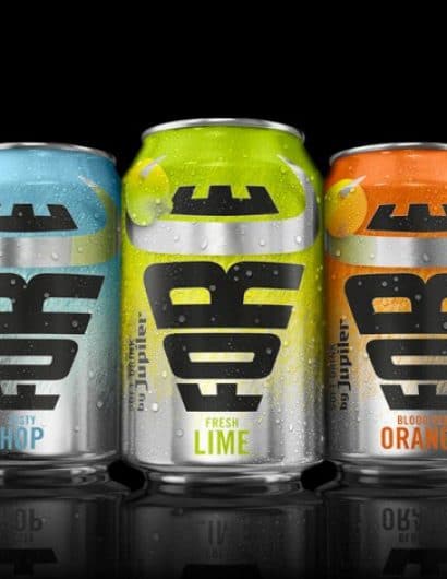
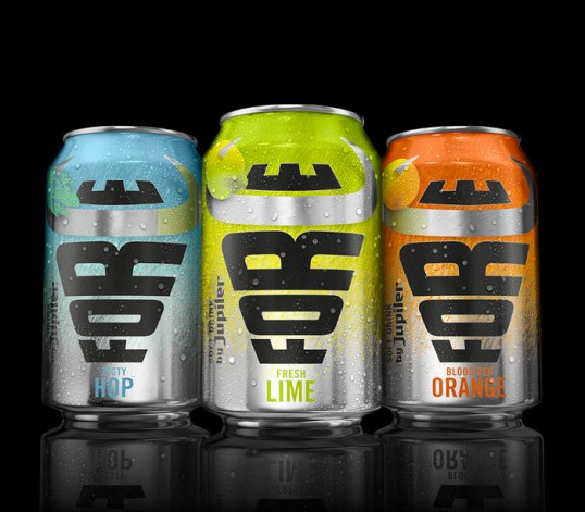
The answer, the bull and the typography became one entity where the horns of the bull form the ‘C’ in Force in a playful and powerful way. Combining the ‘typographic bull’ with a fresh and lively colour palette created a forceful design that literally steps of the shelves.”

Force

Force

Force

Get the latest packaging design inspiration in your inbox:

Popular designs

Over the wave

This Kombucha originates in Lombok, Indonesia, where its paradise beaches attract hundreds of surfers eager to ride the waves. When you surf,

The Bra Guru

Most women are wearing the wrong size bra and that is a fact. The Bra Guru® is the first and only professional

Far Out Bar

Description: Far Out Bar is a cutting-edge packaging design project created for High Life Farms’ macrodose THC chocolate bars. This project involved

Designed by: PepsiCo Design & Innovation
Country: United States

Force

lovely-package-force-1

Force

Designed by Mountain | Country: The Netherlands

“Jupiler has become the iconic beer brand for ‘real men’ in the Benelux. But sometimes, even ‘real men’ want to enjoy a refreshing drink without the sweetness and without the alcohol.

Jupiler Force is a real innovation in the soft drink category. A naturally brewed soft drink with a familiar taste that only Jupiler drinkers know and love.

Mountain attacked the challenge by asking ‘how can the bull step into the world of soft drinks without loosing its identity as a real man’s beer?’

The answer, the bull and the typography became one entity where the horns of the bull form the ‘C’ in Force in a playful and powerful way. Combining the ‘typographic bull’ with a fresh and lively colour palette created a forceful design that literally steps of the shelves.”
Force

Force

Force

Previous slide
Next slide

Explore more great package design

Get the latest on packaging design in your inbox: