Designed by: PepsiCo Design & Innovation
Country: United States

Foster’s

Foster's

Designed by BrandMe | Country: United Kingdom

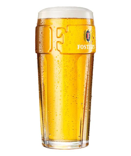
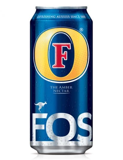
“Heineken UK’s leading lager Foster’s has unveiled a radical branding redesign that emphasises its Australian personality and accentuates the quality and modernity of the brand.

The new look will be introduced to all brand ‘touch-points’ including packaging design, POS, customer and consumer marketing. All the new brand elements and packaging designs have been created by FMCG brand designers BrandMe and will be available in UK supermarkets and off-licences nationally from August.

The new branding builds a strong point of difference for Foster’s in a market where most lager brands use heritage as a selling point.  The new design clearly presents a progressive and positive attitude with its Australian stance – communicating sunshine, fun, informality and inclusiveness.

Gayle Harrison, Marketing Manager, Foster’s said: “The new visual identity represents one of the most significant changes in the brand’s UK history. It will revitalise the brand and add to the marketing momentum that is building on the back of the innovative advertising and sponsorship support we have put in place. Most importantly, the redesign will give Foster’s a powerful competitive advantage through the creation of an instantly recognisable brand mark that can be easily translated across all Foster’s branded materials.”

John Wynne, Creative Director at BrandMe said: “Throughout the process it was important to consider all of Foster’s brand elements individually, and review their contribution to the overall brand expression. These elements were carefully researched with consumers to understand their value and equity.“

“The famous Foster’s roundel has been retained but made more prominent and contemporary – now showing cues of sunshine and freshness. This iconic new mark is central to the branding and will provide huge standout and aid consumer recognition for the brand going forward.”

Other familiar elements of the brand design – the kangaroo, the ‘Amber Nectar’ statement and the unique, bespoke hand-lettered Foster’s typeface-  have also been enhanced and developed and a new ‘refreshing Aussies since 1888″

Foster's

Get the latest packaging design inspiration in your inbox:

Popular designs

Far Out Bar

Description: Far Out Bar is a cutting-edge packaging design project created for High Life Farms’ macrodose THC chocolate bars. This project involved

Pure Persian Honey

When we look closely at honey packaging, they are almost all in the usual format, and the ultimate in creativity is that

Over the wave

This Kombucha originates in Lombok, Indonesia, where its paradise beaches attract hundreds of surfers eager to ride the waves. When you surf,

The Port Vodka Lemon Water

Overview: In response to my client’s vision for a Cape Cod themed beverage brand, I embarked on the journey to create The Port

Designed by: PepsiCo Design & Innovation
Country: United States

Foster’s

fosters1

Foster's

Designed by BrandMe | Country: United Kingdom

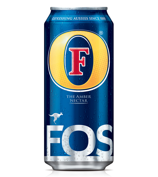
“Heineken UK’s leading lager Foster’s has unveiled a radical branding redesign that emphasises its Australian personality and accentuates the quality and modernity of the brand.

The new look will be introduced to all brand ‘touch-points’ including packaging design, POS, customer and consumer marketing. All the new brand elements and packaging designs have been created by FMCG brand designers BrandMe and will be available in UK supermarkets and off-licences nationally from August.

The new branding builds a strong point of difference for Foster’s in a market where most lager brands use heritage as a selling point.  The new design clearly presents a progressive and positive attitude with its Australian stance – communicating sunshine, fun, informality and inclusiveness.

Gayle Harrison, Marketing Manager, Foster’s said: “The new visual identity represents one of the most significant changes in the brand’s UK history. It will revitalise the brand and add to the marketing momentum that is building on the back of the innovative advertising and sponsorship support we have put in place. Most importantly, the redesign will give Foster’s a powerful competitive advantage through the creation of an instantly recognisable brand mark that can be easily translated across all Foster’s branded materials.”

John Wynne, Creative Director at BrandMe said: “Throughout the process it was important to consider all of Foster’s brand elements individually, and review their contribution to the overall brand expression. These elements were carefully researched with consumers to understand their value and equity.“

“The famous Foster’s roundel has been retained but made more prominent and contemporary – now showing cues of sunshine and freshness. This iconic new mark is central to the branding and will provide huge standout and aid consumer recognition for the brand going forward.”

Other familiar elements of the brand design – the kangaroo, the ‘Amber Nectar’ statement and the unique, bespoke hand-lettered Foster’s typeface-  have also been enhanced and developed and a new ‘refreshing Aussies since 1888″
Foster's

Previous slide
Next slide

Explore more great package design

Get the latest on packaging design in your inbox: