Designed by Partners + Napier | Country: United States
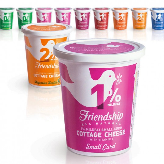
“Friendship Dairies needed a way to reach 100% of their target audience. How? By bringing a little color and sass to the dairy case. With packaging becoming the new POS, especially when it comes to clean stores, we decided to amplify Friendship’s fun personality at the dairy case to a point where even their competitors’ consumers couldn’t help but love ‘em. With a sophisticated package redesign, Friendship was able to elevate their brand’s personality, as well as shopability—filling an unmet need in the cottage cheese category.
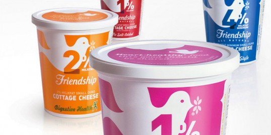
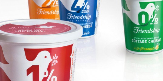
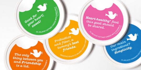
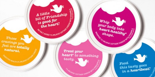
We went directly to the source and used qualitative and quantitative testing to ask consumers what was most important to them when shopping. As a result, we were able to give them exactly what they wanted. Sassy lid and tub discovery lines were also added to introduce a fun, witty dialogue at shelf, and to help differentiate from competitors with Friendship’s “all natural” stance.”
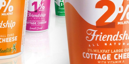
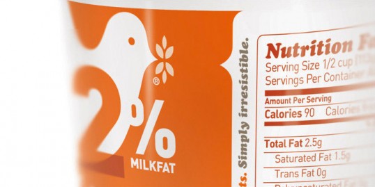
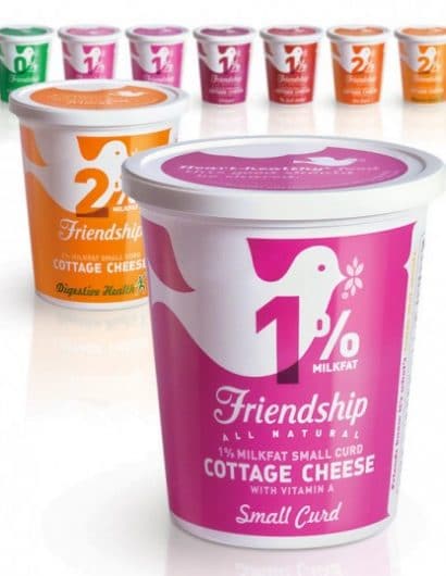
“Shopability was strengthened with the migration to single key colors. These new bright and punchy single key colors make an impact at shelf especially when viewed as a family. Because shoppers look for milkfat percentage first, each variety’s percentage was increased 400%, allowing shoppers to find their favorite SKUs quickly and be on their way. Brand recognition was also improved by increasing the size of the iconic dove.”
“In the end, we created an attractive new package that elevates the brands personality with sassy and progressive styling, didn’t alienate current loyalists, and was alluring enough to gain Friendship a bunch of new fans.”

