Designed by: PepsiCo Design & Innovation
Country: United States

Fruene Chocolate

lovely-package-fruene-chocolate-1

Designed by Tank Design Tromsø | Country: Norway

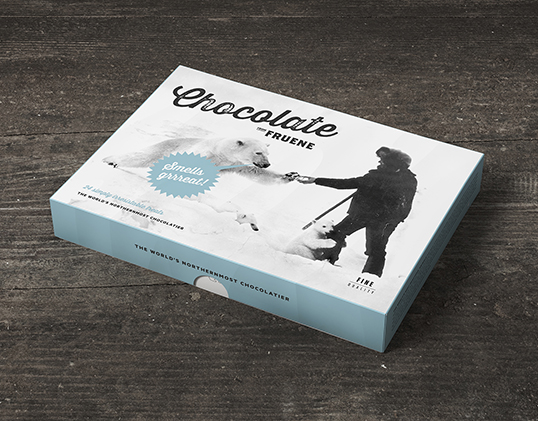
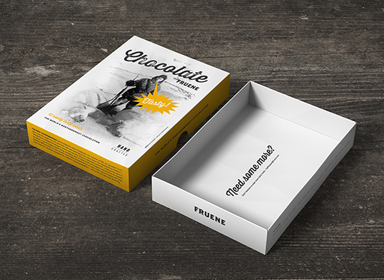
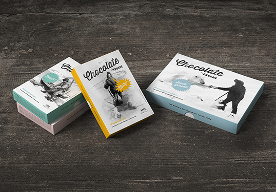
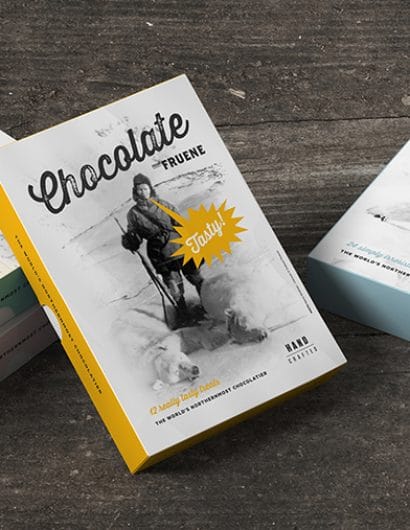
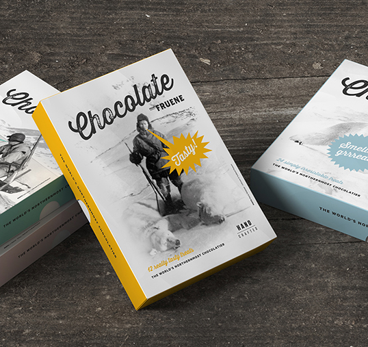
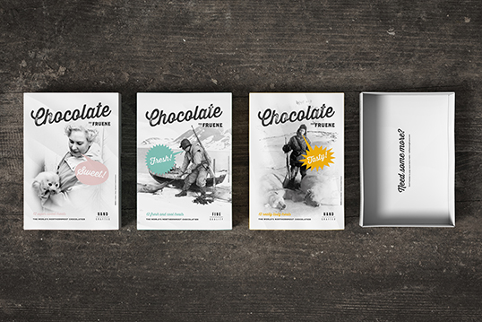
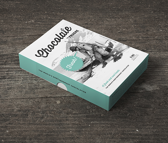
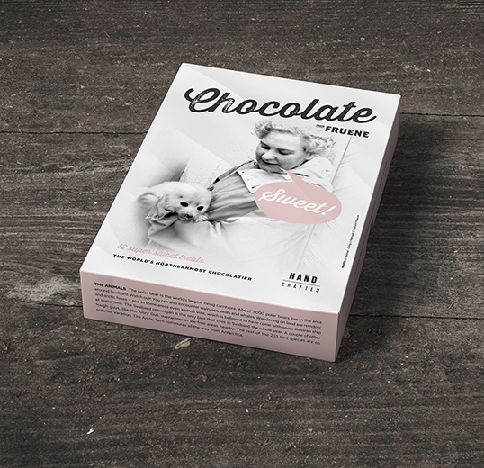
“The brief was to create a full range identity for a popular café in Longyearbyen on Svalbard. The client had recently started up the world’s northernmost chocolaterie, and were producing a wide range of handmade quality chocolate that needed packaging for the tourist market. The clients name Fruene means «The Ladies» and refers to strong female characters who during the last century made their mark in a male dominated and extremely rough hunter and trapper society. The end result is an homage to those women and to the unique stories of both the people and the animals that inhabit Svalbard. We have worked closely with both the client, writers and the Svalbard Museum in order to find the best stories and pictures. Simple color coding and clean typography distinguishes the different boxes from each other and leave the story in focus.”
lovely-package-fruene-chocolate-2 lovely-package-fruene-chocolate-4 lovely-package-fruene-chocolate-3 lovely-package-fruene-chocolate-5 lovely-package-fruene-chocolate-6 lovely-package-fruene-chocolate-7

Get the latest packaging design inspiration in your inbox:

Popular designs

The Bra Guru

Most women are wearing the wrong size bra and that is a fact. The Bra Guru® is the first and only professional

Pure Persian Honey

When we look closely at honey packaging, they are almost all in the usual format, and the ultimate in creativity is that

Burma Love Rebrand

Love at First BiteAs an extension of the Burma Superstar restaurant in San Francisco, Burma Love Foods gives diners an opportunity to

Over the wave

This Kombucha originates in Lombok, Indonesia, where its paradise beaches attract hundreds of surfers eager to ride the waves. When you surf,

Designed by: PepsiCo Design & Innovation
Country: United States

Fruene Chocolate

lovely-package-fruene-chocolate-1

Designed by Tank Design Tromsø | Country: Norway

“The brief was to create a full range identity for a popular café in Longyearbyen on Svalbard. The client had recently started up the world’s northernmost chocolaterie, and were producing a wide range of handmade quality chocolate that needed packaging for the tourist market. The clients name Fruene means «The Ladies» and refers to strong female characters who during the last century made their mark in a male dominated and extremely rough hunter and trapper society. The end result is an homage to those women and to the unique stories of both the people and the animals that inhabit Svalbard. We have worked closely with both the client, writers and the Svalbard Museum in order to find the best stories and pictures. Simple color coding and clean typography distinguishes the different boxes from each other and leave the story in focus.”
lovely-package-fruene-chocolate-2 lovely-package-fruene-chocolate-4 lovely-package-fruene-chocolate-3 lovely-package-fruene-chocolate-5 lovely-package-fruene-chocolate-6 lovely-package-fruene-chocolate-7

Previous slide
Next slide

Explore more great package design

Get the latest on packaging design in your inbox: