Designed by: PepsiCo Design & Innovation
Country: United States

Student Work – Marie-Eve Dubois

frugal3

Designed by Marie-Eve Dubois | Country: Canada

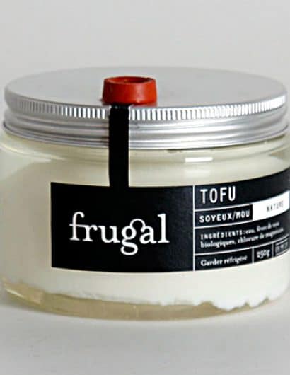
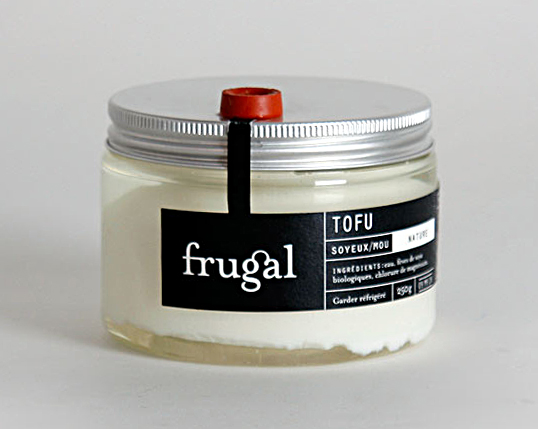
“If you’re among those who think that tofu is a rather boring and bland product, you might want to have a look at this new way of conditioning and packaging tofu. This study by Marie-Eve Dubois in my packaging class is quite an interesting way of combining aesthetic and function.

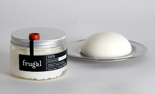
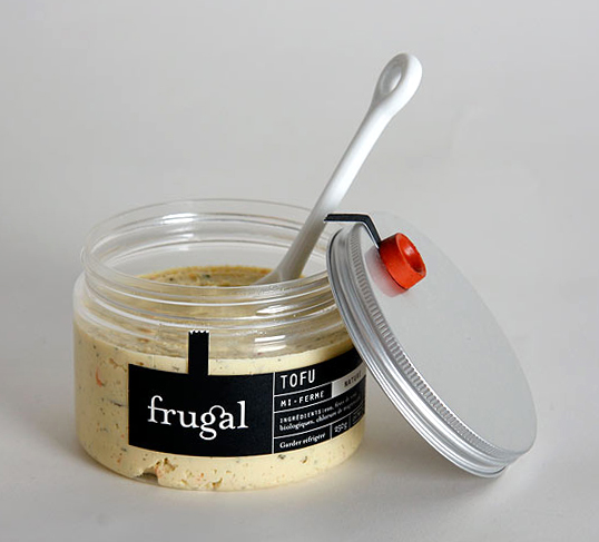
The first goal was to solve the water change problem and try to make it easier in creating this valve that makes the emptying easier. To avoid a blockage of the valve by the product when turned, the tofu is molded into a half spherical shape. The shape makes it functional and much nicer than the standard block. From a graphic point of view, the pure simplistic approach is trading the old traditional Asian look for a much more occidental clientele. The jar is also useful for recipe mixes the tofu with various spices and sauces. It could also be used as a bowl.”
frugal2

frugal1

Get the latest packaging design inspiration in your inbox:

Popular designs

Far Out Bar

Description: Far Out Bar is a cutting-edge packaging design project created for High Life Farms’ macrodose THC chocolate bars. This project involved

Pure Persian Honey

When we look closely at honey packaging, they are almost all in the usual format, and the ultimate in creativity is that

Burma Love Rebrand

Love at First BiteAs an extension of the Burma Superstar restaurant in San Francisco, Burma Love Foods gives diners an opportunity to

Designed by: PepsiCo Design & Innovation
Country: United States

Student Work – Marie-Eve Dubois

frugal3

frugal3

Designed by Marie-Eve Dubois | Country: Canada

“If you’re among those who think that tofu is a rather boring and bland product, you might want to have a look at this new way of conditioning and packaging tofu. This study by Marie-Eve Dubois in my packaging class is quite an interesting way of combining aesthetic and function.

The first goal was to solve the water change problem and try to make it easier in creating this valve that makes the emptying easier. To avoid a blockage of the valve by the product when turned, the tofu is molded into a half spherical shape. The shape makes it functional and much nicer than the standard block. From a graphic point of view, the pure simplistic approach is trading the old traditional Asian look for a much more occidental clientele. The jar is also useful for recipe mixes the tofu with various spices and sauces. It could also be used as a bowl.”

frugal2

frugal1

Previous slide
Next slide

Explore more great package design

Get the latest on packaging design in your inbox: