Designed by: PepsiCo Design & Innovation
Country: United States

Fruya Packaging Design

Designed by: Studio Unbound | Country: United Kingdom

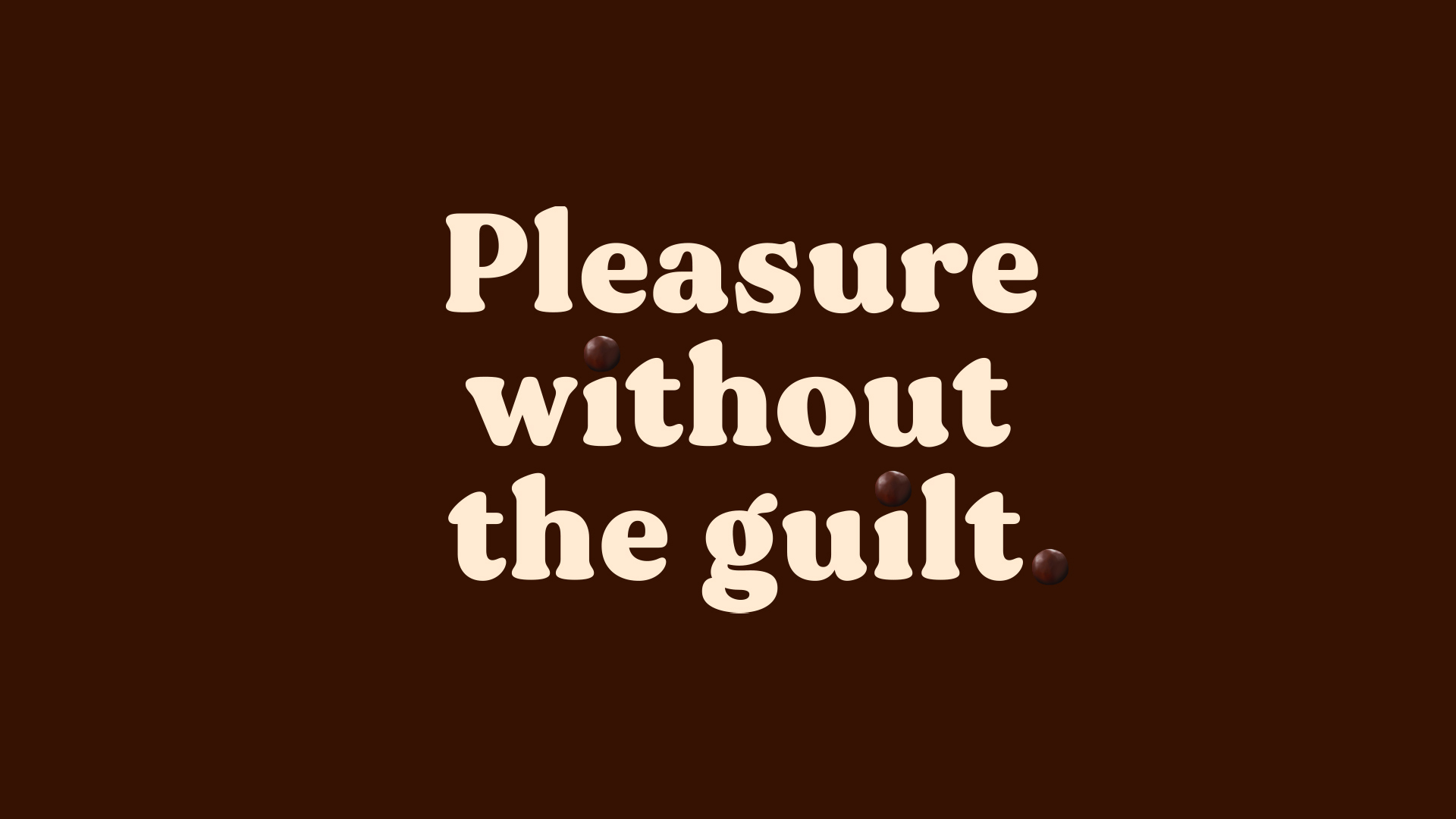
Studio Unbound teamed up with Fruya to bring the brand’s “vision of a Better-For-You to life.” Fruya hopes to disrupt the eat-between-meal category by providing a healthier alternative to conventional chocolate snacks. Fruya products are a combination of sustainable chocolates and ripe fruits. Free of GMOs and additives: these eat-between-meals provide a “guilt-free” way of snacking. 

“Being healthy doesn’t mean depriving yourself of treats and isn’t life supposed to be about balance? Fruya’s mission is just beginning, these young innovators have big plans to further shake up the snack market and Studio Unbound are delighted to be on this journey with them.

Fruya Packaging Design

The packaging

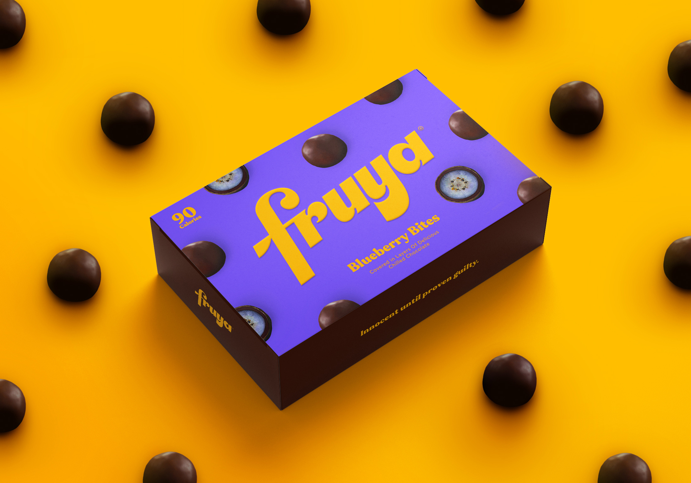
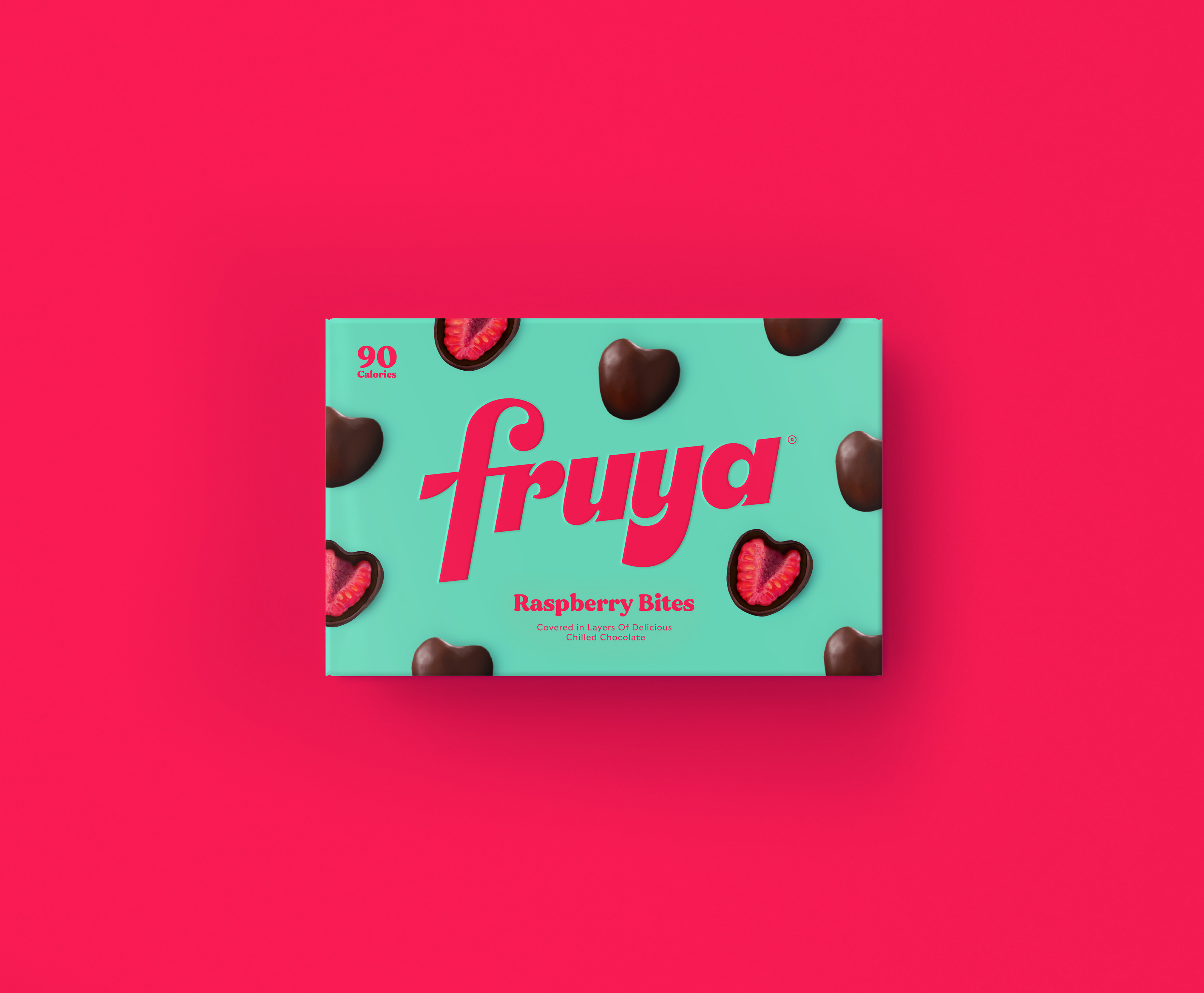
Studio Unbound used the idea of “guilt-free” to create retro-styled packaging for the brand.

The 70s-themed packaging appears perfect for Fruya. The decade is nothing short of extremes: from wild protests and radical changes to the rise of laid-back hippie culture, the 70s has seen it all.

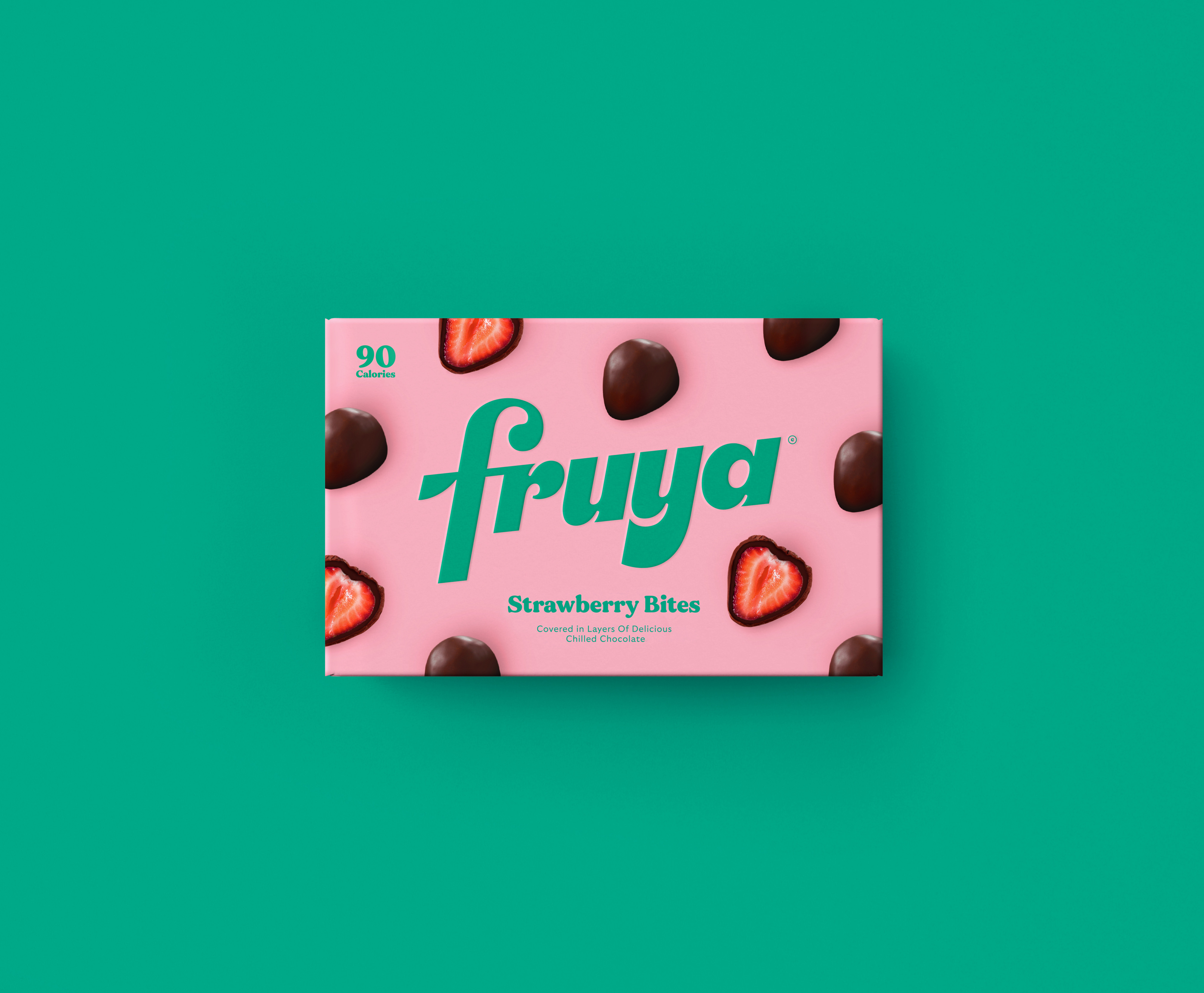
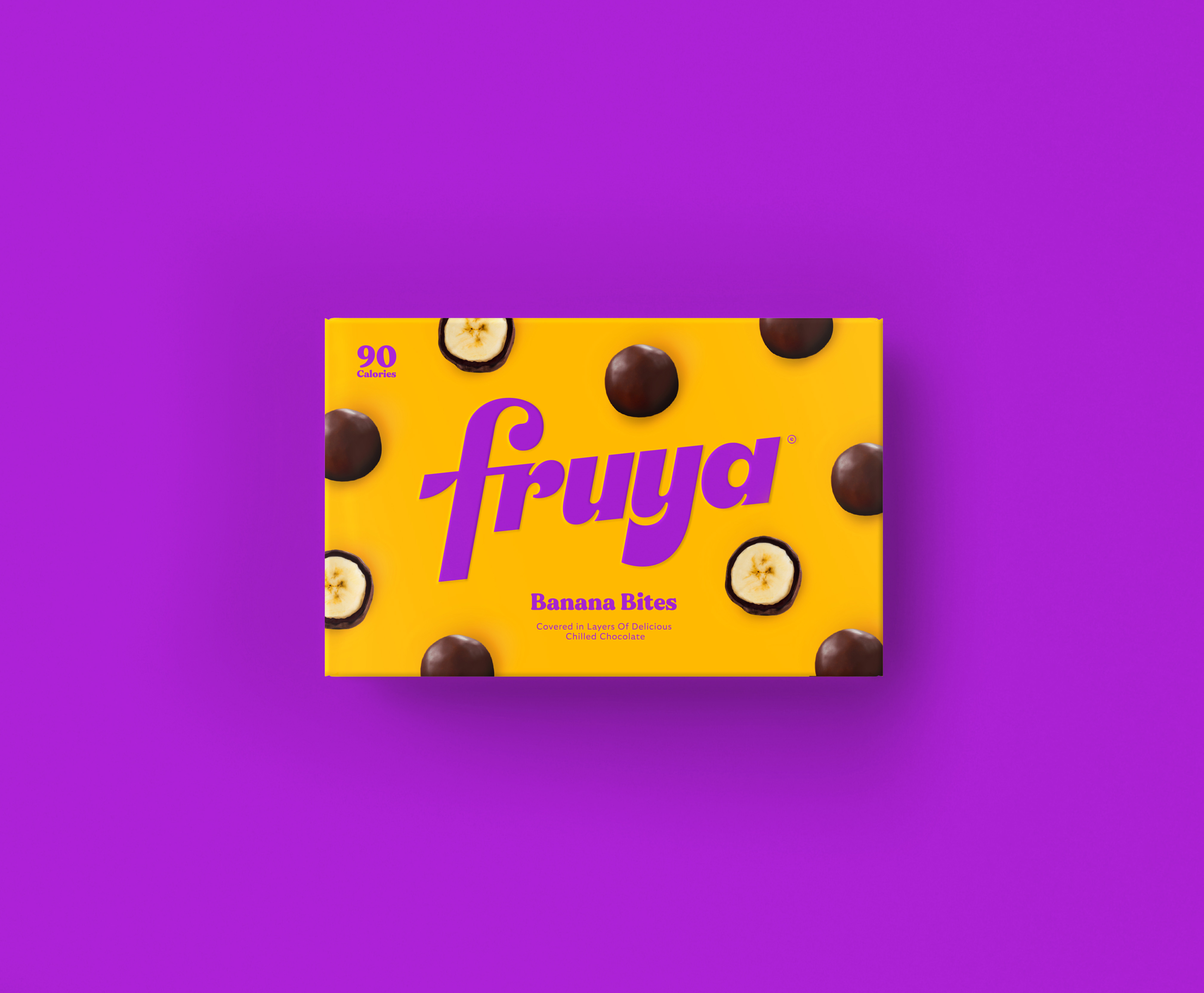
Keeping with that retro vibe, the packaging format is inspired by the legendary Poppet snack box with the open and close flap on the corner. The snack boxes are covered in images of the tasty chocolate snacks laid out almost like a pattern. All this combined creates a striking packaging design that ‘jumps straight off the shelf’.

Get the latest packaging design inspiration in your inbox:

Popular designs

The Bra Guru

Most women are wearing the wrong size bra and that is a fact. The Bra Guru® is the first and only professional

Burma Love Rebrand

Love at First BiteAs an extension of the Burma Superstar restaurant in San Francisco, Burma Love Foods gives diners an opportunity to

Over the wave

This Kombucha originates in Lombok, Indonesia, where its paradise beaches attract hundreds of surfers eager to ride the waves. When you surf,

Designed by: PepsiCo Design & Innovation
Country: United States

Fruya Packaging Design

Fruya_Rasp

Designed by: Studio Unbound | Country: United Kingdom

Studio Unbound teamed up with Fruya to bring the brand’s “vision of a Better-For-You to life.” Fruya hopes to disrupt the eat-between-meal category by providing a healthier alternative to conventional chocolate snacks. Fruya products are a combination of sustainable chocolates and ripe fruits. Free of GMOs and additives: these eat-between-meals provide a “guilt-free” way of snacking. 

“Being healthy doesn’t mean depriving yourself of treats and isn’t life supposed to be about balance? Fruya’s mission is just beginning, these young innovators have big plans to further shake up the snack market and Studio Unbound are delighted to be on this journey with them.

Fruya Packaging Design

The packaging

Studio Unbound used the idea of “guilt-free” to create retro-styled packaging for the brand.

The 70s-themed packaging appears perfect for Fruya. The decade is nothing short of extremes: from wild protests and radical changes to the rise of laid-back hippie culture, the 70s has seen it all.

Keeping with that retro vibe, the packaging format is inspired by the legendary Poppet snack box with the open and close flap on the corner. The snack boxes are covered in images of the tasty chocolate snacks laid out almost like a pattern. All this combined creates a striking packaging design that ‘jumps straight off the shelf’.

Previous slide
Next slide

Explore more great package design

Get the latest on packaging design in your inbox: