Designed by: PepsiCo Design & Innovation
Country: United States

Fully Loaded Tea

Fully Loaded Tea

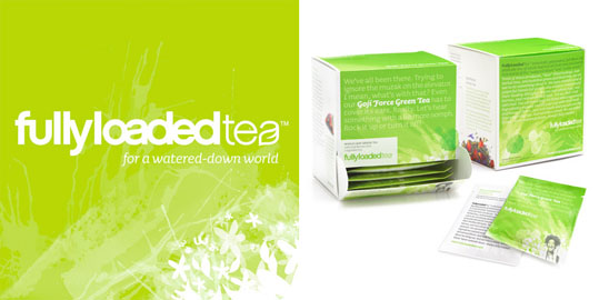
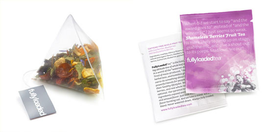
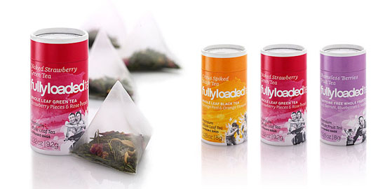
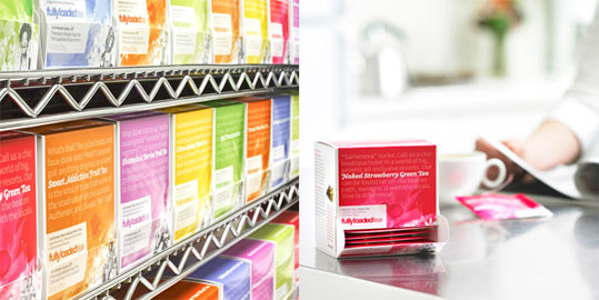
Fully Loaded Tea takes exotic berries that are full of vitamins and antioxidants, and then blends them with premium whole leaf teas. Beautiful brand development including identity and package design by Subplot.

“The logomark presents this concept in its simplest form: “Fully Loaded” is bursting so much with goodness and flavour that the letterforms are swelling to capacity. Truly “Fully Loaded”. And the “tea” leaf anchors the logomark and brings it fully in sync with the purity of the whole-leaf product.

The identity system takes the concept farther with fun rantings against the “watered down world” and how FullyLoadedTea is the bold and opinionated alternative. This is principally evident on the packaging system, where the flavour names jump out of the rantings, while a flavour-inspired painted background with illustrated fruit blends and iconic photography bring both the storytelling and flavour story to life. The packaging system also integrates a unique drop-down drawer for restaurant and café display purposes, instead of the typical ripped front.”
Fully Loaded Tea

Fully Loaded Tea

Fully Loaded Tea

Get the latest packaging design inspiration in your inbox:

Popular designs

Innovative Mushroom-Based Packaging Used in Haircare Industry

Explore the sustainable revolution in the beauty industry, as haircare brand The Rootist partners with Morae and Evocative to create fully biodegradable and compostable packaging made from mushroom roots. An innovative solution for eco-friendly beauty essentials.

Designed by: PepsiCo Design & Innovation
Country: United States

Fully Loaded Tea

fltweb01

Fully Loaded Tea

Fully Loaded Tea takes exotic berries that are full of vitamins and antioxidants, and then blends them with premium whole leaf teas. Beautiful brand development including identity and package design by Subplot.

“The logomark presents this concept in its simplest form: “Fully Loaded” is bursting so much with goodness and flavour that the letterforms are swelling to capacity. Truly “Fully Loaded”. And the “tea” leaf anchors the logomark and brings it fully in sync with the purity of the whole-leaf product.

The identity system takes the concept farther with fun rantings against the “watered down world” and how FullyLoadedTea is the bold and opinionated alternative. This is principally evident on the packaging system, where the flavour names jump out of the rantings, while a flavour-inspired painted background with illustrated fruit blends and iconic photography bring both the storytelling and flavour story to life. The packaging system also integrates a unique drop-down drawer for restaurant and café display purposes, instead of the typical ripped front.”
Fully Loaded Tea

Fully Loaded Tea

Fully Loaded Tea

Previous slide
Next slide
Get the latest on packaging design in your inbox: