


AGENCY: Fun Agency Ltd
COUNTRY: United Kingdom
Fun Agency was approached to create a new, super-smooth, premium potato vodka brand. This presented them with a true from-scratch brief, prompting questions about what it should be called and how it should appear.
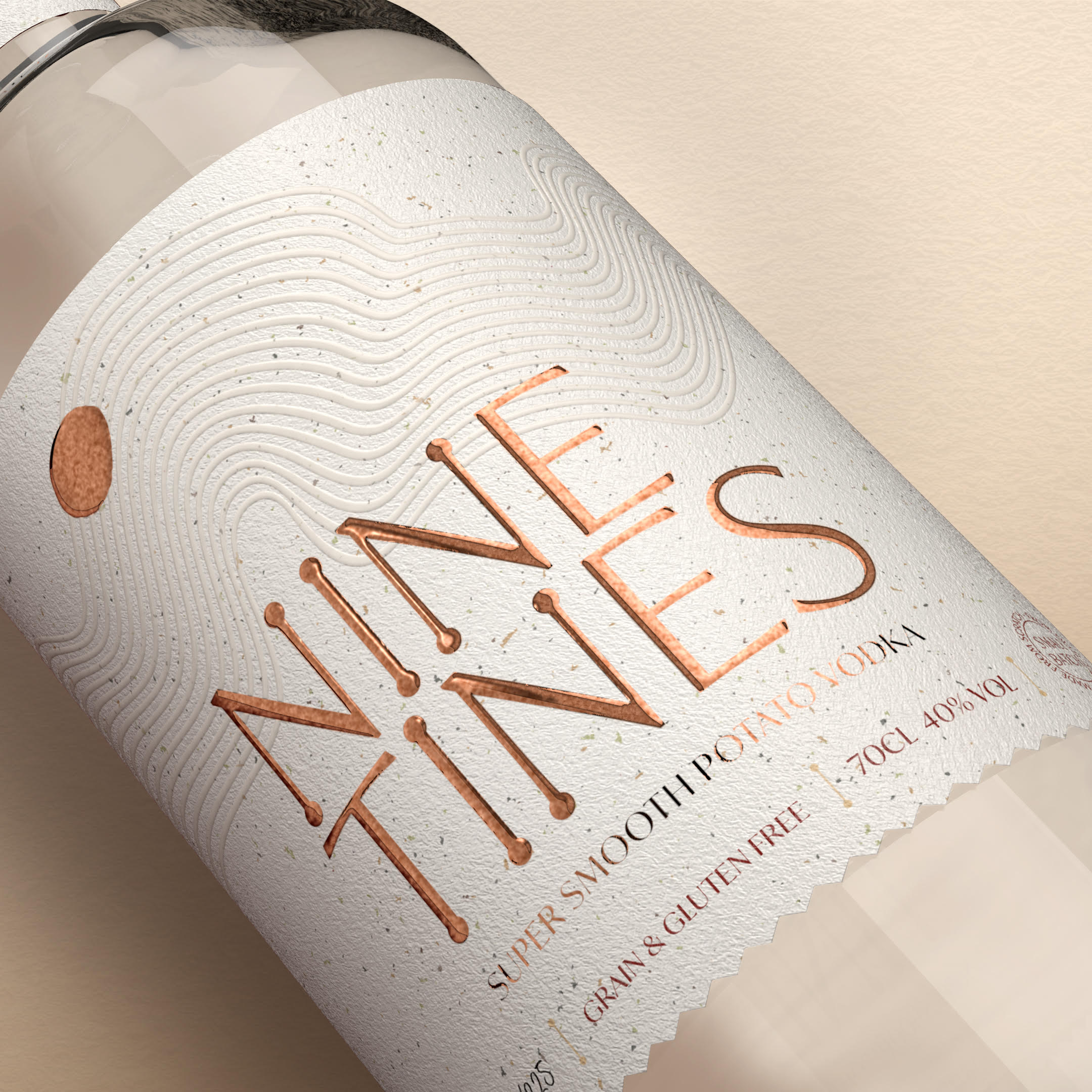
Since the wonderful potato played a central role in their success, it seemed only right and natural to honor it in the brand’s name. They chose “Nine Tines” as an affectionate nod to the ‘tines’ – or prongs – on a traditional potato farming fork, which historians would refer to as a sippet. Traditionally, these sippets had nine or ten tines arranged in a simple row, and “Nine” was selected for its resonance.
The subtle, meandering lines on the label recall the softly furrowed and gently undulating landscape of their North Yorkshire homeland. In this region, iconic hills, valleys, and rivers have shaped the ancient lands they’ve farmed for generations. The zig-zag edges on the bottle’s label echo these furrows, subtly alluding to the impressive attention to detail that characterizes their process and product.
Copper foiling was employed to reflect the rich and appealing color of their Lady Claire potatoes, and the potato-shaped icon itself is exactly what it appears to be: a potato! The soft-feel Fasson cotton white paper and exquisite embossing further convey the essence of the Nine Tines brand.
The overall effect is one of smoothness, gentleness, and subtlety, coupled with unwavering commitment to premium quality at every stage. It is tastefully understated yet utterly unmistakable, mirroring the characteristics of their award-winning vodka.


Proposition
Strategy
Brand name creation
Hand lettered logo
Identity
Packaging Design
Tone of Voice
Advertising
Brand Guidelines
Bottle: Hayyan
Label Stock: Avery Dennison Fasson Cotton White
Detailing:
Copper Foil emboss
Emboss detailing
Di Cut
Stopper: Wood/Cork
Printing: The Label Makers
Glassware: Verallia Glass
Postal Outer: Flexi-Hex


