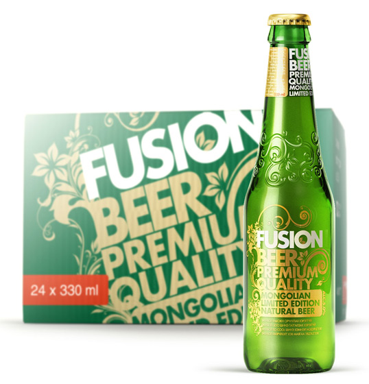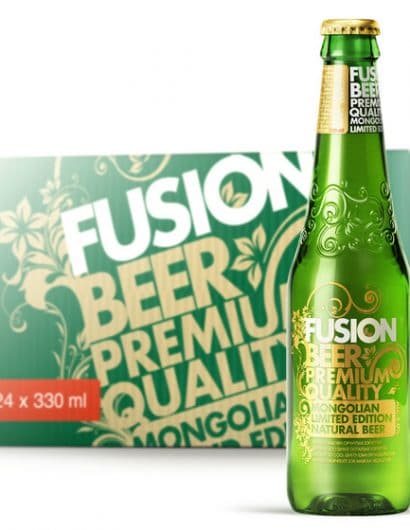
Designed by Depot WPF | Country: Russia
“The purpose: to create a visual image of a new beer for the young target audience of the local premium market. To develop a packaging design and unique form of the bottle (taking into account specific features of Chinese production). Not to try making so-called Mongolian design. The solution had to be worldwide.
The solution: we checked what was appropriate for young people in different countries and came to a solution that a «trend» notion (in the music, fashion and graphic design) is the most suitable for packaging design creation. By choosing this strategy, we perfectly realized a definite responsibility put upon the producer which was to follow youth trends. In order to do that we needed to keep the audience anticipating something new and unusual. Besides, this beer was supposed to become a fashionable attribute of clubbing. After all Fusion means blending various styles, culture and fashion together.
“Young and trendy”. This is the idea which gave us a push to draw our first sketches. As the upcoming product was to be gender mainstreaming we faced a matter of some difficulty, for statistically men and women in Mongolia almost do not have numeral superiority in the beer consumption.
Also, we should not have followed any obscure contemporary art, however, after considering the diversity of trends in graphic design, we decided to start with neutral one: a floral pattern, combined with avant-garde typography.
Our client contentedly accepted our concept. As a result, everybody proved to be satisfied and happy, because today the Fusion beer is a bestseller in local premium segment of Mongolian market”


