Designed by: PepsiCo Design & Innovation
Country: United States

FutureBrand Sao Paulo Creates Vibrant ‘Gen Z’ Packaging Design for Amstel Vibes

2

Amstel Vibes was created to redefine Amstel’s image in Brazil and stands out within the Heineken group’s product portfolio, which is heavily centered on beers. Designed by FutureBrand São Paulo, this new Ready-To-Drink product aims to revitalize the Amstel brand by targeting a new audience with a different narrative and product context.

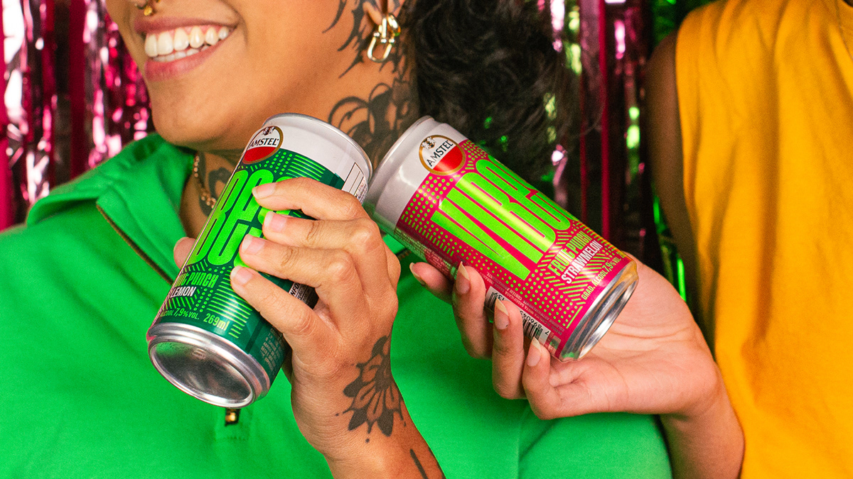
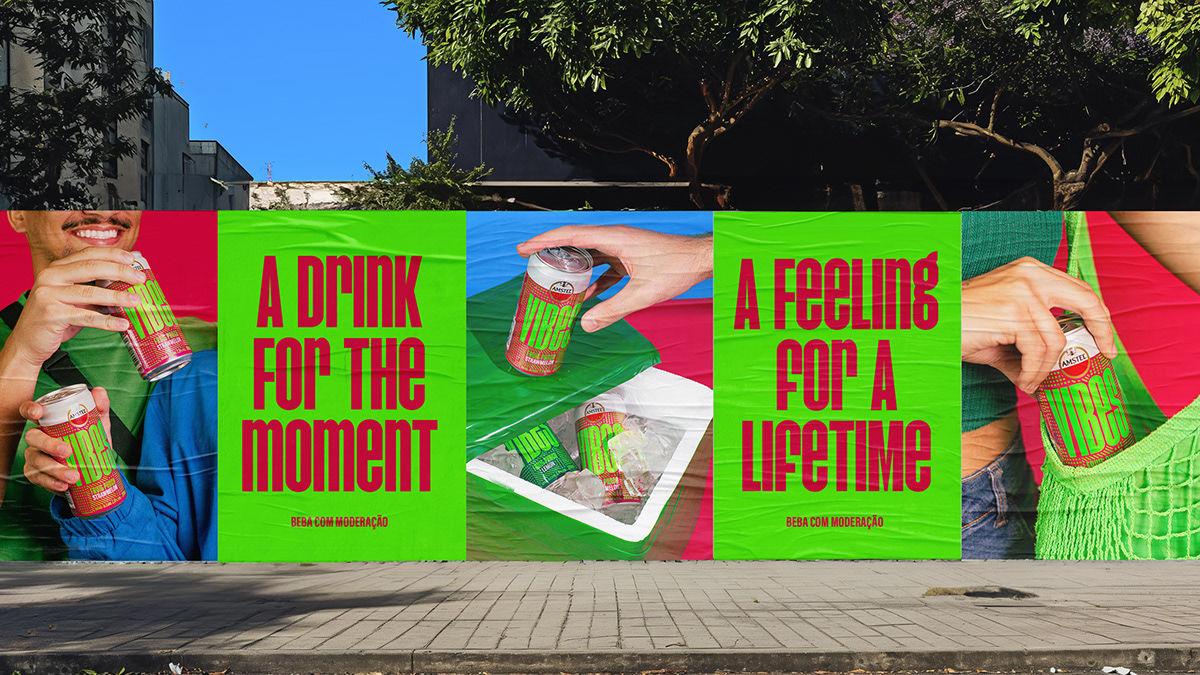
To achieve this, the strategy involved understanding and connecting with Brazilian Gen-Z, Amstel Vibes’ main target audience. This generation values authenticity and community experiences that align with their individual values. Despite their immersion in the digital world, they seek physical and sensory experiences amidst the high exposure to information.

The focus was on transcending traditional associations with the Brazilian RTD (Ready-to-Drink) market, which typically revolves around summertime parties and urban clubs. Instead, the aim was to capture the essence of their feelings and state of mind, exploring sensory experiences and blending rational and emotional appeals.

The concept ‘Fizzy Feels’ encapsulates the moment of peak pleasure when drinking Amstel Vibes. This concept seeks to bring a sensory depth to the brand, reflecting the audience’s inclination towards sensory experiences, emotions, and authenticity.

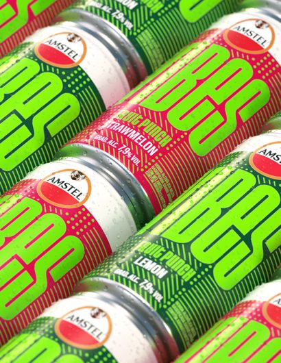
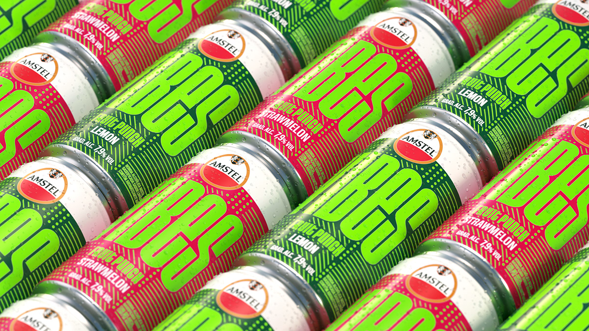
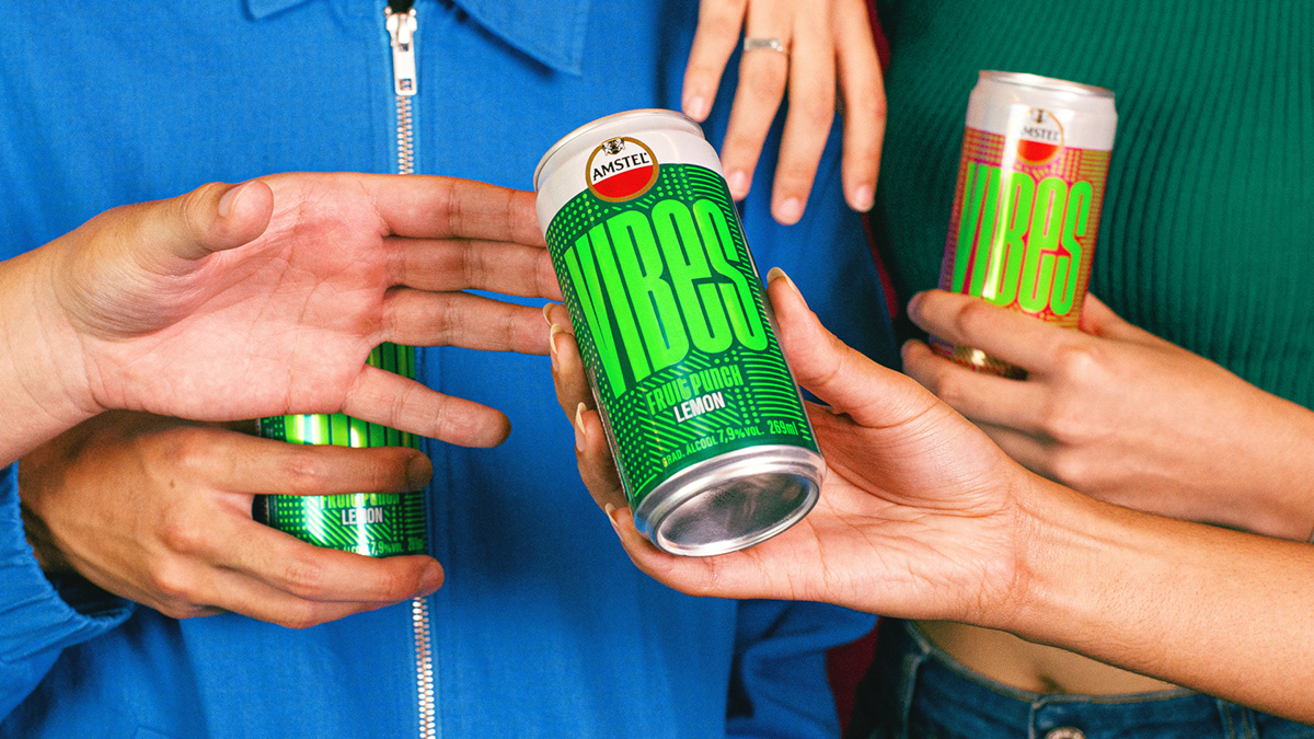
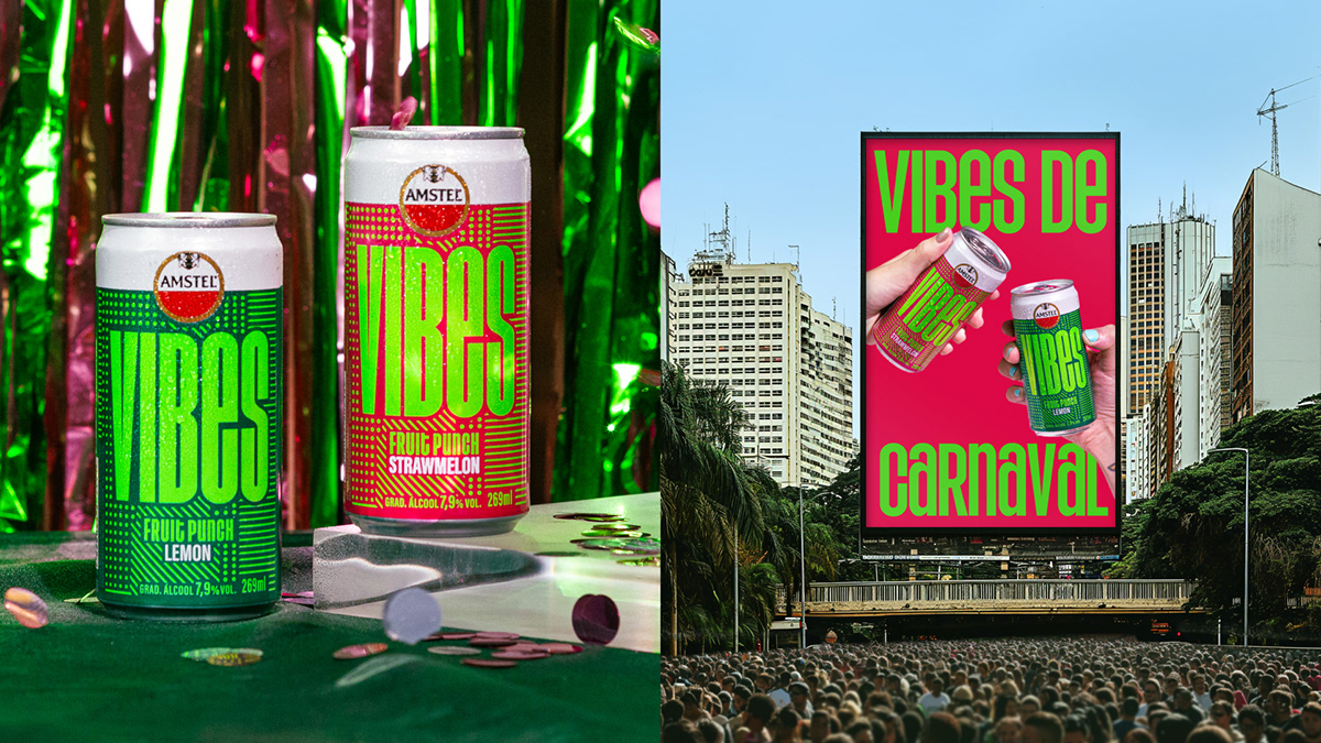
To visually express this concept, FutureBrand São Paulo designed a mix of vibrant colors inspired by Vibes’ fruit flavors. The colors on the packaging cause unexpected reactions to the eyes, embracing the sensory fizzy feel and the dynamism of this generation’s way of life. Amstel Vibes features vibrant colors during the day and glow-in-the-dark printing at night, creating a visual and sensory experience.

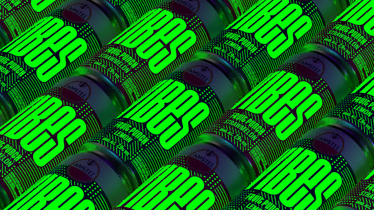
The bold and spontaneous typography reflects the young audience’s behavior and willingness to be different. The crafted texture, composed of a mix of dots and lines, evokes a mix of emotions that are hard to define but are felt.


FutureBrand Sao Paulo Creates Vibrant 'Gen Z' Packaging Design for Amstel Vibes

FutureBrand Sao Paulo Creates Vibrant 'Gen Z' Packaging Design for Amstel Vibes

FutureBrand Sao Paulo Creates Vibrant 'Gen Z' Packaging Design for Amstel Vibes

FutureBrand Sao Paulo Creates Vibrant 'Gen Z' Packaging Design for Amstel Vibes

FutureBrand Sao Paulo Creates Vibrant 'Gen Z' Packaging Design for Amstel Vibes

FutureBrand Sao Paulo Creates Vibrant 'Gen Z' Packaging Design for Amstel Vibes


2

Get the latest packaging design inspiration in your inbox:

Popular designs

The Port Vodka Lemon Water

Overview: In response to my client’s vision for a Cape Cod themed beverage brand, I embarked on the journey to create The Port

Over the wave

This Kombucha originates in Lombok, Indonesia, where its paradise beaches attract hundreds of surfers eager to ride the waves. When you surf,

Designed by: PepsiCo Design & Innovation
Country: United States

FutureBrand Sao Paulo Creates Vibrant ‘Gen Z’ Packaging Design for Amstel Vibes

2
Revitalizing Amstel's Image with Vibrant RTD Packaging for Brazilian Gen-Z

Amstel Vibes was created to redefine Amstel’s image in Brazil and stands out within the Heineken group’s product portfolio, which is heavily centered on beers. Designed by FutureBrand São Paulo, this new Ready-To-Drink product aims to revitalize the Amstel brand by targeting a new audience with a different narrative and product context.

To achieve this, the strategy involved understanding and connecting with Brazilian Gen-Z, Amstel Vibes’ main target audience. This generation values authenticity and community experiences that align with their individual values. Despite their immersion in the digital world, they seek physical and sensory experiences amidst the high exposure to information.

The focus was on transcending traditional associations with the Brazilian RTD (Ready-to-Drink) market, which typically revolves around summertime parties and urban clubs. Instead, the aim was to capture the essence of their feelings and state of mind, exploring sensory experiences and blending rational and emotional appeals.

The concept ‘Fizzy Feels’ encapsulates the moment of peak pleasure when drinking Amstel Vibes. This concept seeks to bring a sensory depth to the brand, reflecting the audience’s inclination towards sensory experiences, emotions, and authenticity.

To visually express this concept, FutureBrand São Paulo designed a mix of vibrant colors inspired by Vibes’ fruit flavors. The colors on the packaging cause unexpected reactions to the eyes, embracing the sensory fizzy feel and the dynamism of this generation’s way of life. Amstel Vibes features vibrant colors during the day and glow-in-the-dark printing at night, creating a visual and sensory experience.

The bold and spontaneous typography reflects the young audience’s behavior and willingness to be different. The crafted texture, composed of a mix of dots and lines, evokes a mix of emotions that are hard to define but are felt.


FutureBrand Sao Paulo Creates Vibrant 'Gen Z' Packaging Design for Amstel Vibes

FutureBrand Sao Paulo Creates Vibrant 'Gen Z' Packaging Design for Amstel Vibes

FutureBrand Sao Paulo Creates Vibrant 'Gen Z' Packaging Design for Amstel Vibes

FutureBrand Sao Paulo Creates Vibrant 'Gen Z' Packaging Design for Amstel Vibes

FutureBrand Sao Paulo Creates Vibrant 'Gen Z' Packaging Design for Amstel Vibes

FutureBrand Sao Paulo Creates Vibrant 'Gen Z' Packaging Design for Amstel Vibes


2

Explore more great package design

Get the latest on packaging design in your inbox: