Designed by: PepsiCo Design & Innovation
Country: United States

Gaea Fruit Bars

ovely-package-gaea-fruit-bar-1

Designed by mousegraphics | Country: Greece

“The riefing (in brief): We would like to renew packaging for our fruit bars in order to claim a better position in the market.

The target consumer: Modern consumers in the international market. Mostly young to adults, busy and health conscious people.

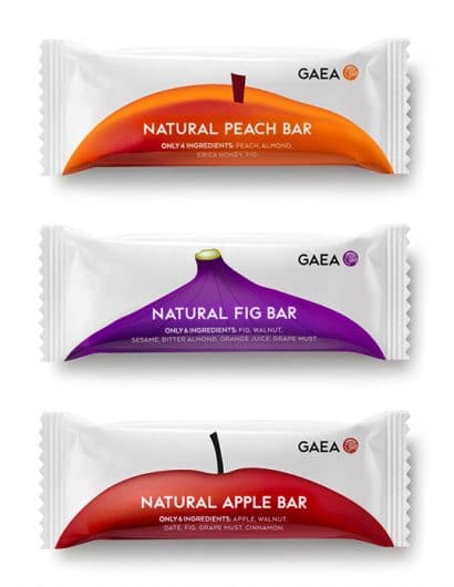
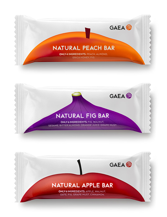
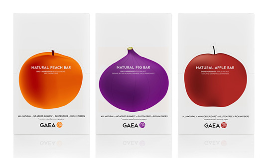
The design: We studied the relevant market carefully and discovered that fruit bar packaging is dominated by the same aesthetic: small surfaces busy with information, colors and naturalistic details to the end that the product look misses the point of the very simplicity and practicality that lies in the product’s making. Our client, Gaea, has a reputation for natural practices and the use of pure ingredients. We decided to place all focus on relating this fact to the consumers in a strikingly minimal way. For both the individual and multiple bar packages we cleared the front and laid a crispy white surface. Each fruit taste (peach, fig, apple) is conveyed by a domineering close up of the fruit (on the bar) and its full shape (on the box). The fruit image has a distinctly sharp character and the effect of a 3D experience.”
ovely-package-gaea-fruit-bar-2

Get the latest packaging design inspiration in your inbox:

Popular designs

The Bra Guru

Most women are wearing the wrong size bra and that is a fact. The Bra Guru® is the first and only professional

Burma Love Rebrand

Love at First BiteAs an extension of the Burma Superstar restaurant in San Francisco, Burma Love Foods gives diners an opportunity to

Far Out Bar

Description: Far Out Bar is a cutting-edge packaging design project created for High Life Farms’ macrodose THC chocolate bars. This project involved

Pure Persian Honey

When we look closely at honey packaging, they are almost all in the usual format, and the ultimate in creativity is that

Designed by: PepsiCo Design & Innovation
Country: United States

Gaea Fruit Bars

ovely-package-gaea-fruit-bar-1

ovely-package-gaea-fruit-bar-1

Designed by mousegraphics | Country: Greece

“The riefing (in brief): We would like to renew packaging for our fruit bars in order to claim a better position in the market.

The target consumer: Modern consumers in the international market. Mostly young to adults, busy and health conscious people.

The design: We studied the relevant market carefully and discovered that fruit bar packaging is dominated by the same aesthetic: small surfaces busy with information, colors and naturalistic details to the end that the product look misses the point of the very simplicity and practicality that lies in the product’s making. Our client, Gaea, has a reputation for natural practices and the use of pure ingredients. We decided to place all focus on relating this fact to the consumers in a strikingly minimal way. For both the individual and multiple bar packages we cleared the front and laid a crispy white surface. Each fruit taste (peach, fig, apple) is conveyed by a domineering close up of the fruit (on the bar) and its full shape (on the box). The fruit image has a distinctly sharp character and the effect of a 3D experience.”

ovely-package-gaea-fruit-bar-2

Previous slide
Next slide

Explore more great package design

Get the latest on packaging design in your inbox: