Designed by: PepsiCo Design & Innovation
Country: United States

Garbage Pail Beats

garbage1

Designed by ThinConsolation | Country: Belgium

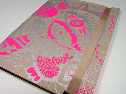
Garbage Pail Beats is an instrumental Hip-Hop, Off-beat to be precise, album. If you read the Cupp Cave bio or listen to his music, here it what you should think about: His Garbage Pail Beats are a rump-shaking, head-nodding, feet-shuffling slap in the face, one for the crate-diggers and glitch-lovers. Think nice crunchy gravel. Think big, red, 8-bit family sedan. Think wearing sunglasses sitting in the passenger seat with the window open. Think sunshine. Thump, thump, clap; Cupp Cave is guaranteed Hennessy-free.

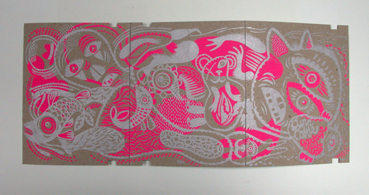
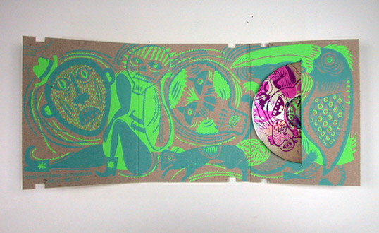
We wanted to make a sleeve with the same feeling.  We asked Oreli for the artwork. She has a psychedelic universe, full of toys and happy monsters… as just as the Cupp Cave’s mind!

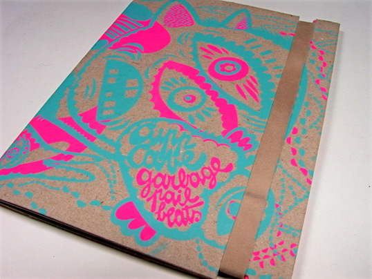
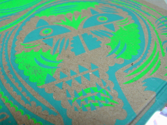
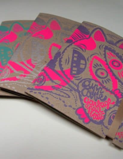
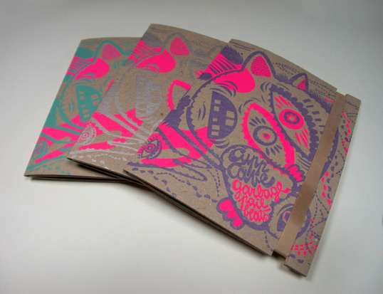
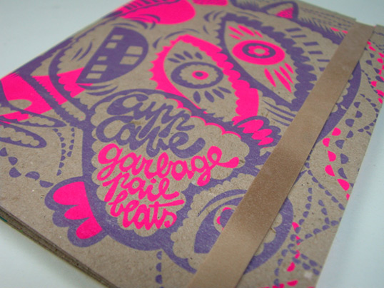
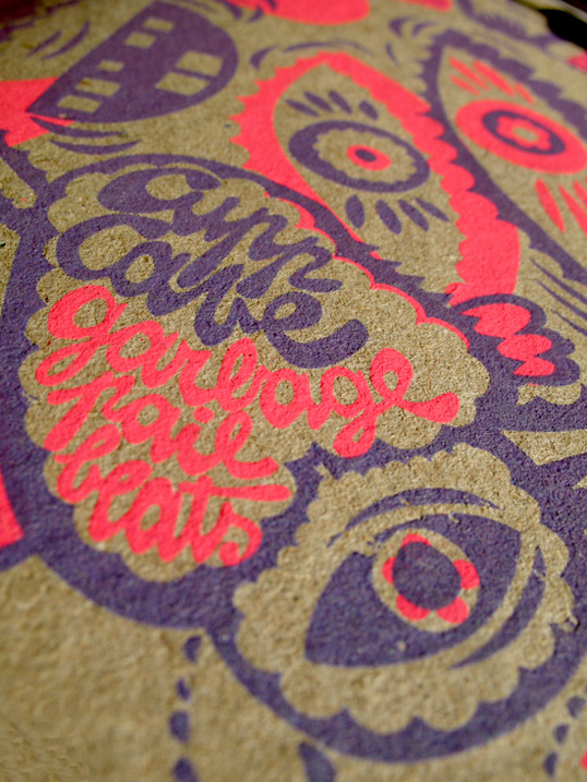
The color choice was really difficult. First, Oreli designed it in Gold + Black. We were not so convinced and started to think about it.  Finally, fluorescent pink and green where picked for the “backgound” colors and we decided to print it with 3 different foreground colors: Silver, Purple and Cyan. Think video games, 80’s, Miami. PAN!

The music can be a bit difficult. If you are tired, forget it… try later! We wanted something similar with the colors. Through the monitor, it’s a bit different, but we where looking for something HU! The silver + fluoro pink and cyan + fluoro pink are… you can’t miss it. And if you’ve got an headache, it’s not gonna help!

After some mistakes for the hand made screen print and approximately 3000 passages, we’ve finally got it.

We didn’t have too much money, so we wanted something cheap but cool for the case. As for the Back & Forth, we used cardboard. A simple grey one 450/m². It’s cheap, you can print it and fold it.

500 sleeves are hand screenprinted and crafted.
garbage2

garbage3

garbage4

garbage5

garbage6

garbage7

garbage8

Get the latest packaging design inspiration in your inbox:

Popular designs

Dama Blanca: Packaging Design for Salt of Cádiz

Discover the artisanal salt packaging design for Dama Blanca, a family project from Salinas of Cádiz. The design reflects the brand’s 3000-year history, authenticity and love for the sea, using natural materials and a sea-inspired palette.

Luxurious Packaging Design for Saudi Chocolatier Fahda by TOLD

Discover how TOLD transformed the packaging of Saudi chocolate brand Fahda, creating an opulent unboxing experience with liquid gold lettering, cheetah iconography, and intricately embossed jungle landscapes. A luxury experience even before tasting the chocolate.

Motivational Sock Packaging: A Good Start to Your Day

Discover ‘Good Start’, a new sock brand designed to motivate. Each pack contains seven pairs of socks, each adorned with motivational quotes from famous personalities, intended to inspire a positive start to the day.

Designed by: PepsiCo Design & Innovation
Country: United States

Garbage Pail Beats

garbage1

garbage1

Designed by ThinConsolation | Country: Belgium

Garbage Pail Beats is an instrumental Hip-Hop, Off-beat to be precise, album. If you read the Cupp Cave bio or listen to his music, here it what you should think about: His Garbage Pail Beats are a rump-shaking, head-nodding, feet-shuffling slap in the face, one for the crate-diggers and glitch-lovers. Think nice crunchy gravel. Think big, red, 8-bit family sedan. Think wearing sunglasses sitting in the passenger seat with the window open. Think sunshine. Thump, thump, clap; Cupp Cave is guaranteed Hennessy-free.

We wanted to make a sleeve with the same feeling.  We asked Oreli for the artwork. She has a psychedelic universe, full of toys and happy monsters… as just as the Cupp Cave’s mind!

The color choice was really difficult. First, Oreli designed it in Gold + Black. We were not so convinced and started to think about it.  Finally, fluorescent pink and green where picked for the “backgound” colors and we decided to print it with 3 different foreground colors: Silver, Purple and Cyan. Think video games, 80’s, Miami. PAN!

The music can be a bit difficult. If you are tired, forget it… try later! We wanted something similar with the colors. Through the monitor, it’s a bit different, but we where looking for something HU! The silver + fluoro pink and cyan + fluoro pink are… you can’t miss it. And if you’ve got an headache, it’s not gonna help!

After some mistakes for the hand made screen print and approximately 3000 passages, we’ve finally got it.

We didn’t have too much money, so we wanted something cheap but cool for the case. As for the Back & Forth, we used cardboard. A simple grey one 450/m². It’s cheap, you can print it and fold it.

500 sleeves are hand screenprinted and crafted.
garbage2

garbage3

garbage4

garbage5

garbage6

garbage7

garbage8

Previous slide
Next slide
Get the latest on packaging design in your inbox: