Designed by: PepsiCo Design & Innovation
Country: United States

G&B Wine

G&B Wine

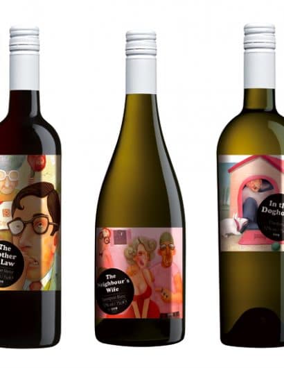
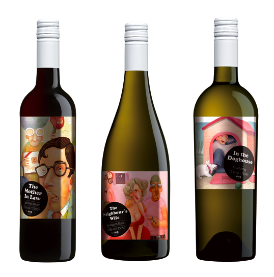
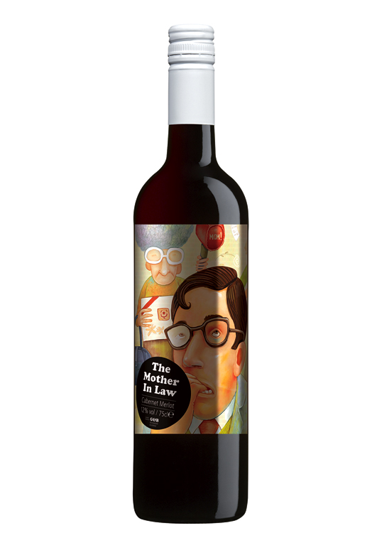
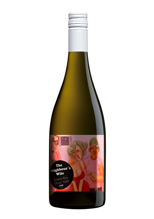
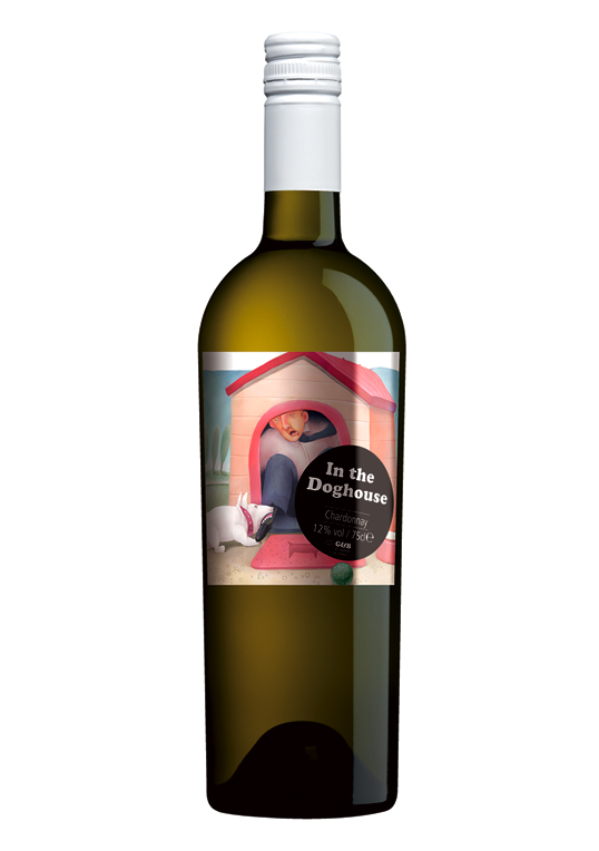
Designed by Narrow House | Country: Spain | Font used: Cooper Black

“The G&B restaurant and lounge is the best restaurant on the east coast (United Kingdom). These wine bottles actually began life as an interior design project. The owners of the restaurant approached us to see if we could do something to spice up the decoration of their restaurant thinking that we would create some murals or wall hangings.

In Narrow House we try very hard to surprise our clients so we decided that instead of the doing the usual we would decorate their restaurant with hundreds of wine bottles. For this project we designed 25 different illustrative wine labels.

The client thought it was great and the idea went ahead. Very soon their customers began asking to sample the wine so the owners decided that they would use the labels for their house wine. The labels change occasionally and we produce new labels for special occasions (Christmas, Easter, the world cup etc…)”
G&B Wine

G&B Wine

G&B Wine

Get the latest packaging design inspiration in your inbox:

Popular designs

The Port Vodka Lemon Water

Overview: In response to my client’s vision for a Cape Cod themed beverage brand, I embarked on the journey to create The Port

Burma Love Rebrand

Love at First BiteAs an extension of the Burma Superstar restaurant in San Francisco, Burma Love Foods gives diners an opportunity to

Far Out Bar

Description: Far Out Bar is a cutting-edge packaging design project created for High Life Farms’ macrodose THC chocolate bars. This project involved

Designed by: PepsiCo Design & Innovation
Country: United States

G&B Wine

gb1

G&B Wine

Designed by Narrow House | Country: Spain | Font used: Cooper Black

“The G&B restaurant and lounge is the best restaurant on the east coast (United Kingdom). These wine bottles actually began life as an interior design project. The owners of the restaurant approached us to see if we could do something to spice up the decoration of their restaurant thinking that we would create some murals or wall hangings.

In Narrow House we try very hard to surprise our clients so we decided that instead of the doing the usual we would decorate their restaurant with hundreds of wine bottles. For this project we designed 25 different illustrative wine labels.

The client thought it was great and the idea went ahead. Very soon their customers began asking to sample the wine so the owners decided that they would use the labels for their house wine. The labels change occasionally and we produce new labels for special occasions (Christmas, Easter, the world cup etc…)”
G&B Wine

G&B Wine

G&B Wine

Previous slide
Next slide

Explore more great package design

Get the latest on packaging design in your inbox: