Designed by: PepsiCo Design & Innovation
Country: United States

GLORIOUS!

GLORIOUS!

Designed by ILoveDust | Country: United Kingdom

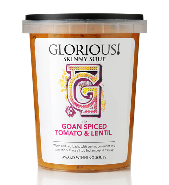
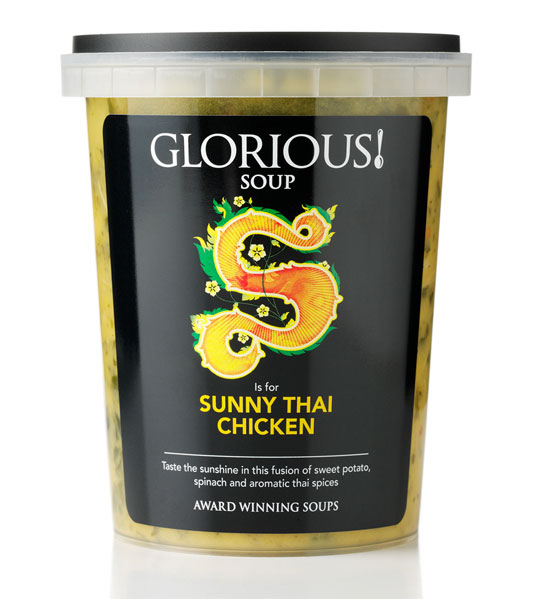
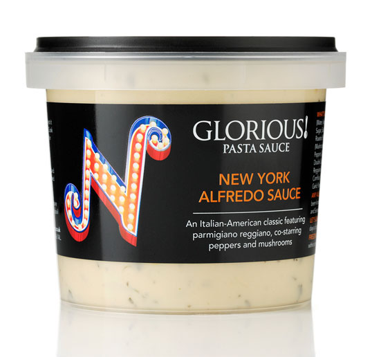
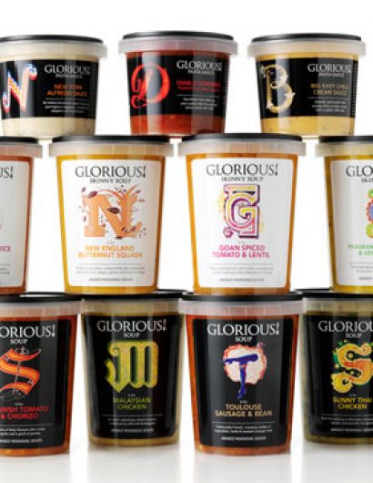
“Since its launch, TSC Food’s premium range of chilled soup and pasta sauces has consistently grown in terms of distribution and sales. Major retailers, consumers and the competition were all starting to take notice. TSC Foods wanted to further strengthen the GLORIOUS! range and shake-up the soup and sauce category.

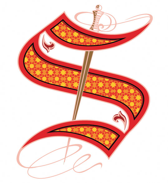
Branding agency Lambie-Nairn uncovered what consumers love about GLORIOUS! – their adventurous and original products, using quality ingredients and flavours from around the globe. Thus, the bold ‘A to Z of Global Flavours’ was born. Partnering with ilovedust an iconic illustration style was created for each letter of the alphabet, representing the authentic global influences and flavours of each product. For example, within the soup range, T is for ‘Toulouse Sausage and Bean’ and M stands for ‘Malaysian Chicken’.

It’s clear that GLORIOUS! has a wonderful and unique range of products that tastes great. We wanted to express this through the branding without being gimmicky. The new pack design ensures the product remains the hero, whilst its fresh simplicity stands out on the shelf. It is also easily expandable as the range grows.”

GLORIOUS!

GLORIOUS!

GLORIOUS!

GLORIOUS!

GLORIOUS!

GLORIOUS!

Get the latest packaging design inspiration in your inbox:

Popular designs

Over the wave

This Kombucha originates in Lombok, Indonesia, where its paradise beaches attract hundreds of surfers eager to ride the waves. When you surf,

The Port Vodka Lemon Water

Overview: In response to my client’s vision for a Cape Cod themed beverage brand, I embarked on the journey to create The Port

Designed by: PepsiCo Design & Innovation
Country: United States

GLORIOUS!

glorious1

GLORIOUS!

Designed by ILoveDust | Country: United Kingdom

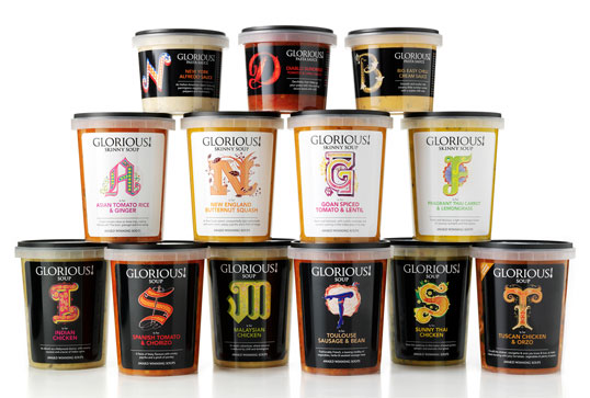
“Since its launch, TSC Food’s premium range of chilled soup and pasta sauces has consistently grown in terms of distribution and sales. Major retailers, consumers and the competition were all starting to take notice. TSC Foods wanted to further strengthen the GLORIOUS! range and shake-up the soup and sauce category.

Branding agency Lambie-Nairn uncovered what consumers love about GLORIOUS! – their adventurous and original products, using quality ingredients and flavours from around the globe. Thus, the bold ‘A to Z of Global Flavours’ was born. Partnering with ilovedust an iconic illustration style was created for each letter of the alphabet, representing the authentic global influences and flavours of each product. For example, within the soup range, T is for ‘Toulouse Sausage and Bean’ and M stands for ‘Malaysian Chicken’.

It’s clear that GLORIOUS! has a wonderful and unique range of products that tastes great. We wanted to express this through the branding without being gimmicky. The new pack design ensures the product remains the hero, whilst its fresh simplicity stands out on the shelf. It is also easily expandable as the range grows.”
GLORIOUS!

GLORIOUS!

GLORIOUS!

GLORIOUS!

GLORIOUS!

GLORIOUS!

Previous slide
Next slide

Explore more great package design

Get the latest on packaging design in your inbox: