Designed by: PepsiCo Design & Innovation
Country: United States

GoldenWing Barley Milk Packaging Design

Designed by: Watermark Design | Country: US

GoldenWing by Molson Coors is a plant-based milk alternative. The brand uses only high-quality barley from the Coors program to create the refreshing drink. Not only is the product one of the best alternatives to milk, but it is a drink aimed at maintaining a sustainable future.

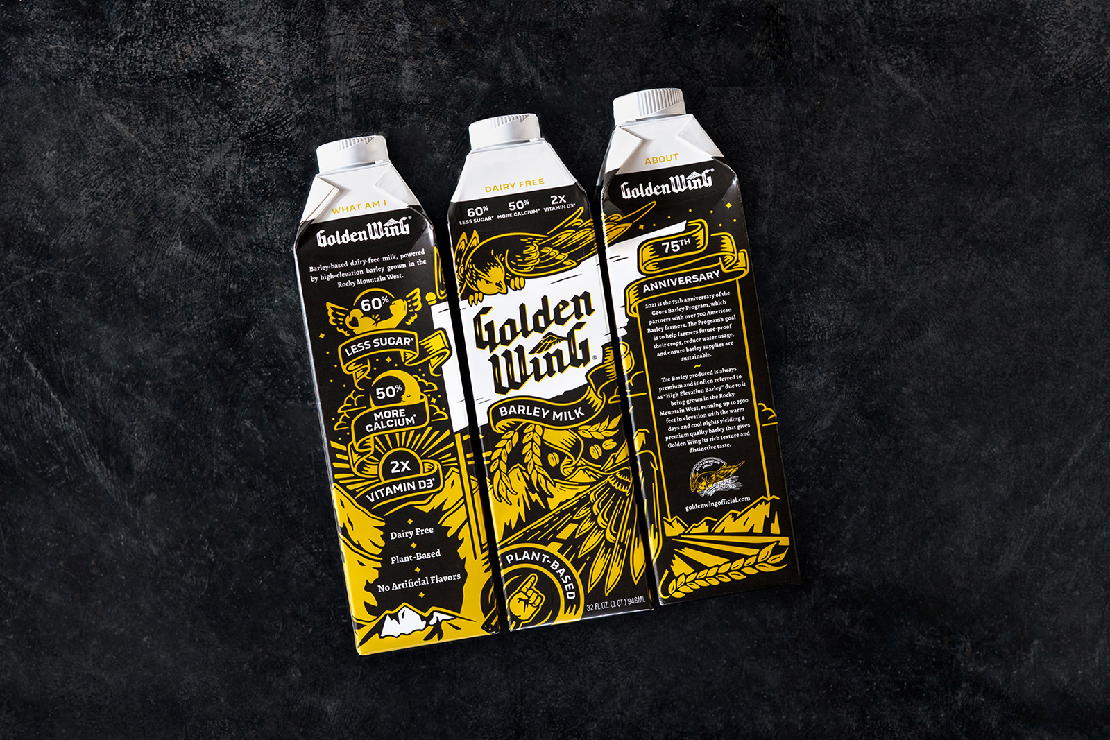
Designed with L.A. Libations for Molson Coors, GoldenWing uses the highest quality barley from the Coors barley program to create a plant-based alternative milk. Not boring, basic, or bland, this brand aims to bring you a bad ass dairy alternative that is focused on quality, nutritional value and sustainability. The creation of this product coincided with the 75th anniversary of the Coors Barley Program, which partners with over 700 farmers with the goal of reducing water usage, future-proofing crops and ensuring barley supplies are sustainable. Beyond the branding, the badass part is bringing 60% less sugar, 50% more calcium, and 2x’s the Vit. D3 2% milk. L.A. Libations approached Watermark with the concept ‘the rock ‘n roll of milk,’ and is a nod to the original Coors Malted Milk that started during Prohibition.

GoldenWing Barley Milk Packaging Design

The packaging

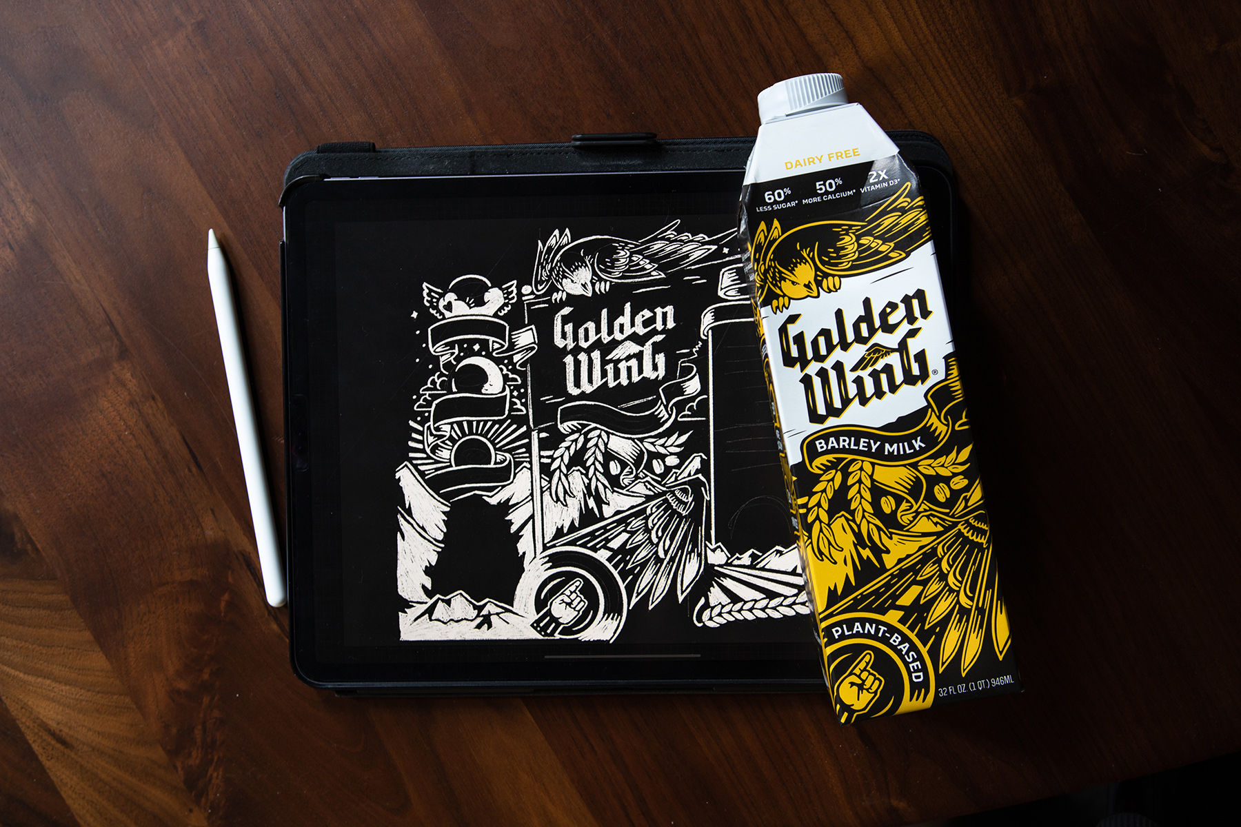
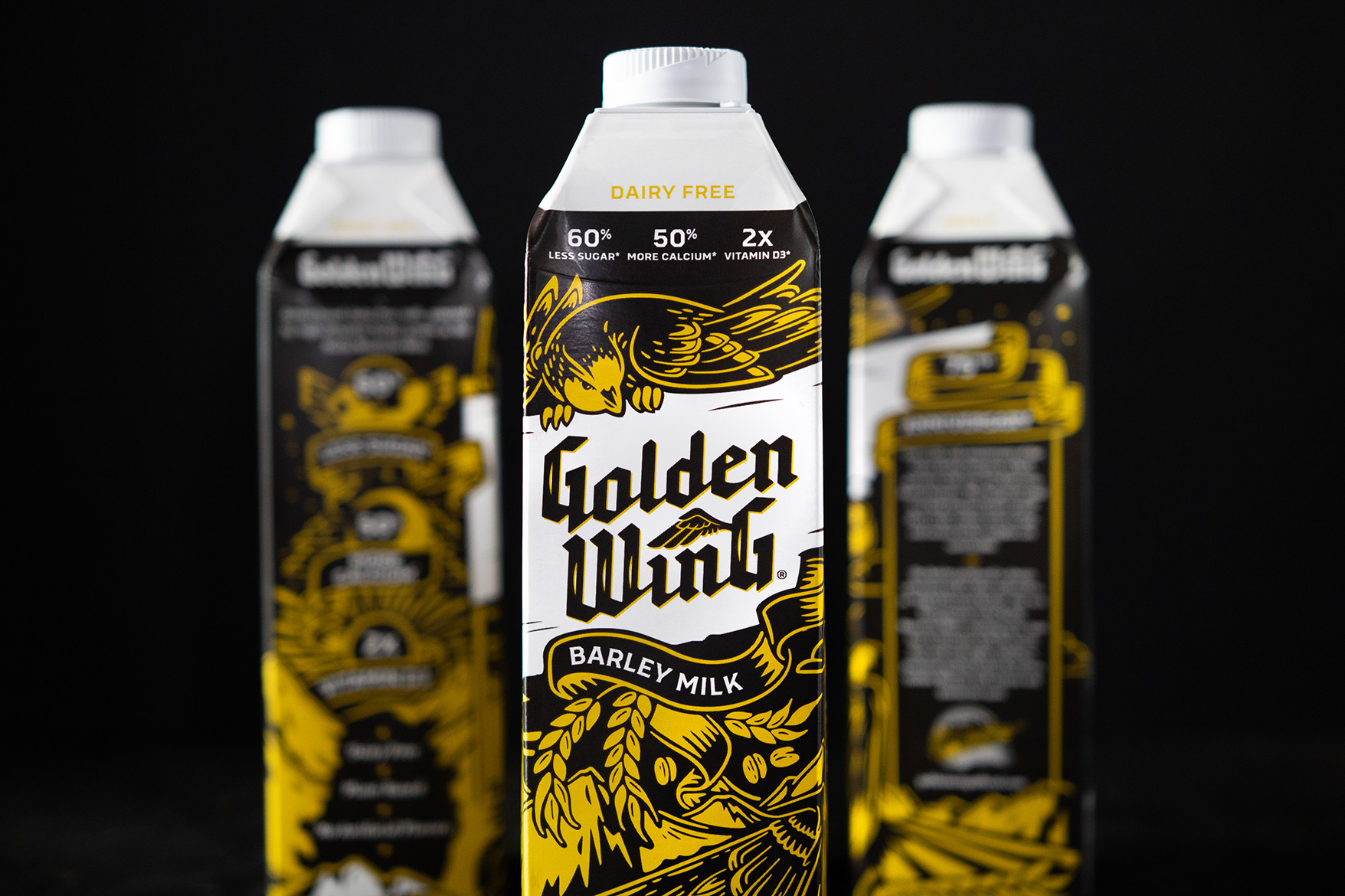
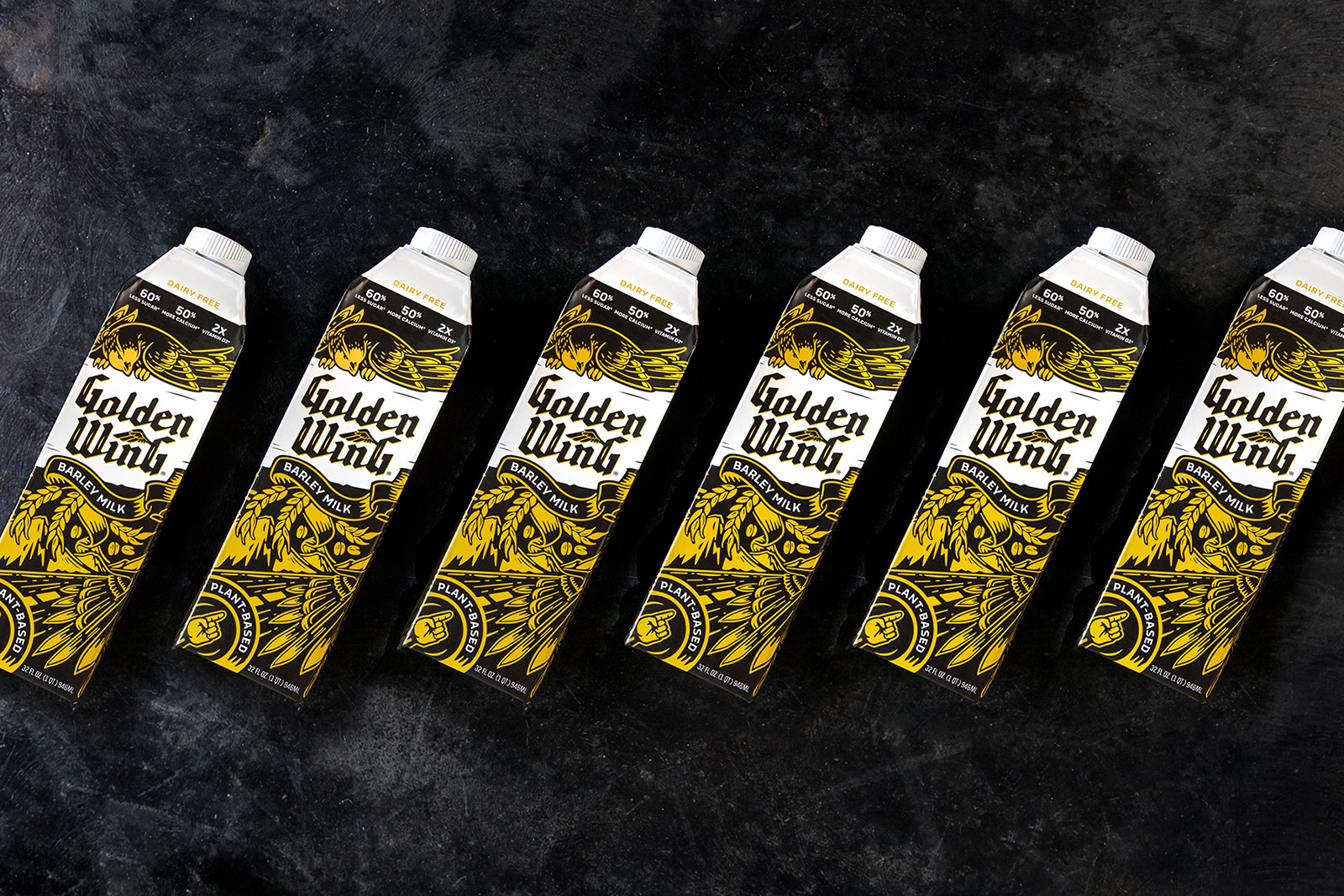
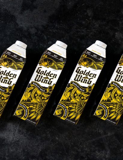
GoldenWing partnered with Watermark Design, a Charlottesville-based branding agency, to create the packaging design for the brand that would highlight rock n roll culture. Tattoo-inspired graphics and traditional motifs brace the packaging label, making the products look unique and attractive.

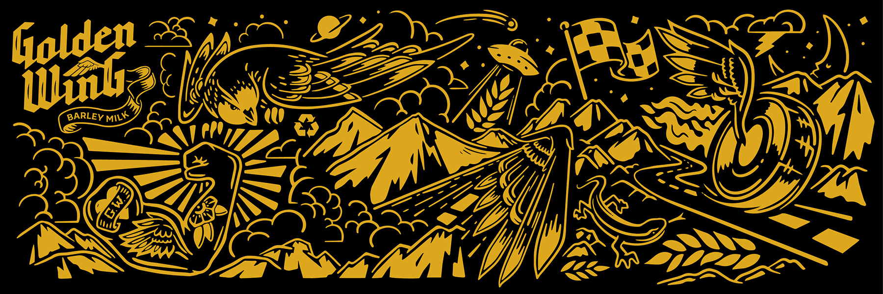
“The logo design displays hints of blackletter inspired by tattoo and motorcycle culture, with the wing graphic nodding to the brand name. The packaging features a custom illustrated story-like landscape that encompasses the entire package and highlights the most important call outs with vintage tattoo-inspired graphic containers geared toward the rock n’ roll brief. Traditional motifs throughout include the swallow watching over and banner/ribbon illustrations to hold the copy. The scene runs from the open road out west to the Rocky Mountains where Coors barley is grown. In a sea of light and bright milk alternatives, this dark and edgy design takes center-stage.

Get the latest packaging design inspiration in your inbox:

Popular designs

Designed by: PepsiCo Design & Innovation
Country: United States

GoldenWing Barley Milk Packaging Design

Golden Wing 5

Designed by: Watermark Design | Country: US

GoldenWing by Molson Coors is a plant-based milk alternative. The brand uses only high-quality barley from the Coors program to create the refreshing drink. Not only is the product one of the best alternatives to milk, but it is a drink aimed at maintaining a sustainable future.

Designed with L.A. Libations for Molson Coors, GoldenWing uses the highest quality barley from the Coors barley program to create a plant-based alternative milk. Not boring, basic, or bland, this brand aims to bring you a bad ass dairy alternative that is focused on quality, nutritional value and sustainability. The creation of this product coincided with the 75th anniversary of the Coors Barley Program, which partners with over 700 farmers with the goal of reducing water usage, future-proofing crops and ensuring barley supplies are sustainable. Beyond the branding, the badass part is bringing 60% less sugar, 50% more calcium, and 2x’s the Vit. D3 2% milk. L.A. Libations approached Watermark with the concept ‘the rock ‘n roll of milk,’ and is a nod to the original Coors Malted Milk that started during Prohibition.

GoldenWing Barley Milk Packaging Design

The packaging

GoldenWing partnered with Watermark Design, a Charlottesville-based branding agency, to create the packaging design for the brand that would highlight rock n roll culture. Tattoo-inspired graphics and traditional motifs brace the packaging label, making the products look unique and attractive.

“The logo design displays hints of blackletter inspired by tattoo and motorcycle culture, with the wing graphic nodding to the brand name. The packaging features a custom illustrated story-like landscape that encompasses the entire package and highlights the most important call outs with vintage tattoo-inspired graphic containers geared toward the rock n’ roll brief. Traditional motifs throughout include the swallow watching over and banner/ribbon illustrations to hold the copy. The scene runs from the open road out west to the Rocky Mountains where Coors barley is grown. In a sea of light and bright milk alternatives, this dark and edgy design takes center-stage.

Explore more great package design

Get the latest on packaging design in your inbox: