


Designed by: Mamba Studio | Country: Mexico
The mysteries that surround the Mayan culture are numerous. From the Temple of Kukulcán to the riddle-filled calendar, the mysteries of the Mayan civilization cannot be solved by an individual alone. However, the pre-Hispanic origin of peanuts is something that can satisfy a curious mind of an investigator trying to decipher the deep mysteries of the ancient civilization.
The design studio mentions:
“…We literally refer to the roots where peanuts grow and the pre-Hispanic origin of peanuts as a superfood and how we bring those concepts to a contemporary market.”
In addition to designing the packaging, Mamba Studio, a Mexico-based design agency, conceptualized the brand name. Good Moots is a combination of two words from English and Mayan origins. Good in English means, well, good, unless you want it to mean something else, and Moots stands for origins or roots.


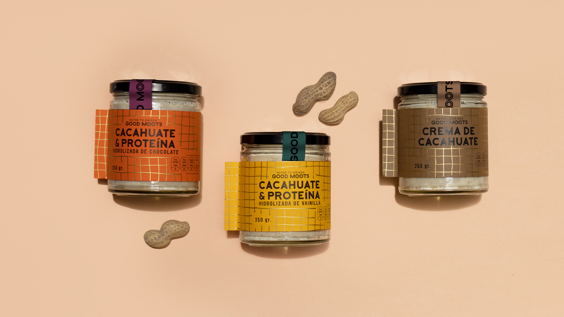
The design concept is based on the outer shell that protects the peanuts. The bright colors, along with a gold-tone, add to the overall energetic appearance of the graphic identity.
“The label is made of paper with very little glue, so that when you peel it off, you can reuse the container with any other product without a difficult-to-remove glue paste. The discretion of the pattern does not interrupt the information that can be perfectly read on the colored paper, which was important to show all the information related to the ingredients and the company.
The typography is a simple and discreet sans serif while the auxiliary graphics have gestures that remind us of Mayan inscriptions.”


