Designed by St. Bernadine Mission Communication Inc. | Country: Canada
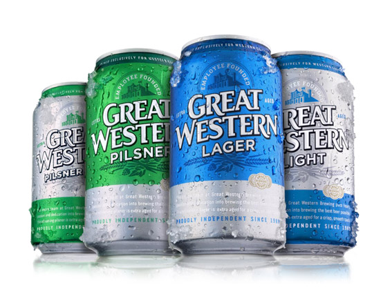
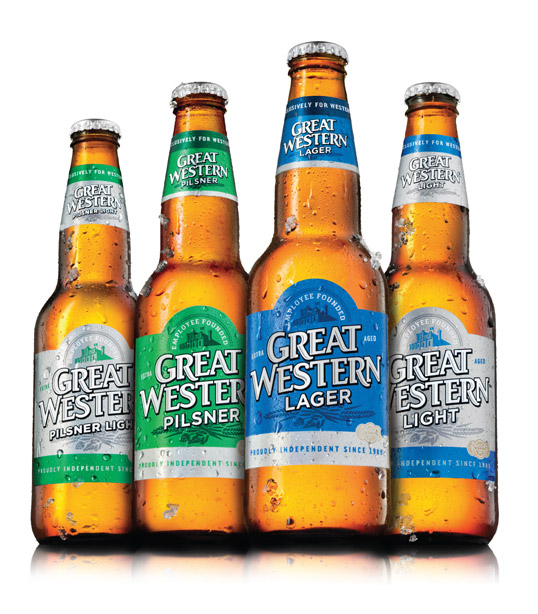
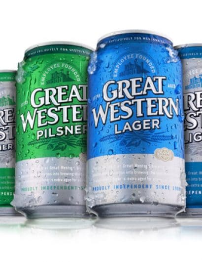
“Saskatoon, Canada’s Great Western Brewing Co’s eponymous family of beers has been a regional favourite for over 20 years. In advance of moving into new markets, Saint Bernadine Mission Communications was asked to update the brand to better reflect the mainstream flavour profile and positioning and increase shelf presence.
Key messaging included refreshment, heritage, tradition, and dedication to quality, shown by research to be important to core consumers.
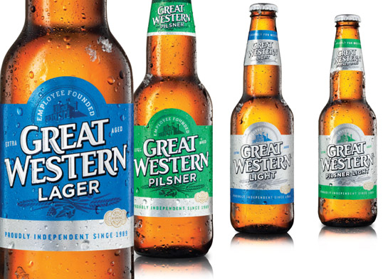
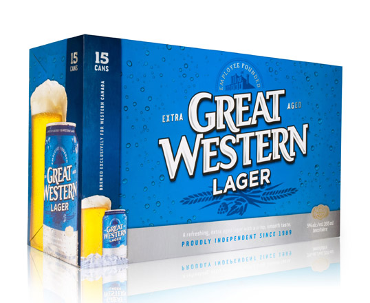
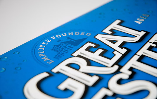
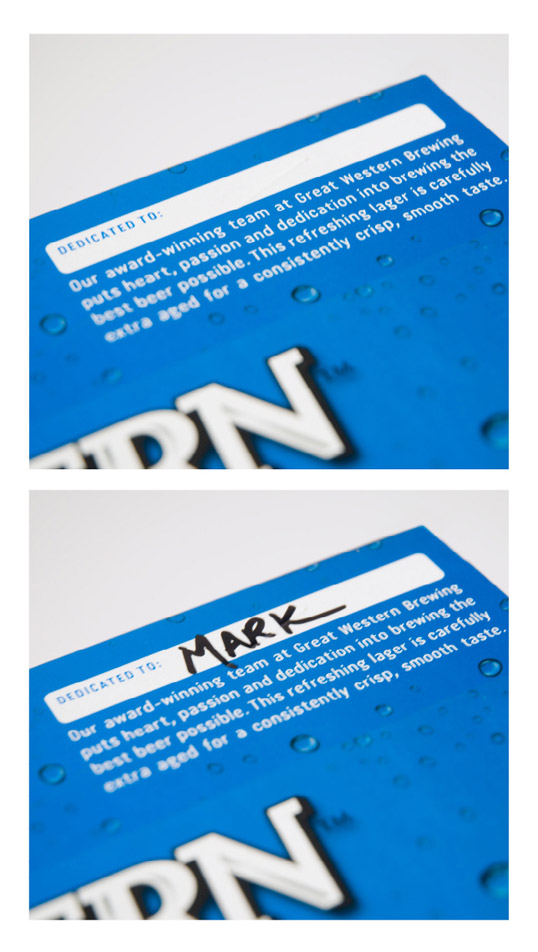
The existing logo was reworked to retain key characteristics and improve readability and shelf presence. A die cut label and award seal represent quality, the employee founded statement celebrates heritage, the brewery graphic acknowledges tradition, and the “extra aged” text highlights a true point of difference in their brewing process that results in much smoother beers. As well, a section was provided to enable someone to “dedicate” a case of beer to by way of thanks. The design system needed to accommodate four (and potentially more) flavours.
The brewery was founded in 1989 when 16 employees risked it all to buy the brewery from the previous employer who had it slated for the wrecking ball. Those genuine, authentic, determined, and committed values were highlighted more prominently in the rebrand to better represent the employee founded and proudly independent brewery. As employee owners, everyone on the team at Great Western is dedicated to making the best beer possible for Western Canadians.”

