


Designed by: Intertype Studio Ltd | Country: UK
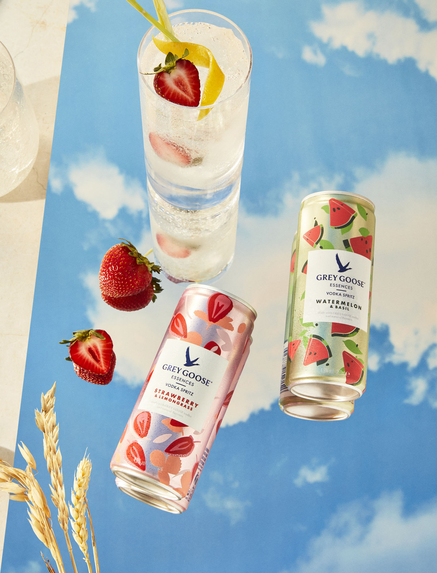
Grey Goose is launching itself in the “Ready to Drink” category for the first time. The “fruit and botanical cocktail” is making its debut just before the summer and promises to sweep the customers off their feet with its innovative flavor choices.
Three reasons make Grey Goose special and luxurious. “First, Grey Goose is created in France from 2 ingredients: Picardie winter wheat and natural spring water. Second, the Picardie wheat farms come from regions of France where some farmers have been working the land for 11 generations. Third, the creator of brand and cellar master, Francois Thibault, still oversees the vodka production today.”

Intertype Studio used satin metallic Vs matt opaque prints on the can to convey the message of quality and luxury that the brand stands for. French photographer Sidney Bensimon worked in the New York studio, while Andy Grimshaw worked in London and took some great shots of the product.
Creative Director, Asa Cook, commented:
“Grey Goose is an iconic brand with a great deal of meaning in the semiotics of the iconography. We wanted to create a design that amplifies these meanings. There is a strong emphasis on nature, which connects to the Goose icon itself – a natural context for its flight is provided by the ‘floating’ feeling of the ingredient depiction. This floating effect is provided by the illusion of a ‘label’ overlaying the background and the style of illustration. A neat detail is that when the cans are stacked, we get the impression of a continuous flow of nature in the vertical – a spontaneous moment in nature is captured. Whilst the design is very simple, a story is told about the ingredients and liquid quality and a consumption occasion is suggested. These visual plays on depth, nature and occasion are further enhanced by the photography style and art direction.”


