Designed by Frost* Design | Country: Australia
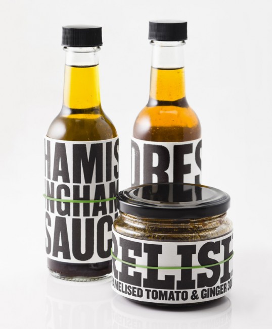
“Sydney chef Hamish Ingham came to Frost* with a challenge to relish - literally. His new range of gourmet sauces and relishes needed a distinctive packaging solution and Frost* created a scheme that is as tasty as the contents. Bold letterpress typography speaks to the honesty of the ingredients and references the décor of his flagship restaurant, Bar H, in Sydney’s hip and happening Surry Hills.
Hamish’s range of gourmet sauces and relishes include Soy, Fennel & Chilli Oil Dressing, Caramelised Tomato & Ginger Relish, Soy, Lemon & Horseradish Sauce and Olive Oil. Frost* also designed the Red and White Wine labels as part of the family.”

“As we got to know Hamish more closely, his personality inspired the design, as did as the fit out of Bar H, which features a wall of woodblock letterpress type,” said Vince Frost, founder and CEO of Frost*. “Hamish is edgy and hip and a bit rock n’ roll. Whilst making the ingredients the heroes of the show, we wanted to bring attention to Hamish as a Chef – a rising star in the Sydney dining scene. So we incorporated his name into the design, along with the ingredients, and tried to reflect the confidence of his cooking style too”.

“Frost* used a weighty, textured stock, Crane Lettra, to add further substance to the look and feel of the products. The labels are held in place with a bright green elastic band that contrasts strongly with the black and white label, adding a striking aesthetic and quirky point of difference.
As well as the packaging for this range, Frost* have been working extensively with Hamish on a host of other projects. The studio created an identity for Bar H’s annex operation, Little H, as well as the name and mark for the chef’s latest venture, a new fine dining restaurant called The Woods, to open at Four Seasons Hotel in Sydney, by the end of the year.”