Designed by PTARMAK | Country: United States
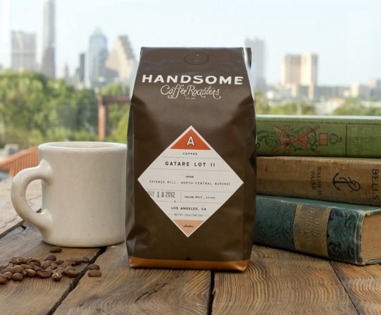
“Handsome needed a robust label system and an all purpose bag that could serve as its backdrop. ” We were briefed that Handsome intended to have two lines of coffees: Comfort and Adventure. Each line would have coffees and espressos, and each line (and its category) needed to be immediately recognizable. We employed color, shape and a little figure ground to differentiate between the lines and categories. The color system was developed loosely around a 1940’s craftsman—workshirt blue, denim, utility orange, metallic copper, crisp white, no-nonsense black and a rich black-brown… in honor of the coffee.”


“Illustrations line the sides and are what we like to call the manly-man items—objects that share the Handsome dedication to a by-gone era where handmade craft and a dedication to quality were a labor of love as well as a way of life. A dip of copper at the bottom of the bags is a continuation of the copper counters in the Handsome shop and on the Handsome Traveler. It adds just a touch of elegance to the otherwise practical bags. The system is intended to be humble and utilitarian with every detail lovingly applied.”


“Handsome is your grandpa who fixed airplane engines during WWII, shaves with a straight razor, wears seer-sucker jumpsuits, mows in a pith helmet, listens to Nat King Cole, and drinks his gin with bitter lemon. Okay, that might be pure projection, but that doesn’t mean it’s not true.
Drink Coffee. Stay Handsome.”