Designed by: PepsiCo Design & Innovation
Country: United States

Hapello Branding and Packaging Design by OurCreative

1

Designed by: OurCreative | Country: UK

After Asda split from Walmart, the company was looking to create a brand that would span across multiple categories. The company found a new opportunity to highlight its uniqueness with “a new exclusive toy brand.”

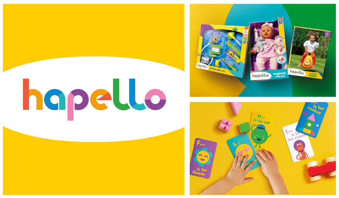
Asda’s new brand, Hapello, is a combination of two words, “happy” and “Hello.” The brand name stands for positivity, playfulness and cheerfulness. The brand focuses on different age groups and categories.

Being a complex category stretching across different ranges and different ages, we created a comprehensive set of brand guidelines to ensure the various suppliers could comfortably apply the new design to the products, providing rules for all graphical elements and detailed instructions about how to build a pack.

Hapello Branding and Packaging Design by OurCreative

The packaging

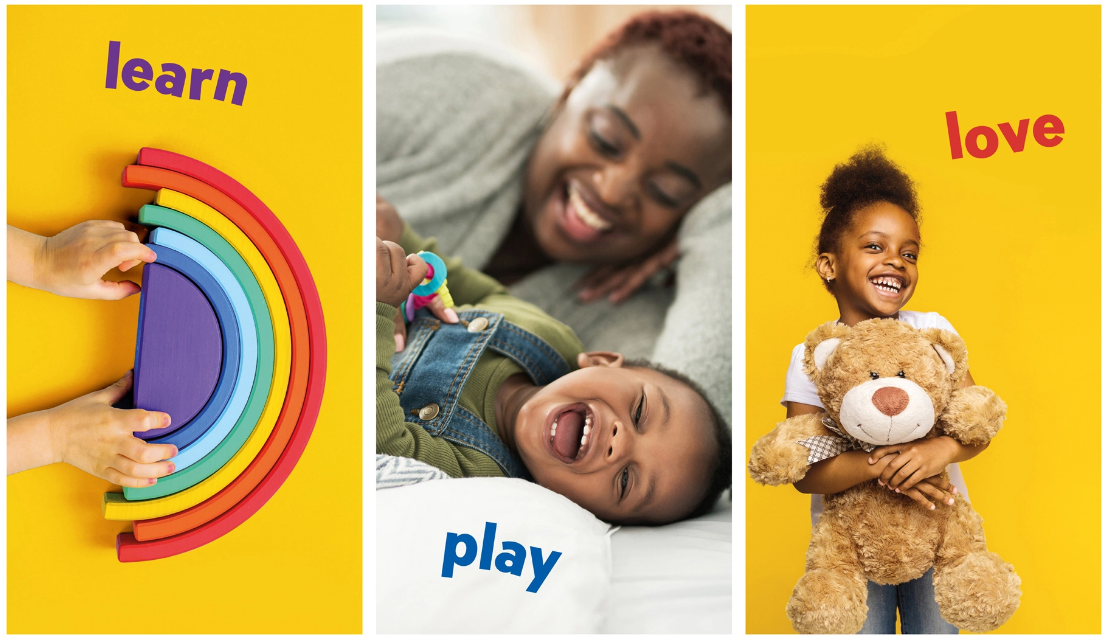
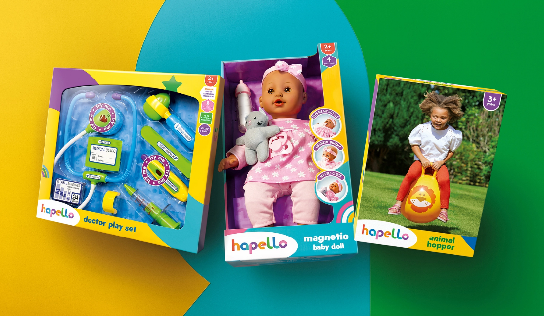
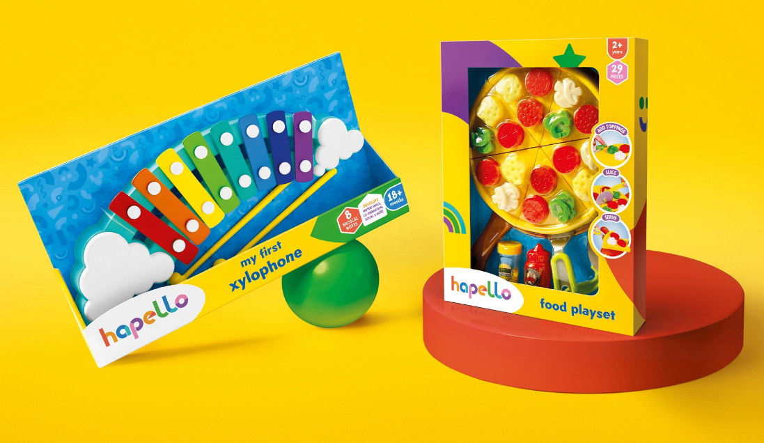
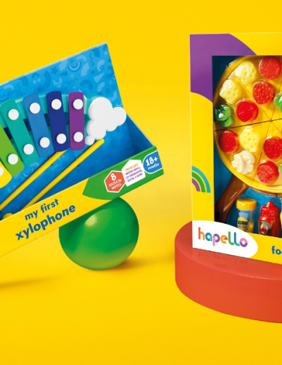
Hapello teamed up with OurCreative, a Leeds-based branding agency, to create branding and packaging that would highlight the playful aspect of the brand. The design agency used color palettes, photographs and geometric illustrations on the packaging that can easily attract customers of every age.

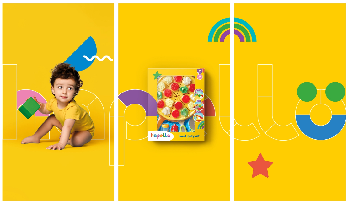
The warm primary color palette combined with the geometric ‘blocks’ of the logo create a modern playful identity. These ‘blocks’ are used to create age and range appropriate patterns, graphical elements, iconography and characters allowing for cohesive flexibility across categories.” 

1

Get the latest packaging design inspiration in your inbox:

Popular designs

Miller 64 Rebrands & Relaunches as 64 Extra Light

Miller Brewing Company introduces Miller Extra Light, a rebranded version of Miller64, targeting the growing low-alcohol beer market with a focus on balance and moderation. Anne Pando, Director of Activation for Miller brands, highlights the shift, stating, “This isn’t just a packaging refresh – it’s a new opportunity for us,” emphasizing the strategic repositioning away from calories to low ABV content.

Unique Whisky Packaging Design Celebrates 40-Year Legacy

Stckmn crafted ‘The Only Drop,’ a unique whisky packaging celebrating liquid and cask unity. Featuring handcrafted paper pulp sculptures and transparent bottle designs, the project fetched £18,750 at auction, aiding Scottish youth.

Designed by: PepsiCo Design & Innovation
Country: United States

Hapello Branding and Packaging Design by OurCreative

1
Hapello 2

Designed by: OurCreative | Country: UK

After Asda split from Walmart, the company was looking to create a brand that would span across multiple categories. The company found a new opportunity to highlight its uniqueness with “a new exclusive toy brand.”

Asda’s new brand, Hapello, is a combination of two words, “happy” and “Hello.” The brand name stands for positivity, playfulness and cheerfulness. The brand focuses on different age groups and categories.

Being a complex category stretching across different ranges and different ages, we created a comprehensive set of brand guidelines to ensure the various suppliers could comfortably apply the new design to the products, providing rules for all graphical elements and detailed instructions about how to build a pack.

Hapello Branding and Packaging Design by OurCreative

The packaging

Hapello teamed up with OurCreative, a Leeds-based branding agency, to create branding and packaging that would highlight the playful aspect of the brand. The design agency used color palettes, photographs and geometric illustrations on the packaging that can easily attract customers of every age.

The warm primary color palette combined with the geometric ‘blocks’ of the logo create a modern playful identity. These ‘blocks’ are used to create age and range appropriate patterns, graphical elements, iconography and characters allowing for cohesive flexibility across categories.” 

1
Previous slide
Next slide
Get the latest on packaging design in your inbox: