Designed by: PepsiCo Design & Innovation
Country: United States

Heckler Design

Heckler Design

Designed by RMA | Country: United States

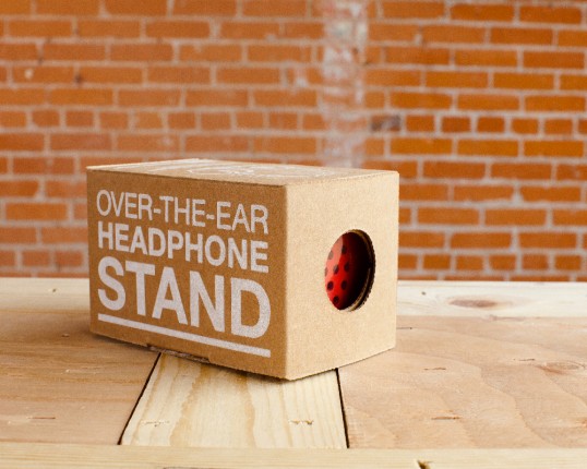
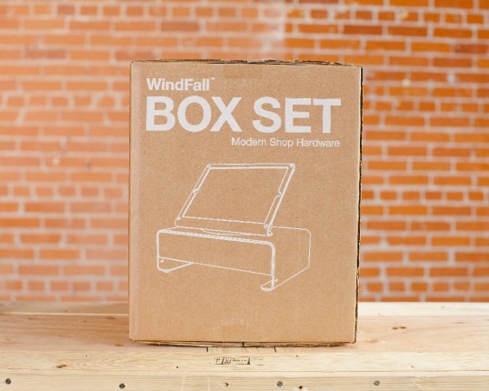
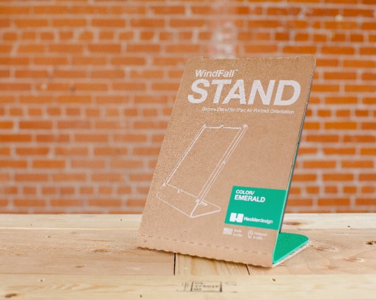
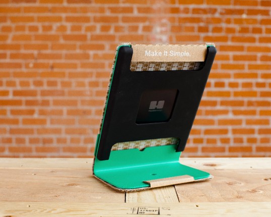
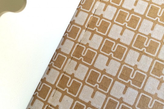
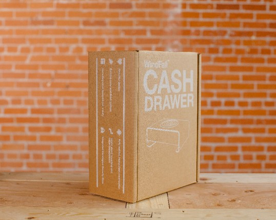
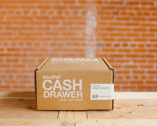
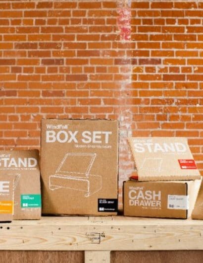
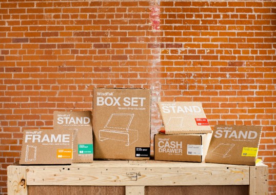
“We were tasked with updating existing direct to consumer packing for Heckler Design.Maintaining the brand ideals of using honest, simple and functional materials was of utmost concern. The design was created to be flexible enough to adapt the many variations of products, both color and supported device. We were able to do this using a clean one color design that’s not dependent on a different package for each color or device variation. We designed labels too quickly help identify the product color and also allow for quality assurance sign offs, while adding life to the overall look.”

Heckler Design

Heckler Design

Heckler Design

Heckler Design

Heckler Design

Heckler Design

Heckler Design

Heckler Design

Get the latest packaging design inspiration in your inbox:

Popular designs

Pure Persian Honey

When we look closely at honey packaging, they are almost all in the usual format, and the ultimate in creativity is that

Burma Love Rebrand

Love at First BiteAs an extension of the Burma Superstar restaurant in San Francisco, Burma Love Foods gives diners an opportunity to

Over the wave

This Kombucha originates in Lombok, Indonesia, where its paradise beaches attract hundreds of surfers eager to ride the waves. When you surf,

Far Out Bar

Description: Far Out Bar is a cutting-edge packaging design project created for High Life Farms’ macrodose THC chocolate bars. This project involved

The Bra Guru

Most women are wearing the wrong size bra and that is a fact. The Bra Guru® is the first and only professional

Designed by: PepsiCo Design & Innovation
Country: United States

Heckler Design

lovely-package-heckler-design-1

Heckler Design

Designed by RMA | Country: United States

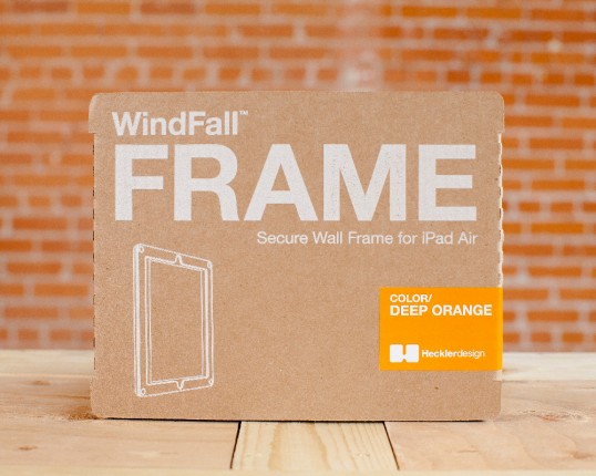
“We were tasked with updating existing direct to consumer packing for Heckler Design.Maintaining the brand ideals of using honest, simple and functional materials was of utmost concern. The design was created to be flexible enough to adapt the many variations of products, both color and supported device. We were able to do this using a clean one color design that’s not dependent on a different package for each color or device variation. We designed labels too quickly help identify the product color and also allow for quality assurance sign offs, while adding life to the overall look.”
Heckler Design

Heckler Design

Heckler Design

Heckler Design

Heckler Design

Heckler Design

Heckler Design

Heckler Design

Previous slide
Next slide

Explore more great package design

Get the latest on packaging design in your inbox: