Designed by: PepsiCo Design & Innovation
Country: United States

Help Remedies

Help Remedies

Designed by Pearlfisher | Country: United States

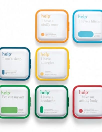
“Pearlfisher has refreshed the packaging for Help Remedies – the New York City-based boutique pharma company and creator of minimalist medicine – as part of Help’s national Take Less campaign.

As part of the rollout of the Take Less campaign, Pearlfisher was tasked with refreshing the packaging for the existing product range and for the addition of new variants to the portfolio – including Help I have a stuffy nose.

Jonathan Ford, Pearlfisher Creative Partner, says, “We have refined the identity and colorcoded the embossed pill shape to make the overall brand architecture more visually strong and to give the brand better stand-out and immediacy of recognition. The design evolution dials up Help’s equities, creating an ownable secondary language through the pill iconography, that will be used across further brand touchpoints and communications.”

Get the latest packaging design inspiration in your inbox:

Popular designs

Introducing Nasbah: Egyptian Product Packaging Design

Uncover how the Egyptian product “Nasbah” is taking a contemporary approach to package design, making a mark in the local market. Learn how the design strategy influences consumer perception and enhances product appeal.

Motivational Sock Packaging: A Good Start to Your Day

Discover ‘Good Start’, a new sock brand designed to motivate. Each pack contains seven pairs of socks, each adorned with motivational quotes from famous personalities, intended to inspire a positive start to the day.

Designed by: PepsiCo Design & Innovation
Country: United States

Help Remedies

Help_7Packs_RGB

Help Remedies

Designed by Pearlfisher | Country: United States

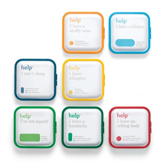
“Pearlfisher has refreshed the packaging for Help Remedies – the New York City-based boutique pharma company and creator of minimalist medicine – as part of Help’s national Take Less campaign.

As part of the rollout of the Take Less campaign, Pearlfisher was tasked with refreshing the packaging for the existing product range and for the addition of new variants to the portfolio – including Help I have a stuffy nose.

Jonathan Ford, Pearlfisher Creative Partner, says, “We have refined the identity and colorcoded the embossed pill shape to make the overall brand architecture more visually strong and to give the brand better stand-out and immediacy of recognition. The design evolution dials up Help’s equities, creating an ownable secondary language through the pill iconography, that will be used across further brand touchpoints and communications.”
Previous slide
Next slide
Get the latest on packaging design in your inbox: