Designed by: PepsiCo Design & Innovation
Country: United States

Helvetica Blu-ray

helvetica1

Designed by Experimental Jetset | Country: The Netherlands

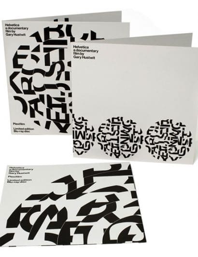
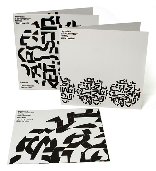
“In 2007, we were involved in a documentary about the typeface Helvetica, a movie directed by Gary Hustwit. Our involvement in this project basically consisted of designing two film posters, and making a short appearance in the movie itself. (More about the documentary can be read at Helvetica / Hustwit). In 2008, Gary approached us again, to design the limited edition packaging of the Blu-ray version of the documentary. The DVD version already came out in 2007, so did a special, limited edition of this DVD. The Blu-ray version was released in 2008, and of this version, Gary wanted to bring out a special, limited edition as well. And that’s where we came in.

Thinking about a packaging for this Blu-ray disk, we first started to consider the whole concept of Blu-ray itself. It is yet another format, the latest in a string of formats, and just like VHS and DVD, this format will be obsolete soon. This whole theme, of obsolete formats, is something that we have always found interesting; in fact, towards the end of 2000, we dedicated a whole issue of Emigre magazine on this subject (see Lost Formats). So we thought it would be interesting to come up with a packaging that would revolve around this whole theme of formats. That’s when we decided to package the Blu-ray disk in a record sleeve, referring to the vinyl 12” LP, a now almost defunct format. There’s also another reason why we chose a record sleeve as packaging. When we first met Gary, he tried to explain the concept of the Helvetica film to us. “A rock documentary, but about a typeface”, that’s how he described it to us. So a record sleeve as packaging for this documentary made perfect sense to us.

In short, the packaging consisted of a 12” gatefold sleeve (double album). One side of the gatefold sleeve contained a cardboard 4-panel insert, holding the actual disk. The other side contained a fold-out poster (60 x 60 cm). Shown below the gatefold sleeve (frontside, backside and inside):
helvetica2

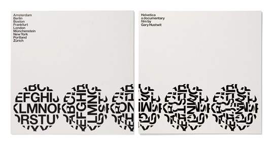
As we said, one side of this gatefold sleeve contained a 4-panel insert. This insert was basically a cardboard sheet of 30 x 60 cm, printed on both sides, and folded in two. On the outside of this insert, we placed a series of five discs; these five discs showed step-by-step how we created the discs on the gatefold sleeve. (When we say ‘disc’, we are referring the graphic motive on the sleeve; and when we say ‘disk’, we refer to the actual Blu-ray disk… we know, it’s confusing). Anyway, shown below the outside of the insert:
helvetica3

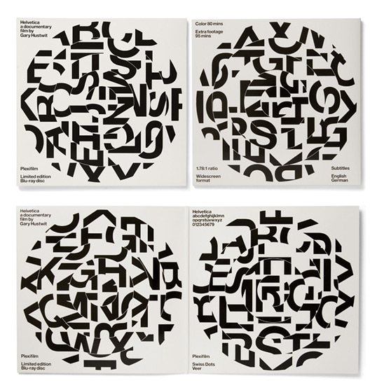
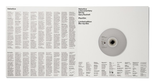
The inside of this insert contained the actual Blu-ray disk. The disk was attached to the cardboard with a so-called ‘hub dot’, a small foam button used to fasten CDs and DVDs to all kinds of surfaces. In our original proposal, we actually came up with a completely different system: we wanted to fasten the DVD to the cardboard by using a self-invented system of slits. The printer persuaded us to go for the hub, and in retrospect, it was the right decision; slits would have been too risky. Underneath the disk, we placed all the credits (note how the typography on the disk aligns with the typography at the bottom). On the left hand panel, we put an introductory text by Gary, and some excerpts from the movie:
helvetica4

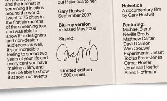
The text on the left-hand panel of the insert contained a little empty space for Gary Hustwit, to place his autograph (the whole limited edition of 1500 copies was signed by Gary):
helvetica5

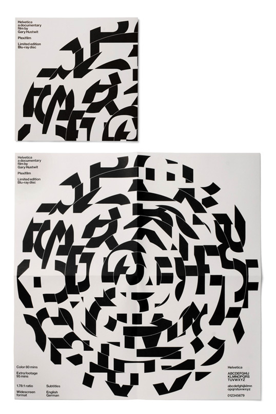
The other side of the gatefold sleeve contained a fold-out poster, basically a paper sheet of 60 x 60 cm, printed on one side, and folded to a format of 30 x 30 cm. Shown below the poster in its folded and unfolded form:
helvetica6

The sleeve came in a custom-made black cloth record bag (tote bag), printed on one side with the disc motive. (Obviously, we wanted the disc on the bag to have exactly the same size as the discs on the gatefold sleeve, but unfortunately, because of technical reasons, the print on the bag was slightly smaller):

The idea of the spiralling discs came from the ‘Meet the cast’ poster that we made earlier for Gary (see Helvetica / Hustwit). For the sleeve, we wanted to use the Helvetica alphabet as it was shown on that poster, but we also wanted it to refer to the idea of a 12” vinyl record. So we started spiralling the alphabet, referring to the way a record spins, but also to the idea of a record divided in tracks. (By spiralling the disc in different ways, we could come up with different variations; as you can see on the gatefold sleeve, each version is slightly different).

But besides the fact that the spirals refer to records, we also liked the idea of Helvetica as a typeface spiralling out of control, revolving almost like a planet, or a dark sun, a universe in itself. Next, we hoped that the spiral-like disc would refer to rays, radiation and sci-fi radar technology, underlining the whole idea of Blu-ray.

We also really wanted to show the typeface as a sort of deconstructed type specimen. We thought it would be good to show the typeface without actually showing it. As you see, the forms shown on the sleeve are not recognizable as letters, but you can still notice the shapes that are characteristic for Helvetica. We thought this was interesting.”

Get the latest packaging design inspiration in your inbox:

Popular designs

Introducing Nasbah: Egyptian Product Packaging Design

Uncover how the Egyptian product “Nasbah” is taking a contemporary approach to package design, making a mark in the local market. Learn how the design strategy influences consumer perception and enhances product appeal.

Designed by: PepsiCo Design & Innovation
Country: United States

Helvetica Blu-ray

helvetica1

helvetica1

Designed by Experimental Jetset | Country: The Netherlands

“In 2007, we were involved in a documentary about the typeface Helvetica, a movie directed by Gary Hustwit. Our involvement in this project basically consisted of designing two film posters, and making a short appearance in the movie itself. (More about the documentary can be read at Helvetica / Hustwit). In 2008, Gary approached us again, to design the limited edition packaging of the Blu-ray version of the documentary. The DVD version already came out in 2007, so did a special, limited edition of this DVD. The Blu-ray version was released in 2008, and of this version, Gary wanted to bring out a special, limited edition as well. And that’s where we came in.

Thinking about a packaging for this Blu-ray disk, we first started to consider the whole concept of Blu-ray itself. It is yet another format, the latest in a string of formats, and just like VHS and DVD, this format will be obsolete soon. This whole theme, of obsolete formats, is something that we have always found interesting; in fact, towards the end of 2000, we dedicated a whole issue of Emigre magazine on this subject (see Lost Formats). So we thought it would be interesting to come up with a packaging that would revolve around this whole theme of formats. That’s when we decided to package the Blu-ray disk in a record sleeve, referring to the vinyl 12” LP, a now almost defunct format. There’s also another reason why we chose a record sleeve as packaging. When we first met Gary, he tried to explain the concept of the Helvetica film to us. “A rock documentary, but about a typeface”, that’s how he described it to us. So a record sleeve as packaging for this documentary made perfect sense to us.

In short, the packaging consisted of a 12” gatefold sleeve (double album). One side of the gatefold sleeve contained a cardboard 4-panel insert, holding the actual disk. The other side contained a fold-out poster (60 x 60 cm). Shown below the gatefold sleeve (frontside, backside and inside):

helvetica2

As we said, one side of this gatefold sleeve contained a 4-panel insert. This insert was basically a cardboard sheet of 30 x 60 cm, printed on both sides, and folded in two. On the outside of this insert, we placed a series of five discs; these five discs showed step-by-step how we created the discs on the gatefold sleeve. (When we say ‘disc’, we are referring the graphic motive on the sleeve; and when we say ‘disk’, we refer to the actual Blu-ray disk… we know, it’s confusing). Anyway, shown below the outside of the insert:

helvetica3

The inside of this insert contained the actual Blu-ray disk. The disk was attached to the cardboard with a so-called ‘hub dot’, a small foam button used to fasten CDs and DVDs to all kinds of surfaces. In our original proposal, we actually came up with a completely different system: we wanted to fasten the DVD to the cardboard by using a self-invented system of slits. The printer persuaded us to go for the hub, and in retrospect, it was the right decision; slits would have been too risky. Underneath the disk, we placed all the credits (note how the typography on the disk aligns with the typography at the bottom). On the left hand panel, we put an introductory text by Gary, and some excerpts from the movie:

helvetica4

The text on the left-hand panel of the insert contained a little empty space for Gary Hustwit, to place his autograph (the whole limited edition of 1500 copies was signed by Gary):

helvetica5

The other side of the gatefold sleeve contained a fold-out poster, basically a paper sheet of 60 x 60 cm, printed on one side, and folded to a format of 30 x 30 cm. Shown below the poster in its folded and unfolded form:

helvetica6

The sleeve came in a custom-made black cloth record bag (tote bag), printed on one side with the disc motive. (Obviously, we wanted the disc on the bag to have exactly the same size as the discs on the gatefold sleeve, but unfortunately, because of technical reasons, the print on the bag was slightly smaller):

The idea of the spiralling discs came from the ‘Meet the cast’ poster that we made earlier for Gary (see Helvetica / Hustwit). For the sleeve, we wanted to use the Helvetica alphabet as it was shown on that poster, but we also wanted it to refer to the idea of a 12” vinyl record. So we started spiralling the alphabet, referring to the way a record spins, but also to the idea of a record divided in tracks. (By spiralling the disc in different ways, we could come up with different variations; as you can see on the gatefold sleeve, each version is slightly different).

But besides the fact that the spirals refer to records, we also liked the idea of Helvetica as a typeface spiralling out of control, revolving almost like a planet, or a dark sun, a universe in itself. Next, we hoped that the spiral-like disc would refer to rays, radiation and sci-fi radar technology, underlining the whole idea of Blu-ray.

We also really wanted to show the typeface as a sort of deconstructed type specimen. We thought it would be good to show the typeface without actually showing it. As you see, the forms shown on the sleeve are not recognizable as letters, but you can still notice the shapes that are characteristic for Helvetica. We thought this was interesting.”

Previous slide
Next slide
Get the latest on packaging design in your inbox: