Designed by: PepsiCo Design & Innovation
Country: United States

HEMA Salty Snacks

Updated on January 6th, 2010  |  
1 Minute Read

hema1

Designed by Studio Kluif | Country: The Netherlands

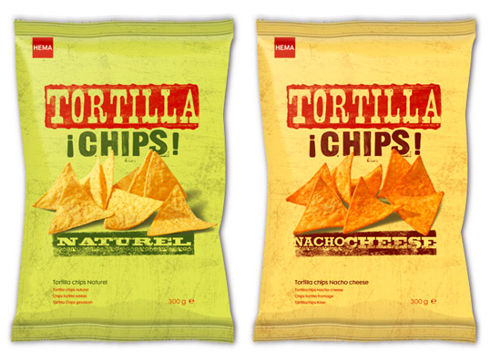
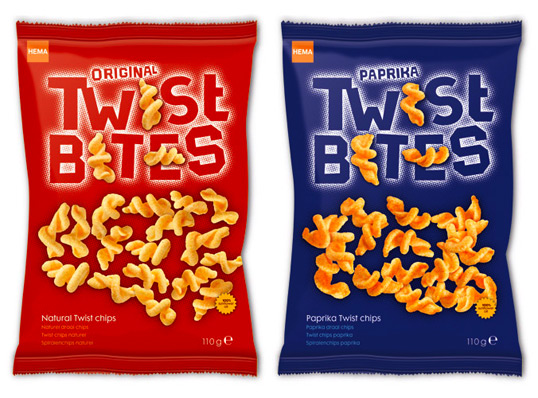
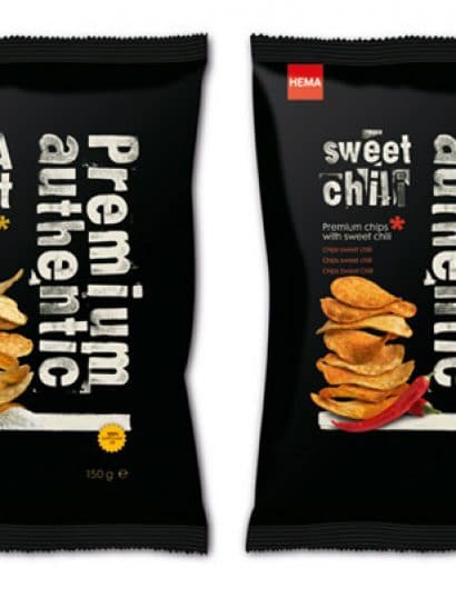
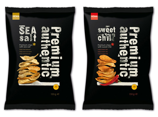
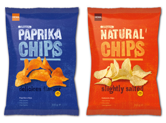
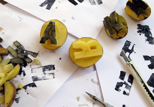
“Kluif designed the entire packaging line for Hema’s salty snacks. The packaging line is divided into 3 different categories- premium, basic and tortilla. We were inspired by the wooden crates that are used to transport vegetables & fruit for their authentic feeling and of course the classic childhood pastime of making potato stamps. To transpose these positive references to the packaging we stamped the typography ourselves thus achieving a genuine and homey atmosphere. Kluif sought crisp, fresh photography, and a composition that would give the feeling of lightness. The extruder line is composed of ‘twistbites’, ‘robo rings’ and ‘cheese sticks’ and makes use of a more illustrative graphic language which also was designed in dialogue with the photography used.”
hema2

hema6

hema3

hema4

hema5

Popular designs

Guilis

Hey Day Group / Cafes Guilis has been announced as a winner of the renowned Golden A’ Design Award.
A’ Award and Competitions are pleased to announce that the work Guilis by Michal Sicinski has been announced as a winner of the renowned Golden A’ Design Award in Packaging Design Category.

Fieldʼs Flora Art Cards

Designed by Wink | Country: United States | Font used: lettering in a Copperplate Script style. “Marshall Field’s teamed up with the

KAWS x The Standard Hotel

Designed by KAWS | Country: United States Renowned artist KAWS and The Standard Hotel just launched their collaboration for limited edition filament light bulbs. Along

Designed by: PepsiCo Design & Innovation
Country: United States

HEMA Salty Snacks

1 Minute Read
hema1

hema1

Designed by Studio Kluif | Country: The Netherlands

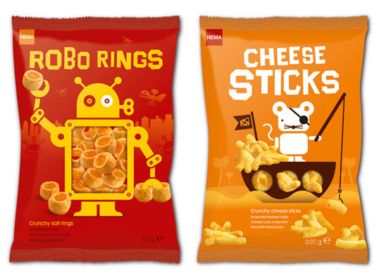
“Kluif designed the entire packaging line for Hema’s salty snacks. The packaging line is divided into 3 different categories- premium, basic and tortilla. We were inspired by the wooden crates that are used to transport vegetables & fruit for their authentic feeling and of course the classic childhood pastime of making potato stamps. To transpose these positive references to the packaging we stamped the typography ourselves thus achieving a genuine and homey atmosphere. Kluif sought crisp, fresh photography, and a composition that would give the feeling of lightness. The extruder line is composed of ‘twistbites’, ‘robo rings’ and ‘cheese sticks’ and makes use of a more illustrative graphic language which also was designed in dialogue with the photography used.”
hema2

hema6

hema3

hema4

hema5

Previous slide
Next slide