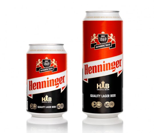
Designed by mousegraphics | Country: Greece
“The briefing (In brief): We need to redesign our brand in order to reach a wider contemporary audience.
The target consumer: Various ages, mostly young and middle age consumers of both sexes, especially men.
The design: A case of redesigning visual identity, this was a challenge that we approached by analyzing carefully all the elements of the existing logo and its context. We decided to keep and rearrange them in a meaningful way: the emblem (a coat of arms with 2 lions) was separated from the brand name, the overall design became more clear and linear, a frame based message was introduced. This evolved like a scrabble game with visual elements in the place of letters.”