Designed by: PepsiCo Design & Innovation
Country: United States

Hiro Sake

Hiro Sake

Designed by Monday Collective | Country: United States

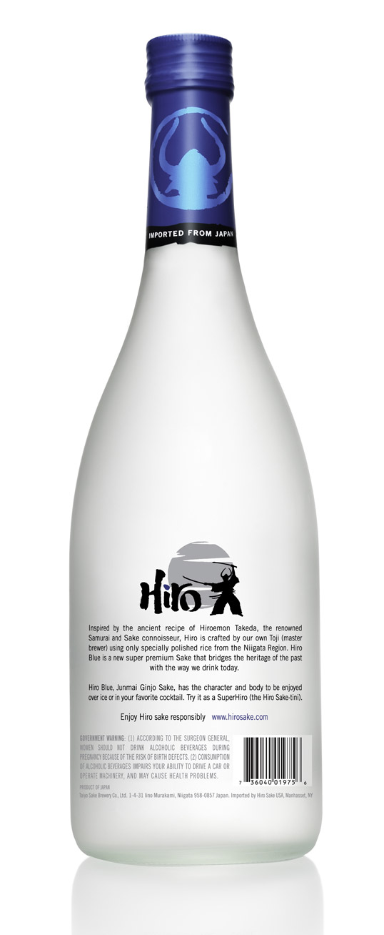
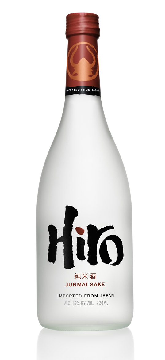
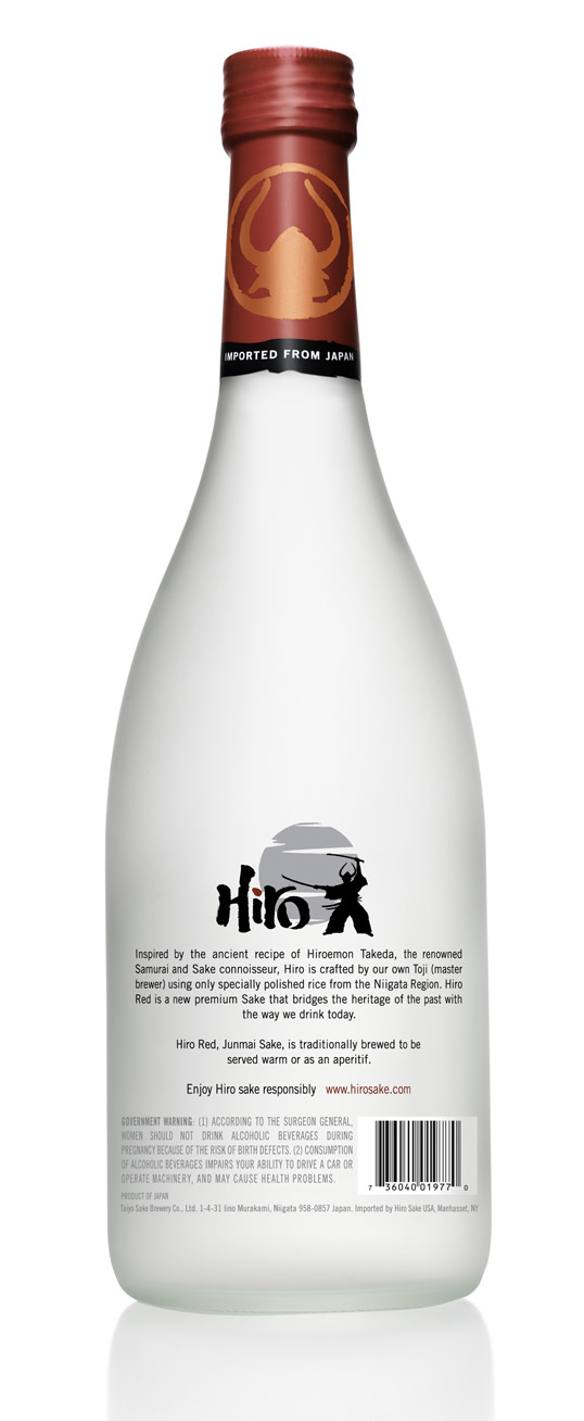
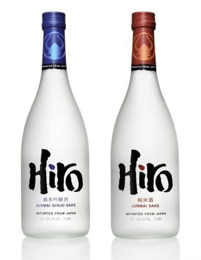
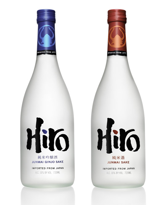
“A simple brand identity, inspired by traditional Japanese calligraphy, reflects the swift movement of the Samurai warrior in action; a Japanese designer provided cultural insight and inspiration and a Japanese calligrapher (both from Monday Collective’s group of experts) hand-crafted the bold, authentic type style; a simple brand icon on the neck of the bottle captures the Samurai in his warrior helmet, as a mark of distinction; and the story extends to the back-of-pack with an illustration of the Samurai warrior in action. The result differentiates Hiro Sake from both traditional and new spirits by simply expressing its cultural authenticity with a contemporary style that connects with today’s international spirits consumer. Hiro Sake comes in two variants, Hiro Red (Junmai) which is served hot and Hiro Blue (Junmai Ginjo) which is served cold, communicated simply through a vibrant color palette. Hiro Sake will be introduced to the Greater New York area Summer of 2011, with a national roll-out later in the year.”

Hiro Sake

Hiro Sake

Hiro Sake

Hiro Sake

Get the latest packaging design inspiration in your inbox:

Popular designs

Pure Persian Honey

When we look closely at honey packaging, they are almost all in the usual format, and the ultimate in creativity is that

Burma Love Rebrand

Love at First BiteAs an extension of the Burma Superstar restaurant in San Francisco, Burma Love Foods gives diners an opportunity to

Over the wave

This Kombucha originates in Lombok, Indonesia, where its paradise beaches attract hundreds of surfers eager to ride the waves. When you surf,

Designed by: PepsiCo Design & Innovation
Country: United States

Hiro Sake

lovely-package-hiro-sake1

Hiro Sake

Designed by Monday Collective | Country: United States

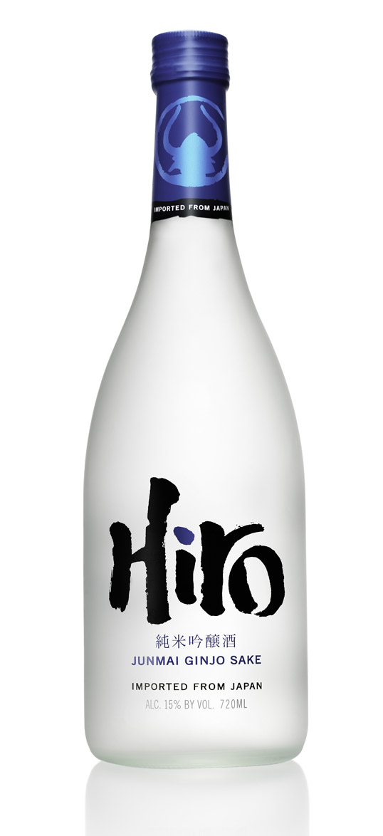
“A simple brand identity, inspired by traditional Japanese calligraphy, reflects the swift movement of the Samurai warrior in action; a Japanese designer provided cultural insight and inspiration and a Japanese calligrapher (both from Monday Collective’s group of experts) hand-crafted the bold, authentic type style; a simple brand icon on the neck of the bottle captures the Samurai in his warrior helmet, as a mark of distinction; and the story extends to the back-of-pack with an illustration of the Samurai warrior in action. The result differentiates Hiro Sake from both traditional and new spirits by simply expressing its cultural authenticity with a contemporary style that connects with today’s international spirits consumer. Hiro Sake comes in two variants, Hiro Red (Junmai) which is served hot and Hiro Blue (Junmai Ginjo) which is served cold, communicated simply through a vibrant color palette. Hiro Sake will be introduced to the Greater New York area Summer of 2011, with a national roll-out later in the year.”
Hiro Sake

Hiro Sake

Hiro Sake

Hiro Sake

Previous slide
Next slide

Explore more great package design

Get the latest on packaging design in your inbox: