Designed by STVK | Country: Germany
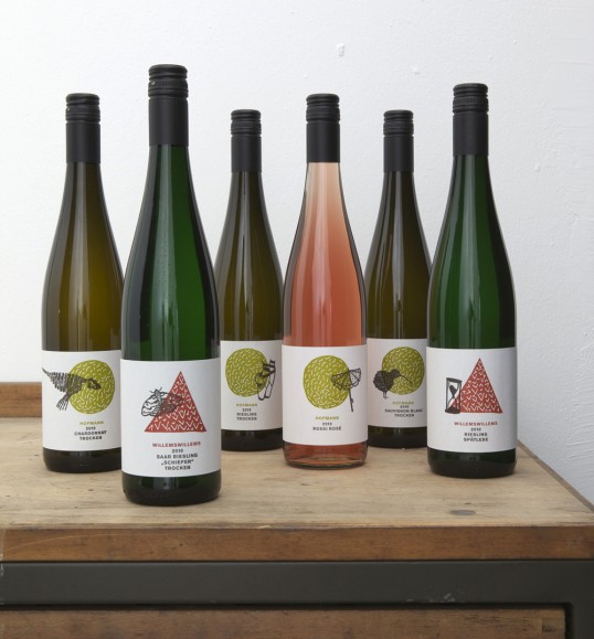
“Packaging solution for two wineries owned by one family. Jürgen Hofmann, owner of the Weingut Hofmann in Rheinhessen and Carolin Willems Willems, owner of Weingut Willems Willems at the Saar are married and are working together for both wineries. The aim was to show that the two wineries belong together but produce wines from two different German wine regions.


Another objective was to creat something which is modern but does not look over-designed, too clean or to strict. The look should be hand-made but premium, playful but simple.


The idea was to create a simple symbol for each winery which represents the terroir of each region. Muschelkalk is symbolised by a circle (the form of the fossils found here) and Schiefer is symbolised by a triangle (Schiefer tends to brake in very sharp forms). The main task now was to find a solution to make all the wines (over 30) look individual without printing a label for each wine. It is a common method to print one basic label and add the text later with a simple black print. We decided to use this method but to print in images with the text, something we did not see before on other bottles. So we painted a little object for every single wine which is printed in black over the symbol of the winery. So every wine has a individual label which tells a little story.