Designed by: PepsiCo Design & Innovation
Country: United States

Holli Mølle

holli1

Designed by Strømme Throndsen Design | Country: Norway | Font: Helvetica Ultra Compressed

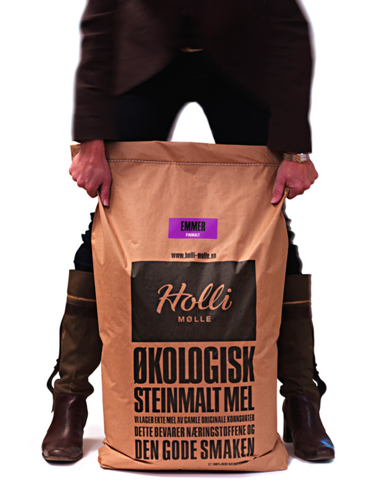
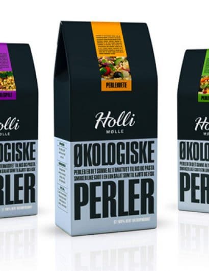
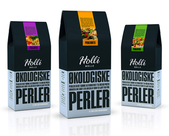
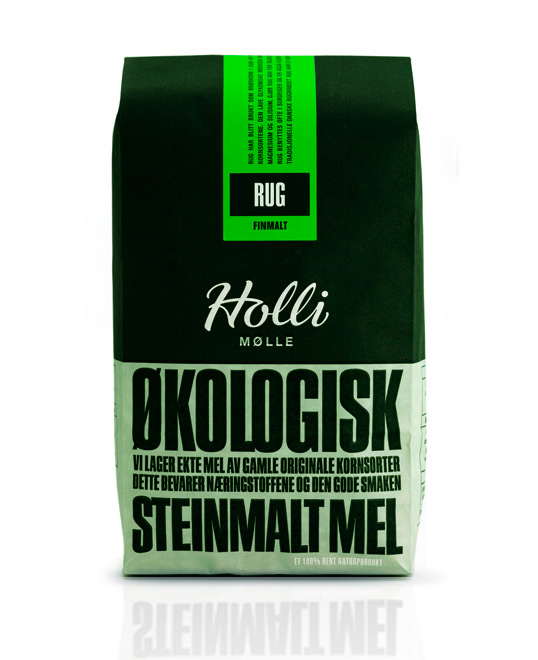
“Holli Mølle is a small organic mill in Eastern Norway, specializing in flour production with the use of ancient and nutritious grain types. The target audience is modern women who value health and nutrition and are willing to pay extra for the safety and taste of organic flour, thereby providing them with an extra feeling of love and care for their family.

In creating the name, visual language and packaging for Holli Mølle, the following criteria were highlighted:

– The identity should be based on traditional and authentic values.
– The packaging should be environmental friendly, functional, flexible and efficient in production.
– The identity should challenge the existing visual language in the flour category.

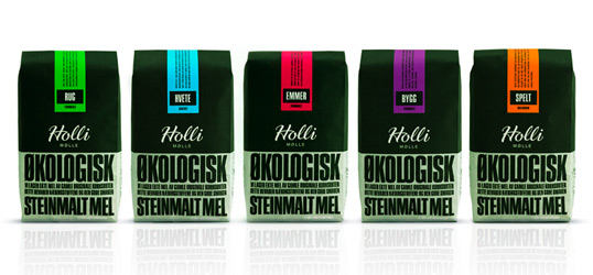
The result is a simple and unique graphical design, with fresh colours on the labels as the only differentiator between the 6 variants. The design communicates well with the target group, giving them a feeling that the flour really is ”ground with love”, as stated on the packaging in the personal message from the owner, Trygve Nesje.”
holli2

holli3

holli4

holli5

Get the latest packaging design inspiration in your inbox:

Popular designs

Burma Love Rebrand

Love at First BiteAs an extension of the Burma Superstar restaurant in San Francisco, Burma Love Foods gives diners an opportunity to

Over the wave

This Kombucha originates in Lombok, Indonesia, where its paradise beaches attract hundreds of surfers eager to ride the waves. When you surf,

The Bra Guru

Most women are wearing the wrong size bra and that is a fact. The Bra Guru® is the first and only professional

Designed by: PepsiCo Design & Innovation
Country: United States

Holli Mølle

holli1

holli1

Designed by Strømme Throndsen Design | Country: Norway | Font: Helvetica Ultra Compressed

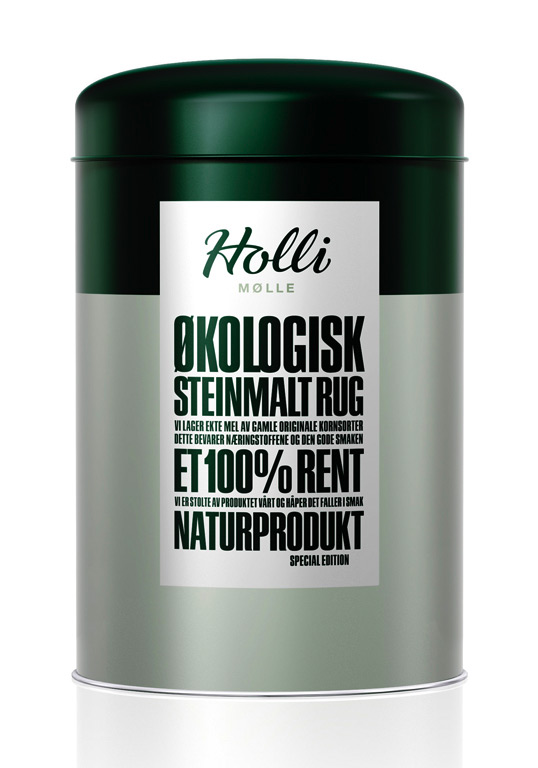
“Holli Mølle is a small organic mill in Eastern Norway, specializing in flour production with the use of ancient and nutritious grain types. The target audience is modern women who value health and nutrition and are willing to pay extra for the safety and taste of organic flour, thereby providing them with an extra feeling of love and care for their family.

In creating the name, visual language and packaging for Holli Mølle, the following criteria were highlighted:

– The identity should be based on traditional and authentic values.
– The packaging should be environmental friendly, functional, flexible and efficient in production.
– The identity should challenge the existing visual language in the flour category.

The result is a simple and unique graphical design, with fresh colours on the labels as the only differentiator between the 6 variants. The design communicates well with the target group, giving them a feeling that the flour really is ”ground with love”, as stated on the packaging in the personal message from the owner, Trygve Nesje.”
holli2

holli3

holli4

holli5

Previous slide
Next slide

Explore more great package design

Get the latest on packaging design in your inbox: