


Designed by: Holy Studio | Market region: North America, South America
Espírito Santo is a famous island in Brazil. Escavalda London Dry Gin is inspired by the beauty of the island, which is known for its tropical beaches and mountains.
The design studio mentions:
“In a region rich in diversity and surrounded by exuberant nature Gin Escalvada personifies people looking for moments of relaxation and fun. An audience that wants to celebrate with elegance, enjoy with friends in a vibrant and relaxed atmosphere, whether day or night, on land or at sea. The inspiration for creating the label came from the tagline, created for the project “when was the last time you dive in?”. In essence it is an invitation to allow yourself.”


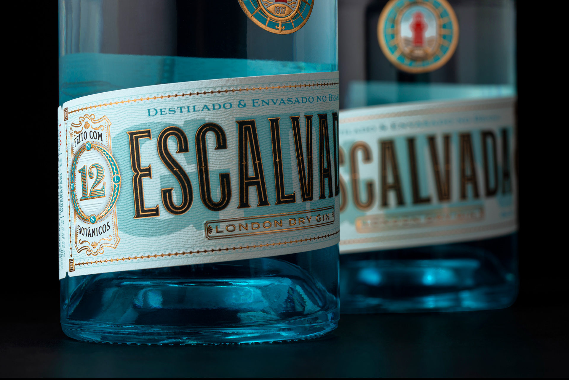
The aesthetics and the details of the packaging are inspired by the origins of Gin production. The label is a fitting tribute to the “European drug label standards” of the yesteryears.
Turquoise blue symbolizes the serenity of the seas, whereas red is associated with the rivets and metals of the famous Escalvada Lighthouse, the popular monument that stands tall in the center of the island with a reddish tone.


