Designed by: PepsiCo Design & Innovation
Country: United States

Honeydrop

Honeydrop

Designed by Monday Collective | Country: United States

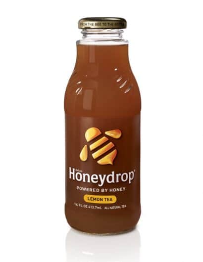
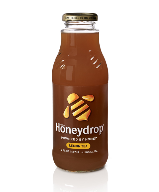
“After two years on the market, Honeydrop realized it needed to simplify its messages. Its central brand concept – the only ready to drink brewed tea and juice sweetened solely with real honey – needed to be expressed in a way that connects with the natural beverage consumer, while differentiating within an overcrowded and fast growing natural beverage category. A new custom designed glass bottle gives Honeydrop a more natural and premium feel; a clear label allows for product transparency; a bee icon redesigned to have more character and look like real honey; a simple system for range differentiation; and new copy including “from the bee to the bottle”. All of which sends a clear, unified message that Honeydrop is made with real honey.”

Honeydrop

Get the latest packaging design inspiration in your inbox:

Popular designs

Over the wave

This Kombucha originates in Lombok, Indonesia, where its paradise beaches attract hundreds of surfers eager to ride the waves. When you surf,

Burma Love Rebrand

Love at First BiteAs an extension of the Burma Superstar restaurant in San Francisco, Burma Love Foods gives diners an opportunity to

The Port Vodka Lemon Water

Overview: In response to my client’s vision for a Cape Cod themed beverage brand, I embarked on the journey to create The Port

Designed by: PepsiCo Design & Innovation
Country: United States

Honeydrop

lovely-package-honey-drop1

Honeydrop

Designed by Monday Collective | Country: United States

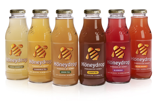
“After two years on the market, Honeydrop realized it needed to simplify its messages. Its central brand concept – the only ready to drink brewed tea and juice sweetened solely with real honey – needed to be expressed in a way that connects with the natural beverage consumer, while differentiating within an overcrowded and fast growing natural beverage category. A new custom designed glass bottle gives Honeydrop a more natural and premium feel; a clear label allows for product transparency; a bee icon redesigned to have more character and look like real honey; a simple system for range differentiation; and new copy including “from the bee to the bottle”. All of which sends a clear, unified message that Honeydrop is made with real honey.”
Honeydrop

Previous slide
Next slide

Explore more great package design

Get the latest on packaging design in your inbox: