Designed by: PepsiCo Design & Innovation
Country: United States

How Sound Lager

How Sound Lager

Designed by The Antidote Inc. | Country: Canada

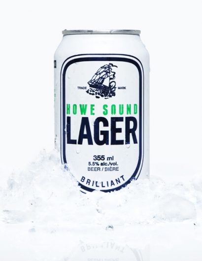
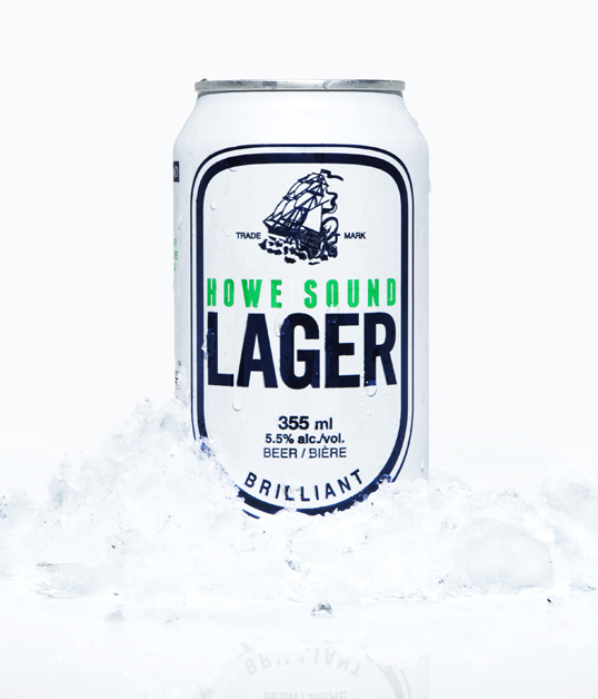
“The packaging was inspired by the geography of the Howe Sound region of coastal British Columbia and the European explorers that first charted these waters.

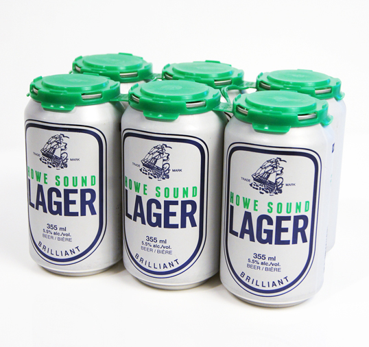
Being the southernmost fjord in North America, Howe Sound has verdant green mountains with snow-capped peaks rising out of deep blue glacial waters. This is represented in the colour scheme. The design itself honours maritime history, particularly old cartography which knew little of these mysterious waters perched on the edge of the earth and therefore filled them with sea monsters. The goal was to create a simple, bold and timeless looking can that respects and continues over a century of classic North American beer can design.

Artwork and design assistance came from Also Known As in Vancouver, BC and Stacey Rozich in Seattle, WA. The 100% recyclable 6-pack topper was created by PakTech in Eugene, OR to our colour Pantone specifications.”

How Sound Lager

Get the latest packaging design inspiration in your inbox:

Popular designs

Wanderers Vodka: A Blend of Nomadic Heritage and Modern Design

The spirit of freedom and adventure is encapsulated in the design of the Wanderers Vodka. Infused with steppe herbs, the complex flavor and unique aroma transport us straight to the vast plains of the Qazaqstan steppe, where nomad tribes traversed the land for thousands of years, shaping its history.

Rebranding Mayawell: A Blend of Mexican Heritage and Healthy Living

Discover Mayawell, a Mexican-owned beverage company that celebrates its heritage with natural, organic, and prebiotic drinks. The rebranding strikes a balance between traditional elements and contemporary design, offering a unique, healthy alternative to traditional sodas.

Designed by: PepsiCo Design & Innovation
Country: United States

How Sound Lager

lovely-package-howe-sound-lager1

How Sound Lager

Designed by The Antidote Inc. | Country: Canada

“The packaging was inspired by the geography of the Howe Sound region of coastal British Columbia and the European explorers that first charted these waters.

Being the southernmost fjord in North America, Howe Sound has verdant green mountains with snow-capped peaks rising out of deep blue glacial waters. This is represented in the colour scheme. The design itself honours maritime history, particularly old cartography which knew little of these mysterious waters perched on the edge of the earth and therefore filled them with sea monsters. The goal was to create a simple, bold and timeless looking can that respects and continues over a century of classic North American beer can design.

Artwork and design assistance came from Also Known As in Vancouver, BC and Stacey Rozich in Seattle, WA. The 100% recyclable 6-pack topper was created by PakTech in Eugene, OR to our colour Pantone specifications.”
How Sound Lager

Previous slide
Next slide
Get the latest on packaging design in your inbox: