


Designed by: Sophia Georgopoulou | Country: US
When two friends got together, a great idea emerged. Stacy, a tea lover, and Pamela, the founder of a vegan ice cream brand, Nutty Bunny, decided to bring the best of two worlds under one brand. And the result: “a light and refreshing tea-infused organic and vegan frozen dessert “brand—Iced T.
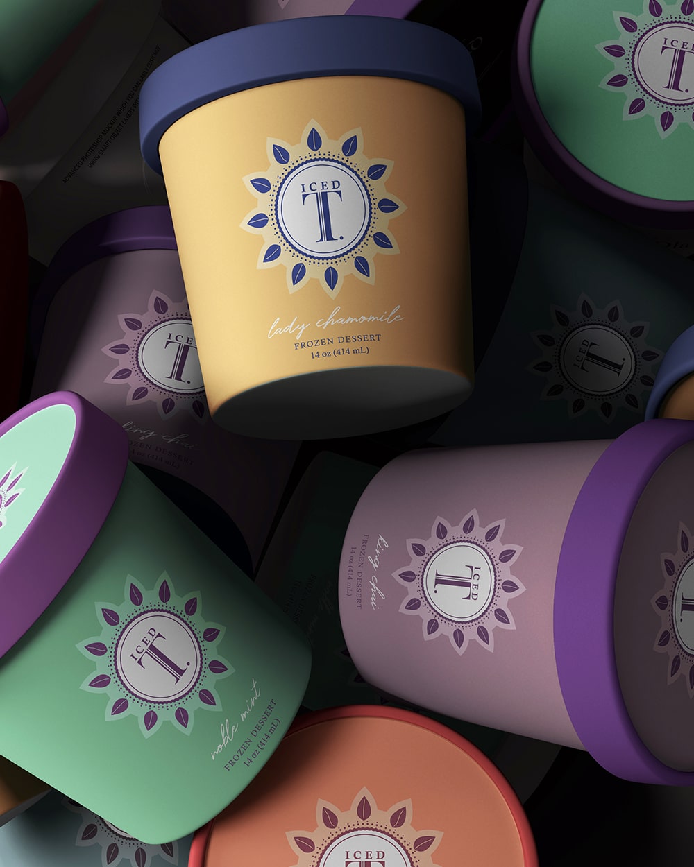
Stacy and Pamela wanted the core qualities of ice cream and tea to be highlighted in the packaging.
“The initiators of this venture wished for the core qualities of tea to be reflected in the identity of the new brand – natural, refreshing and of refined taste. But there were also the core qualities of the frozen desserts regime, typically expressed by ice creams: inviting, uplifting and full of pleasure. Bringing these two distinct worlds together was quite a challenge!”


Iced T combined their efforts with Athens-based graphic artist, Sophia Georgopoulou, to create designs that would highlight the best of both worlds. The minimal design approach, along with simple color schemes, is one of the highlights of the packaging design.
“We started by putting the brand name at the center of the logo. Thus, a big ‘T’ dominates the scenery, imposing, impactful and with a subtle vintage vibe – an allusion to the heavy tea heritage that has shaped the brand. Leaf-like features surround the central shape that encircles the brand name, suggesting naturalness. On top of that, as the result is reminiscent of a sun, they have an uplifting and joyful effect. Each variant is carefully color coded in pastel tones more fit for the tea universe, without negating the ice cream references. Finally, the name of each variant appears in a signature-like script typeface that stresses further the personal involvement and love that go into these great products.”


