

Welcome to another exciting post from your favorite packaging design blog. Today, we are exploring the unique packaging design of Inverey, a premium barrel-aged Scottish gin. 
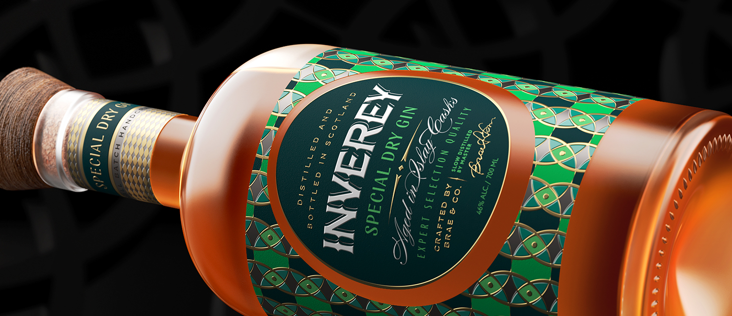
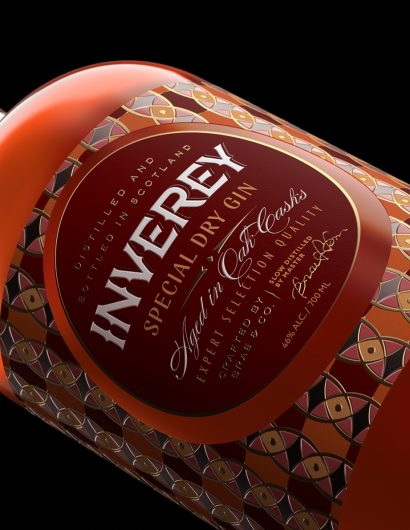
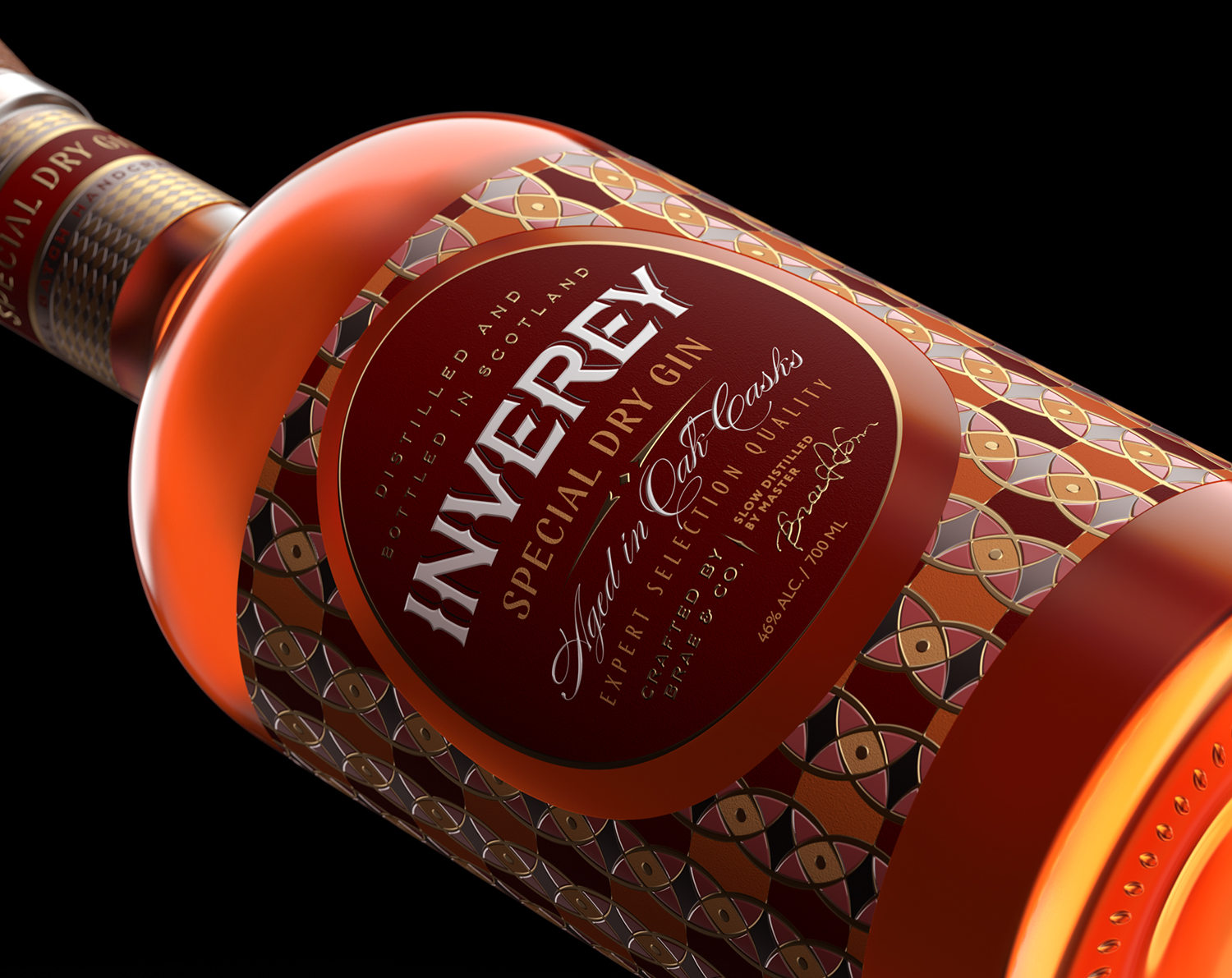
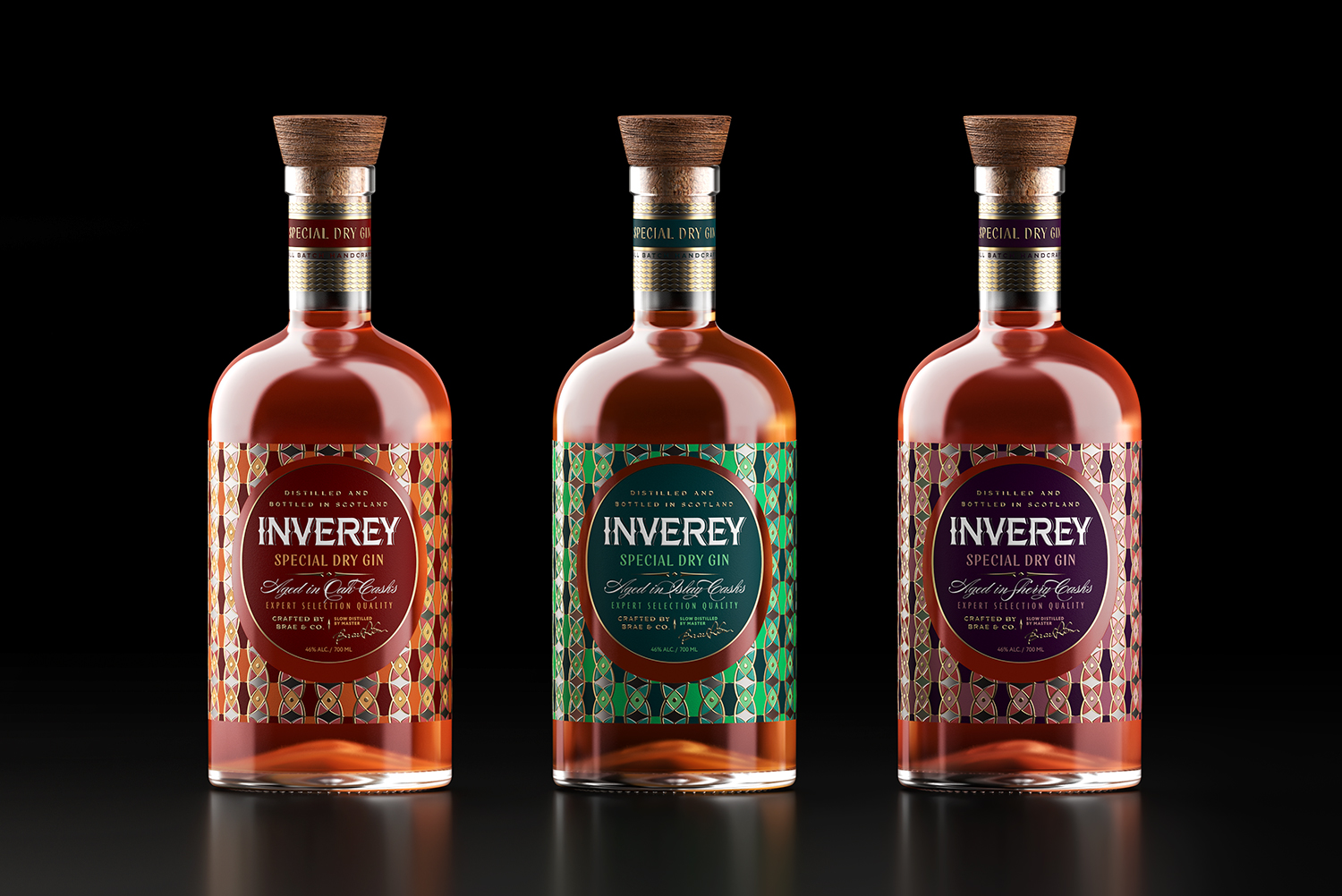
Inverey stands out with its image that captures the essence of the rugged Highland countryside. Breaking away from the norm, the label design does not feature the traditional tartan. Instead, it presents an organised structure of intertwining circles, rhombuses, four-pointed stars and dots born out of their intersection.
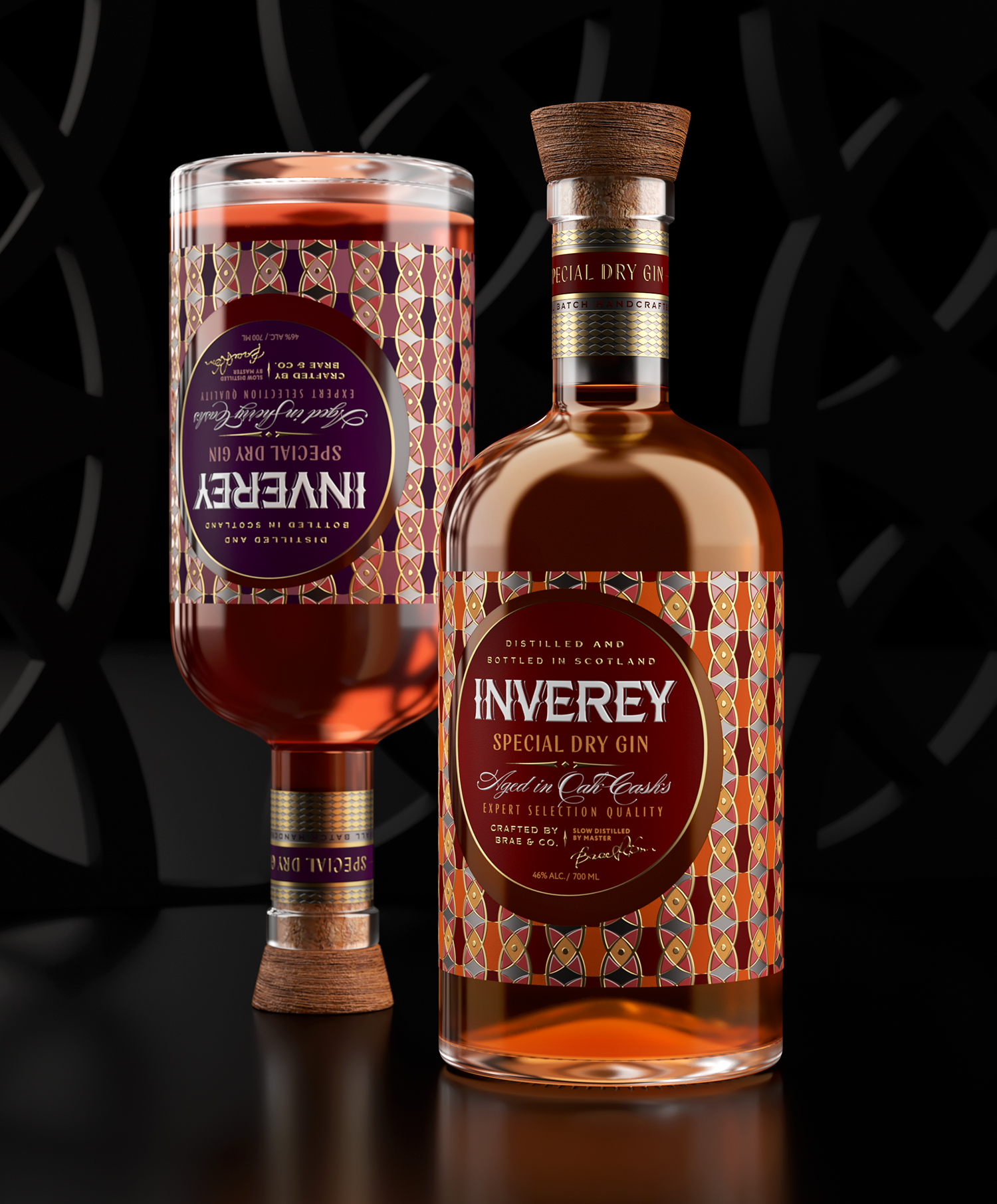
The unusual shape of the label cut is one of the key elements that contributes to its distinctiveness. The label features a classic rectangular shape, with a circular central part that offsets the circular slot. This circle, which dominates the label design, symbolises perfection, unity, and integrity. It is a reflection of the balanced, noble taste of the gin.
Inverey offers three types of gin, each matured in special casks to produce unique flavor and aroma properties. These gins are differentiated using a color code that combines dark and bright shades from different groups. The design is further enriched by the use of silver and gold foil stamping.
Complementing the label is a highly detailed, ornate necklace with a more laconic design. The complete image of the bottle is brought together by an oak trapezoidal stopper.
The Inverey packaging design is a perfect example of how to break away from traditional design norms while maintaining a strong connection to the brand’s roots. It beautifully captures the essence of the product and its origin, providing a unique, premium feel that is sure to attract consumers.
Stay tuned for more inspiring packaging design posts from around the world. As always, we are here to keep you updated on the latest trends and innovations in the packaging design world. Happy packaging!