Designed by Moodley Brand Identity | Country: Austria
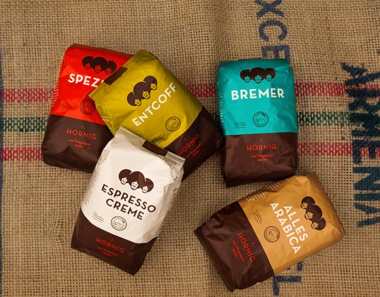
“For 100 years now, J. Hornig has been bringing delicious coffee to Austria. It’s a popular family-run business with traditional roots. Nevertheless there’s no better time than now to “restart” the brand. To focus on the future and to stop following the trends of the past few decades. J. Hornig still knows how coffee tastes best: Black, natural and home-made. It’s the essence that counts most. And the pleasure when roasting coffee.”


“The brand has a simple appearance, with abstract elements and emphasis is placed on the substance. After all, it’s really about the coffee. The new brand represents a good ambience and comfort – in other words it’s for pleasure. For the pleasure of enjoying your own little coffee moments. The brand positioning is made possible by bringing the craftsmanship to the foreground whilst letting the tradition behind it come to life. Even so, one moves with the times. The entire appearance of the brand should be unmistakable. The use and choice of font, colour and format conform to specially defined design principles.”