Designed by: PepsiCo Design & Innovation
Country: United States

Jaja Tequila: A Packaging Design Inspired by Mexican Sunsets and Abstract Art

7
Tequila, one of the most cherished spirits globally, and the heart of many a margarita, is derived from the blue agave plant, a botanical native to a specific region of Mexico. This unique origin story has always lent an air of mystique to the beverage, especially for those who have experienced the vibrant, color-drenched landscapes of Mexico first-hand.

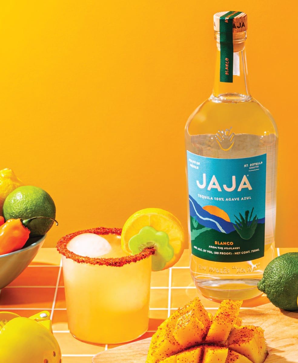
When the founder of Jaja tequila, Emmett Shine, and designer Matthew Haysom visited Jalisco in Mexico, they found themselves deeply inspired by the technicolor sunsets that illuminated the landscape, evoking the art of Henri Matisse and Mark Rothko. The influence of this vibrant palette is clearly seen in the packaging design of Jaja tequilas.

d54740162a8c9ffc5cd0ec8fd3739404d8db798d-984x1200.jpg

In terms of typography, Shine and Haysom were keen to reflect the playful spirit of the label design. The team opted for a chiseled, sans serif type that was then dithered, with one of the agave plant cutouts being used as the brand logo. To add a touch of whimsy, they also introduced a handwritten-style font.

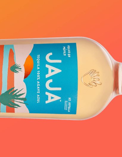
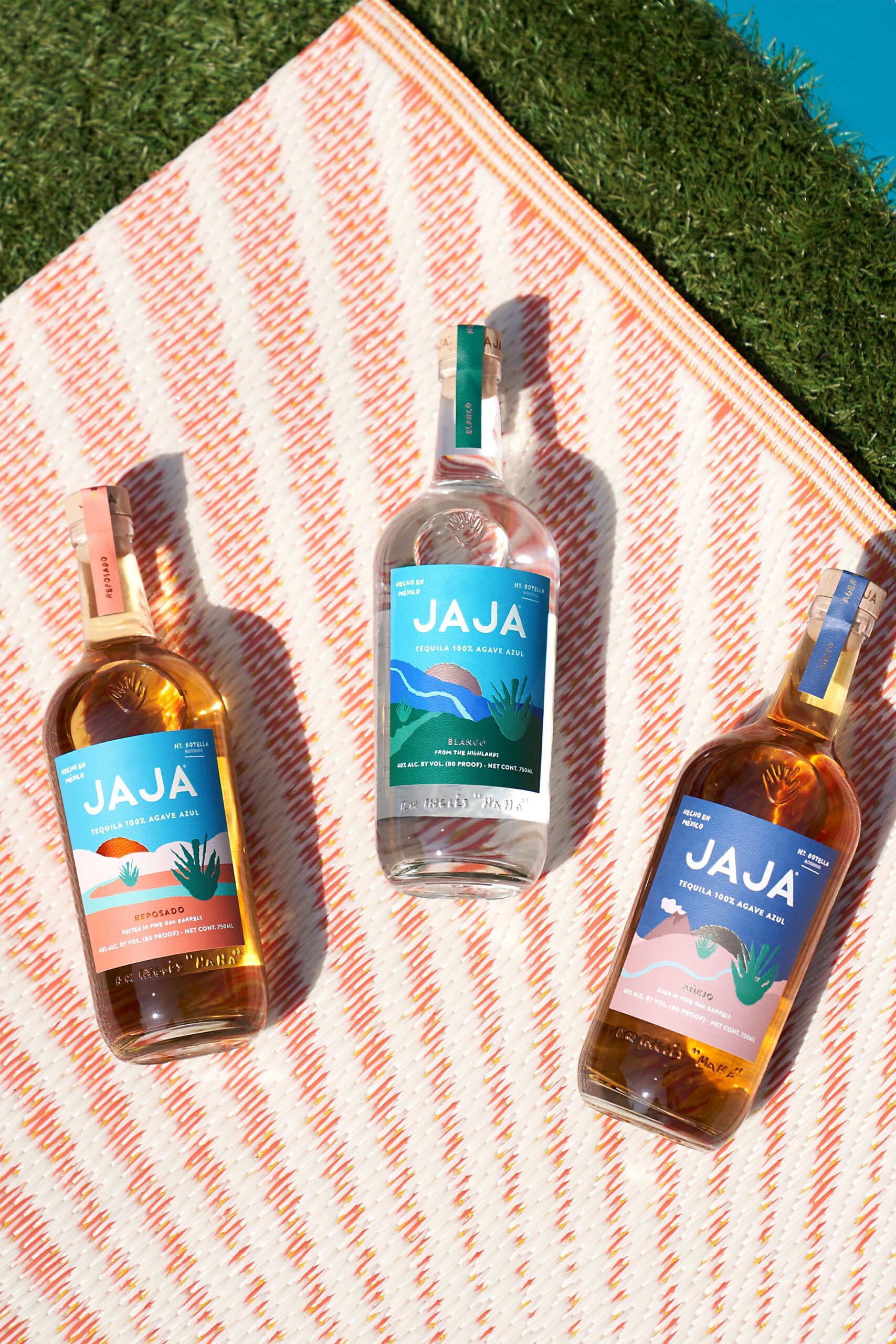
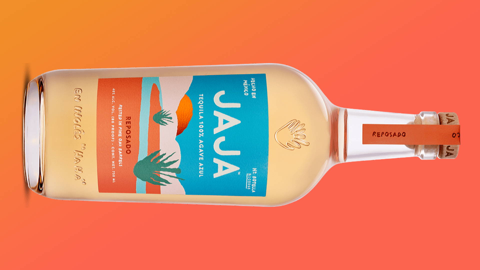
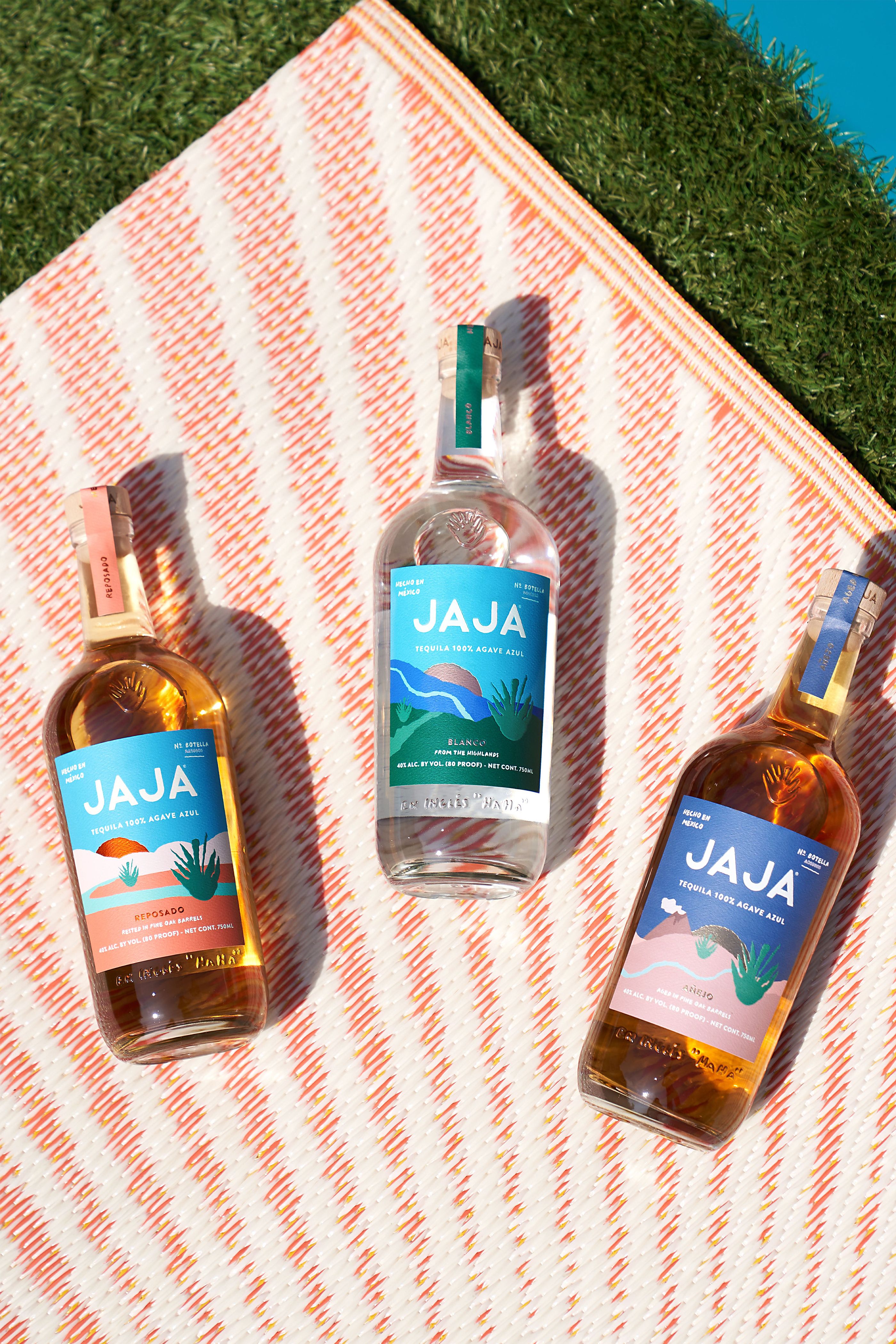
The final product is a range of tequilas – blanco, reposado, and añejo – each with a unique color palette inspired by the Jaliscan sunsets. Blanco is characterized by green, reposado sports a dominant orange, and, fittingly, blue represents añejo. Each label showcases an abstract representation of the agave plant, a river or stream, and a setting sun. The Jaja logo and the phrase “En Inglés ‘Haha,’” which translates to “In English ‘Haha,’” are embossed on every bottle.
2369661bce873311b74e7d8198861684e2c197bb-2800x4198.jpg

In an interesting twist, Shine took to TikTok to share the thought process behind the Jaja branding design. This method of presenting a design project through a social media platform typically associated with short-form videos is a fresh approach, potentially paving the way for more of such posts in the future.

Featured image for Jaja Tequila Keeps It Fun
7

Get the latest packaging design inspiration in your inbox:

Popular designs

Far Out Bar

Description: Far Out Bar is a cutting-edge packaging design project created for High Life Farms’ macrodose THC chocolate bars. This project involved

Over the wave

This Kombucha originates in Lombok, Indonesia, where its paradise beaches attract hundreds of surfers eager to ride the waves. When you surf,

Pure Persian Honey

When we look closely at honey packaging, they are almost all in the usual format, and the ultimate in creativity is that

The Port Vodka Lemon Water

Overview: In response to my client’s vision for a Cape Cod themed beverage brand, I embarked on the journey to create The Port

Designed by: PepsiCo Design & Innovation
Country: United States

Jaja Tequila: A Packaging Design Inspired by Mexican Sunsets and Abstract Art

7
Tequila, one of the most cherished spirits globally, and the heart of many a margarita, is derived from the blue agave plant, a botanical native to a specific region of Mexico. This unique origin story has always lent an air of mystique to the beverage, especially for those who have experienced the vibrant, color-drenched landscapes of Mexico first-hand.

When the founder of Jaja tequila, Emmett Shine, and designer Matthew Haysom visited Jalisco in Mexico, they found themselves deeply inspired by the technicolor sunsets that illuminated the landscape, evoking the art of Henri Matisse and Mark Rothko. The influence of this vibrant palette is clearly seen in the packaging design of Jaja tequilas.

d54740162a8c9ffc5cd0ec8fd3739404d8db798d-984x1200.jpg

In terms of typography, Shine and Haysom were keen to reflect the playful spirit of the label design. The team opted for a chiseled, sans serif type that was then dithered, with one of the agave plant cutouts being used as the brand logo. To add a touch of whimsy, they also introduced a handwritten-style font.

The final product is a range of tequilas – blanco, reposado, and añejo – each with a unique color palette inspired by the Jaliscan sunsets. Blanco is characterized by green, reposado sports a dominant orange, and, fittingly, blue represents añejo. Each label showcases an abstract representation of the agave plant, a river or stream, and a setting sun. The Jaja logo and the phrase “En Inglés ‘Haha,’” which translates to “In English ‘Haha,’” are embossed on every bottle.

2369661bce873311b74e7d8198861684e2c197bb-2800x4198.jpg

In an interesting twist, Shine took to TikTok to share the thought process behind the Jaja branding design. This method of presenting a design project through a social media platform typically associated with short-form videos is a fresh approach, potentially paving the way for more of such posts in the future.

Featured image for Jaja Tequila Keeps It Fun
7
Previous slide
Next slide
Get the latest on packaging design in your inbox: