Designed by: PepsiCo Design & Innovation
Country: United States

Jam Packed Preserves Branding and Packaging Design

2

Designed by: Studio Unbound | Country: UK

When Jam Packed launched its preserves brand, little did they know what the future had in store for them! Jam Packed Preserves became the talk of the town within a couple of years of its launch. After winning multiple awards for its quality, the brand decided to level up its branding and packaging to reflect its premium nature.

“Jam Packed Preserves originally launched their award-winning preserves company straight from a humble allotment. After a few years of trading, Jam Packed was ready to level-up their brand to the next stage. So, they turned to Studio Unbound, who knew immediately that this brand needed to have top-tier packaging to mirror the unparalleled quality of the product itself. Studio Unbound have worked closely to nurture this small-but-mighty brand with its social mission to help British farmers, wildlife and pollinators thrive.

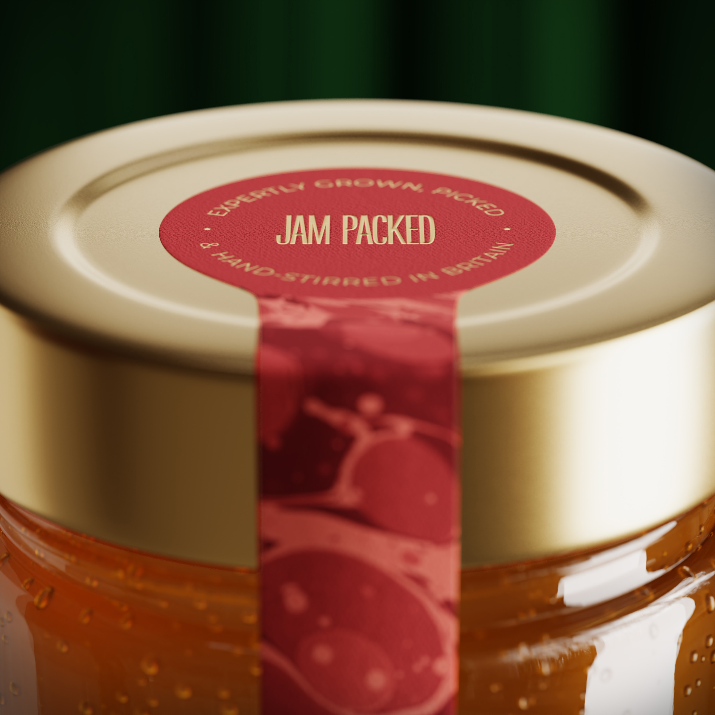
Starting with the logo, the name was the inspiration. A condensed wordmark was crafted so that the logo appears tightly packed to reflect the jar’s delicious contents, which too are literally packed full of fruit – more so than the leading supermarkets alternatives.”
Jam Packed Preserves Branding and Packaging Design

The packaging

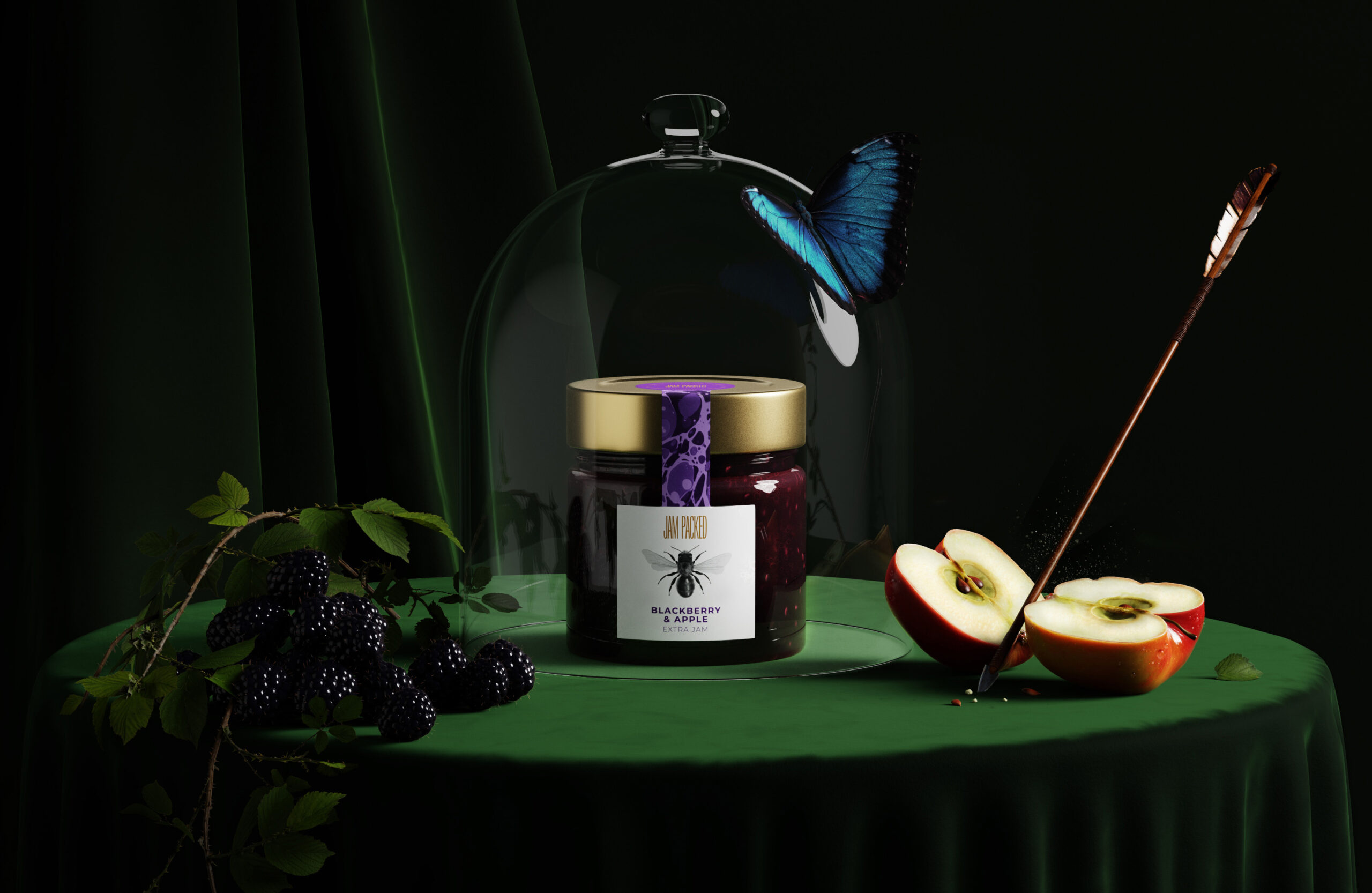
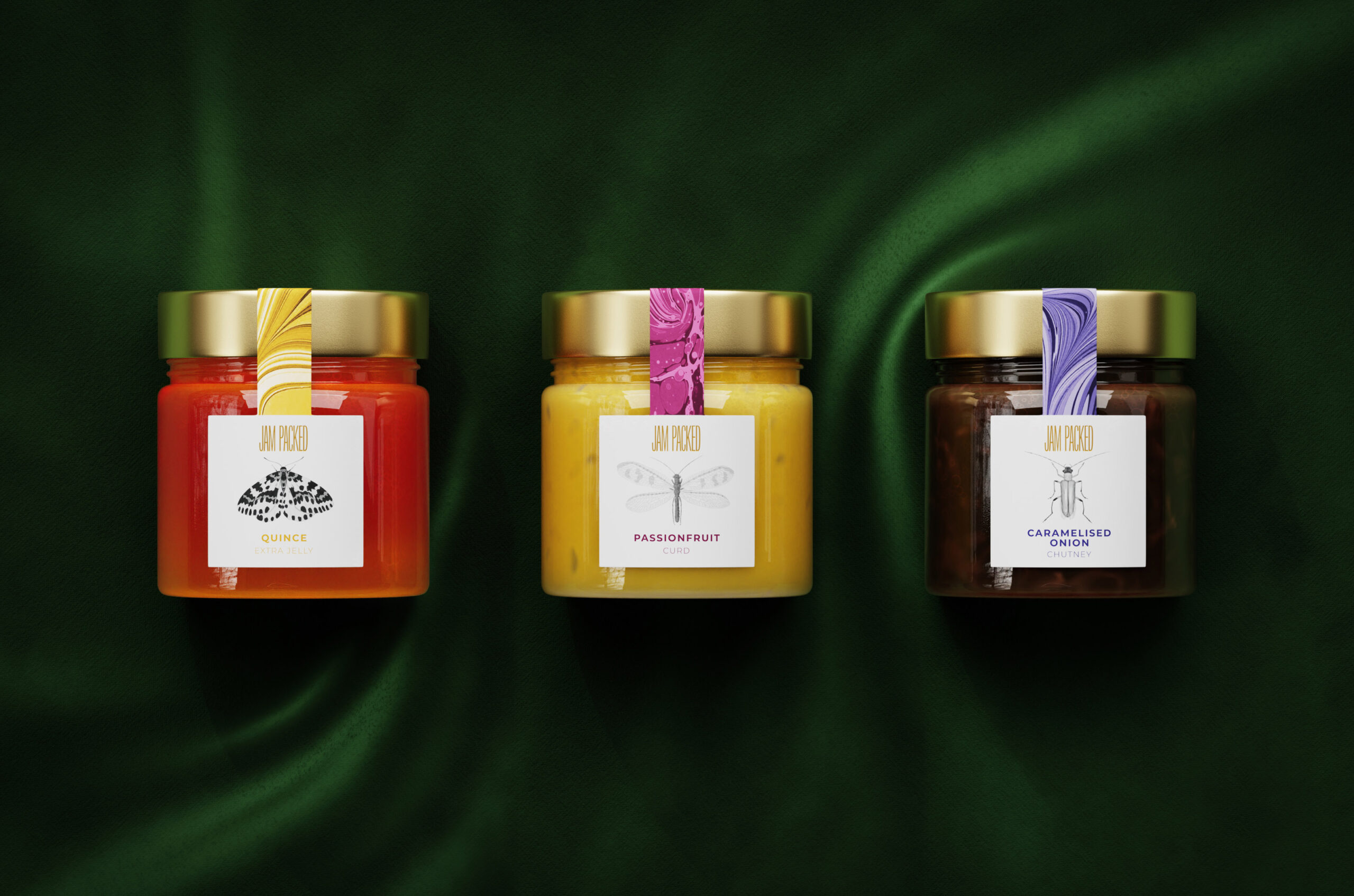
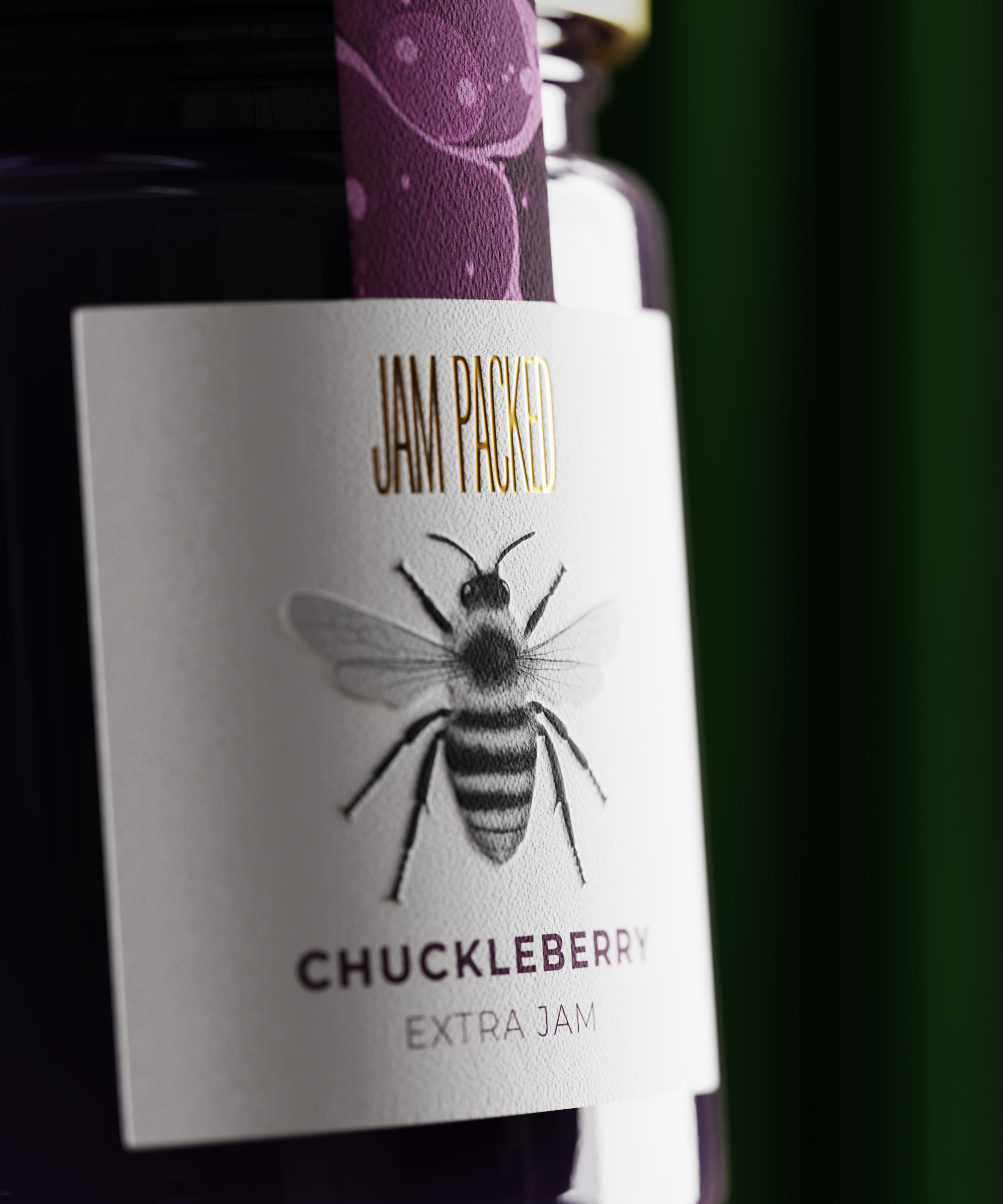
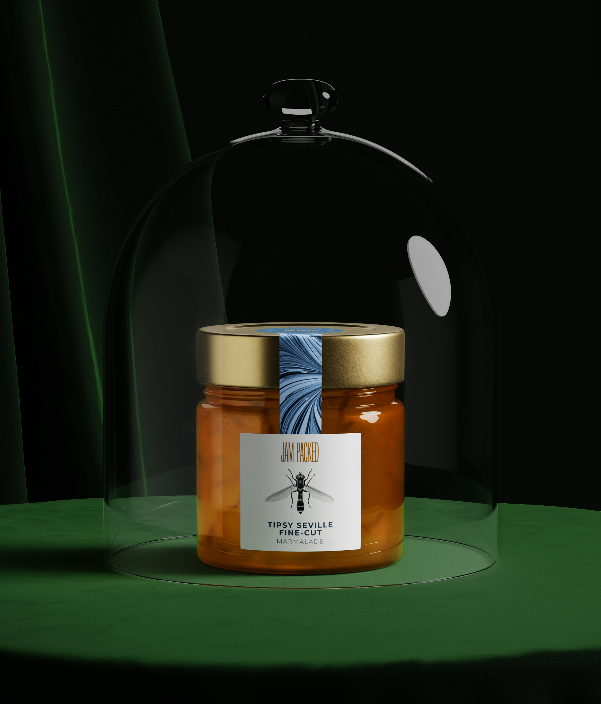
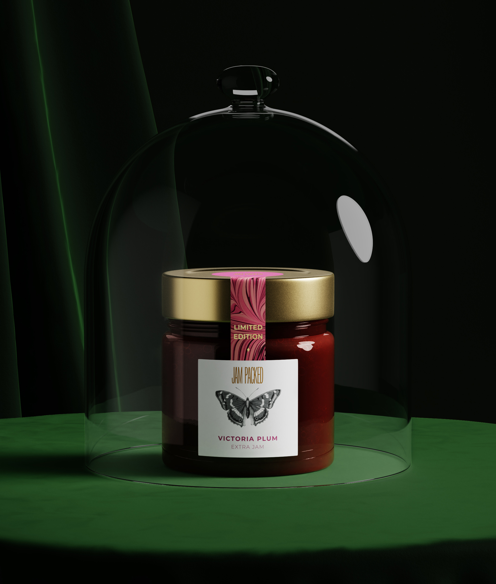
Jam Packed Preserves approached Studio Unbound, a Glasgow-based branding agency, to create packaging illustrations highlighting the company’s superior quality products. Studio Unbound gave the packaging a classic British look by using various images.

“To give it that classic British look and feel, Studio Unbound have used paper marbling on the seal strip. Giving that house in the countryside feeling, you can almost picture the jars sat atop a beautiful oak table in a traditional country home kitchen

The result is now a brand that truly reflects the premium quality of the products and also what they stand for.

Business owner Sue Woodward says ‘From our initial contact with Studio Unbound we felt confident that they understood where we were coming from and wanted to go to with our brand – they simply got it. The evolution began with the jar and ended with a ‘sophisticated, classy and elegant’ branding – our customers words, not ours – exactly what we were aiming for. We sell our products at farmers’ markets and similar events. People used to say, ‘Jam Packed – great name!’ Now, without fail, they say ‘I love the packaging!’ instead at every event we go to. Our stockists have seen increased sales as well. One customer of a farm shop told me that they thought our products were new in the shop as they had just seen them, even though they had been in the same position on shelf for five years. That is the power of the branding that Studio Unbound have created – they make products stand out.”

2

Get the latest packaging design inspiration in your inbox:

Popular designs

Burma Love Rebrand

Love at First BiteAs an extension of the Burma Superstar restaurant in San Francisco, Burma Love Foods gives diners an opportunity to

Pure Persian Honey

When we look closely at honey packaging, they are almost all in the usual format, and the ultimate in creativity is that

Over the wave

This Kombucha originates in Lombok, Indonesia, where its paradise beaches attract hundreds of surfers eager to ride the waves. When you surf,

The Bra Guru

Most women are wearing the wrong size bra and that is a fact. The Bra Guru® is the first and only professional

Designed by: PepsiCo Design & Innovation
Country: United States

Jam Packed Preserves Branding and Packaging Design

2
JamPacked_Lineup-scaled

Designed by: Studio Unbound | Country: UK

When Jam Packed launched its preserves brand, little did they know what the future had in store for them! Jam Packed Preserves became the talk of the town within a couple of years of its launch. After winning multiple awards for its quality, the brand decided to level up its branding and packaging to reflect its premium nature.

“Jam Packed Preserves originally launched their award-winning preserves company straight from a humble allotment. After a few years of trading, Jam Packed was ready to level-up their brand to the next stage. So, they turned to Studio Unbound, who knew immediately that this brand needed to have top-tier packaging to mirror the unparalleled quality of the product itself. Studio Unbound have worked closely to nurture this small-but-mighty brand with its social mission to help British farmers, wildlife and pollinators thrive.

Starting with the logo, the name was the inspiration. A condensed wordmark was crafted so that the logo appears tightly packed to reflect the jar’s delicious contents, which too are literally packed full of fruit – more so than the leading supermarkets alternatives.”
Jam Packed Preserves Branding and Packaging Design

The packaging

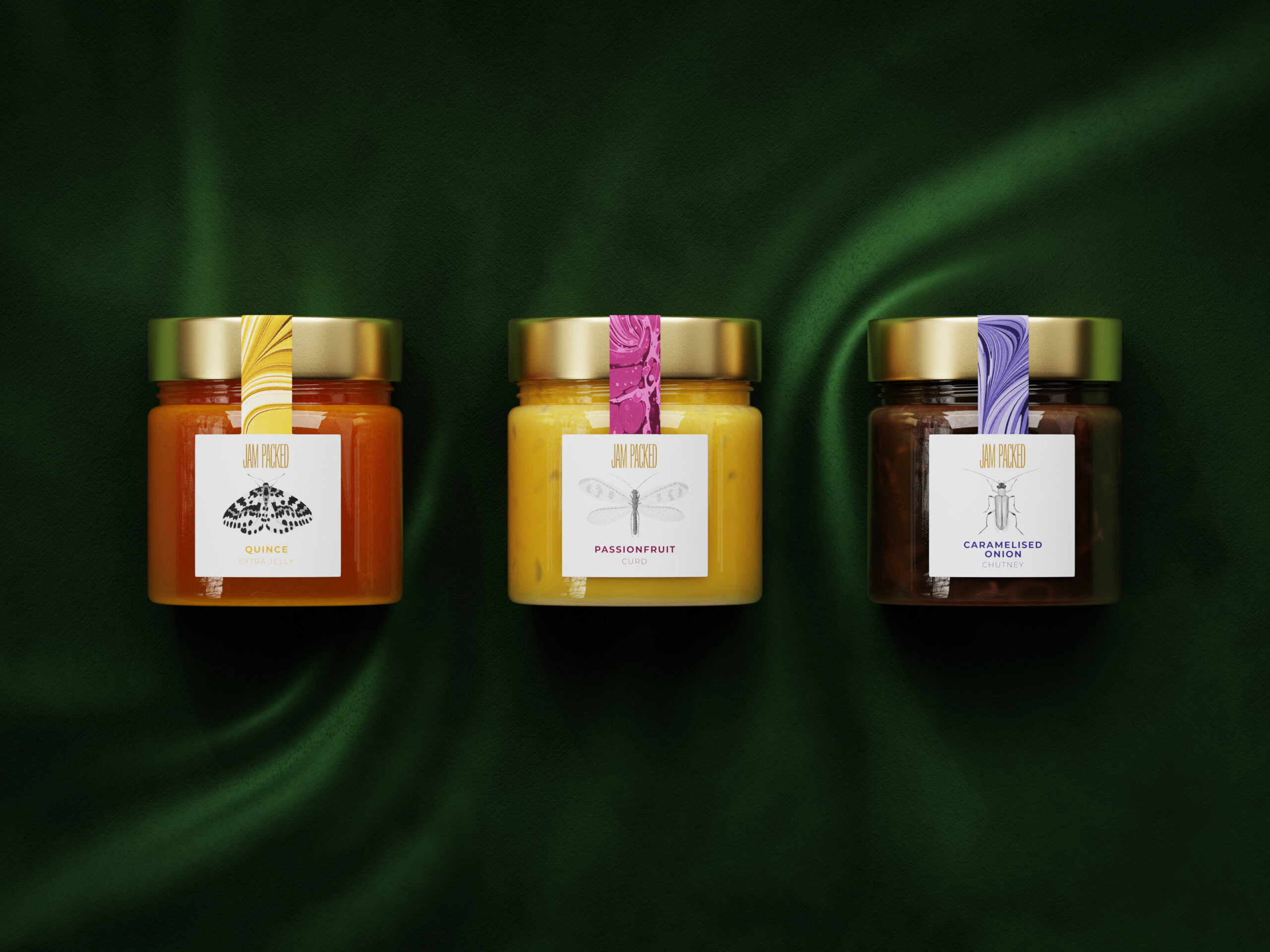
Jam Packed Preserves approached Studio Unbound, a Glasgow-based branding agency, to create packaging illustrations highlighting the company’s superior quality products. Studio Unbound gave the packaging a classic British look by using various images.

“To give it that classic British look and feel, Studio Unbound have used paper marbling on the seal strip. Giving that house in the countryside feeling, you can almost picture the jars sat atop a beautiful oak table in a traditional country home kitchen

The result is now a brand that truly reflects the premium quality of the products and also what they stand for.

Business owner Sue Woodward says ‘From our initial contact with Studio Unbound we felt confident that they understood where we were coming from and wanted to go to with our brand – they simply got it. The evolution began with the jar and ended with a ‘sophisticated, classy and elegant’ branding – our customers words, not ours – exactly what we were aiming for. We sell our products at farmers’ markets and similar events. People used to say, ‘Jam Packed – great name!’ Now, without fail, they say ‘I love the packaging!’ instead at every event we go to. Our stockists have seen increased sales as well. One customer of a farm shop told me that they thought our products were new in the shop as they had just seen them, even though they had been in the same position on shelf for five years. That is the power of the branding that Studio Unbound have created – they make products stand out.”

2

Explore more great package design

Get the latest on packaging design in your inbox: