Designed by: PepsiCo Design & Innovation
Country: United States

Jameson Bitters

lovely-package-jameson-bitters-1

Designed by Pearlfisher | Country: United Kingdom

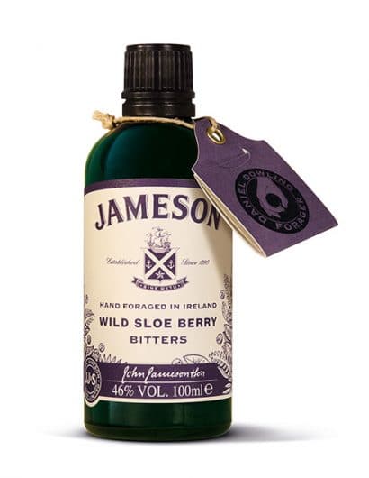
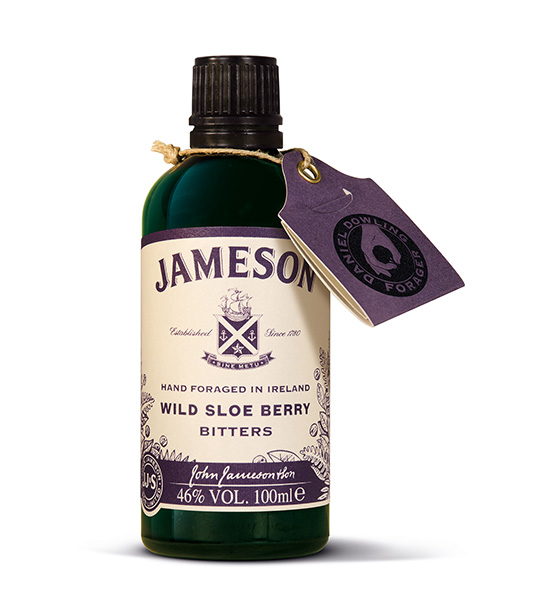
“Pearlfisher has created the brand and packaging design for the new Wild Sloe Berry Bitters, byJameson. This is a new, beautifully crafted and locally sourced Bitters brand from Jameson thatdelves into the brand’s Irish roots and flavours, and is designed to give influential bartenders anddrink enthusiasts new ways to enjoy and experience the iconic whiskey brand.

With the rapid growth in Bitters brands, a certain “type” of Bitters language is quickly saturatingthe category. Pearlfisher’s task was to create a visually distinctive look and feel for JamesonBitters, whilst ensuring we complement, respect and become a great companion to the Jamesonmaster brand.”
lovely-package-jameson-bitters-2

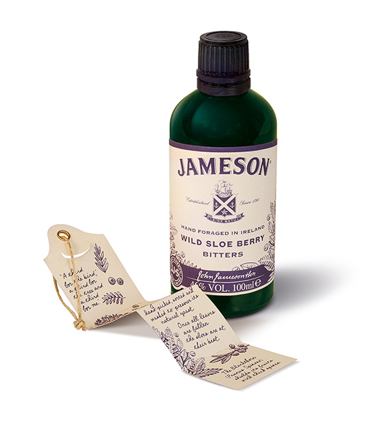
“Pearlfisher Senior Creative Strategist, Jack Hart, commented, “We wanted to use Bitters as anopportunity to tell a story of authenticity, not around heritage, but specifically through the productorigins, how it’s sourced, foraged and made. This allows Jameson to enhance its credentials asa true localvore, sharing their knowledge of the Irish countryside and all it has to offer. In this way,we better connect bartenders to the whole drinks-making process and provide them withgenuine gestures that take them beyond the bar and to the very source of the ingredients theyuse.”

“Pearlfisher Creative Director, Sarah Cattle, commented, “The new design is honest andunpretentious, capturing and preserving the essence of hand foraging with a raw and rusticdelivery. The Jameson hierarchy is maintained but the label encapsulates the idea of steppinginto the wild, and the journey of the forager, by using natural stock, hand illustrated and handwritten detailing with a single-minded and simple use of colour representing the natural andseasonal ingredient.”

Get the latest packaging design inspiration in your inbox:

Popular designs

Unique Whisky Packaging Design Celebrates 40-Year Legacy

Stckmn crafted ‘The Only Drop,’ a unique whisky packaging celebrating liquid and cask unity. Featuring handcrafted paper pulp sculptures and transparent bottle designs, the project fetched £18,750 at auction, aiding Scottish youth.

Studio La Regina Revamps Packaging Design for 7 Colli Amaro

Studio La Regina has transformed the packaging of 7 Colli, an artisan amaro with a loyal following, to support its distribution expansion. The new design features a sleek cylindrical bottle and a striking label with a deep black background, gold foil text, and a distinctive, multi-colored number 7.

Tropicana’s Branding & Packaging Redesign by Sunhouse

Tropicana rejuvenates its brand with Sunhouse, blending modern iconicity and heritage. The redesign emphasizes Tropicana’s legacy, highlighting its unique story and craftsmanship, making it stand out as the original, superior orange juice.

Designed by: PepsiCo Design & Innovation
Country: United States

Jameson Bitters

lovely-package-jameson-bitters-1

lovely-package-jameson-bitters-1

Designed by Pearlfisher | Country: United Kingdom

“Pearlfisher has created the brand and packaging design for the new Wild Sloe Berry Bitters, byJameson. This is a new, beautifully crafted and locally sourced Bitters brand from Jameson thatdelves into the brand’s Irish roots and flavours, and is designed to give influential bartenders anddrink enthusiasts new ways to enjoy and experience the iconic whiskey brand.

With the rapid growth in Bitters brands, a certain “type” of Bitters language is quickly saturatingthe category. Pearlfisher’s task was to create a visually distinctive look and feel for JamesonBitters, whilst ensuring we complement, respect and become a great companion to the Jamesonmaster brand.”

lovely-package-jameson-bitters-2

“Pearlfisher Senior Creative Strategist, Jack Hart, commented, “We wanted to use Bitters as anopportunity to tell a story of authenticity, not around heritage, but specifically through the productorigins, how it’s sourced, foraged and made. This allows Jameson to enhance its credentials asa true localvore, sharing their knowledge of the Irish countryside and all it has to offer. In this way,we better connect bartenders to the whole drinks-making process and provide them withgenuine gestures that take them beyond the bar and to the very source of the ingredients theyuse.”

“Pearlfisher Creative Director, Sarah Cattle, commented, “The new design is honest andunpretentious, capturing and preserving the essence of hand foraging with a raw and rusticdelivery. The Jameson hierarchy is maintained but the label encapsulates the idea of steppinginto the wild, and the journey of the forager, by using natural stock, hand illustrated and handwritten detailing with a single-minded and simple use of colour representing the natural andseasonal ingredient.”

Previous slide
Next slide
Get the latest on packaging design in your inbox: