Designed by: PepsiCo Design & Innovation
Country: United States

Jan Robben

Jan Robben

Designed by Reggs | Country: The Netherlands

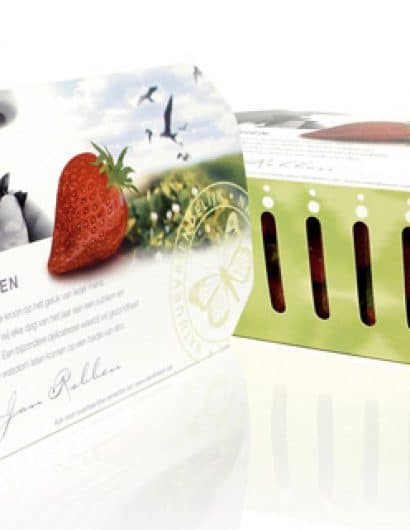
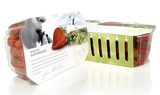
“Jan Robben is a strawberry grower with a passion for his product, and a dedication to producing fruit of a higher standard than your ‘average’ strawberry. In 1998, his company was the first in the Netherlands to receive the Milieukeur certificate. We designed a packaging that presented his strawberries in a way similar to a box of chocolates – as an exclusive, luxurious treat rather than a commodity. The packaging has a natural, intimate look-and-feel, featuring birds, Robbens’ butterfly logo and his signature, reflecting his personal devotion and care for the environment. This enabled Jan Robben to change his market strategy and achieve significant business improvement.”

Get the latest packaging design inspiration in your inbox:

Popular designs

Inverey: A Unique Barrel-Aged Scottish Gin Packaging Design

Inverey stands out with its image that captures the essence of the rugged Highland countryside. Breaking away from the norm, the label design does not feature the traditional tartan. Instead, it presents an organised structure of intertwining circles, rhombuses, four-pointed stars and dots born out of their intersection.

Innovative Design and Packaging of Teeling Whiskey Crystal Malt

Explore the innovative packaging design of Teeling Whiskey Crystal Malt. A dark screen printed bottle with a Marque™ aluminum label, textural dimension, and a seamless diamond pattern, embodies the brand’s commitment to unconventional expressions.

Designed by: PepsiCo Design & Innovation
Country: United States

Jan Robben

janrobben

Jan Robben

Designed by Reggs | Country: The Netherlands

“Jan Robben is a strawberry grower with a passion for his product, and a dedication to producing fruit of a higher standard than your ‘average’ strawberry. In 1998, his company was the first in the Netherlands to receive the Milieukeur certificate. We designed a packaging that presented his strawberries in a way similar to a box of chocolates – as an exclusive, luxurious treat rather than a commodity. The packaging has a natural, intimate look-and-feel, featuring birds, Robbens’ butterfly logo and his signature, reflecting his personal devotion and care for the environment. This enabled Jan Robben to change his market strategy and achieve significant business improvement.”

Previous slide
Next slide
Get the latest on packaging design in your inbox: