Designed by: PepsiCo Design & Innovation
Country: United States

Joe & Seph’s Gourmet Popcorn

Joe & Seph's Gourmet Popcorn

Designed by Designers Anonymous | Country: United Kingdom

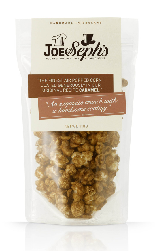
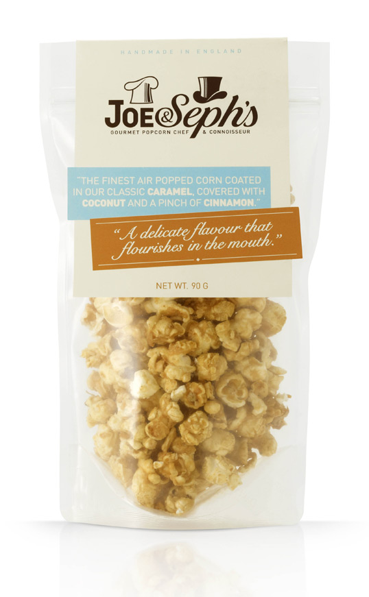
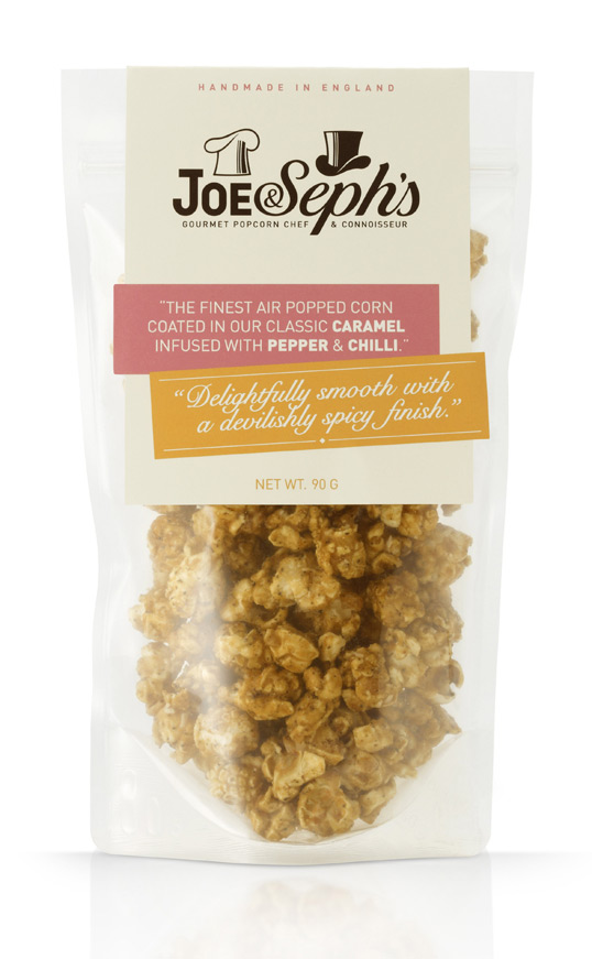
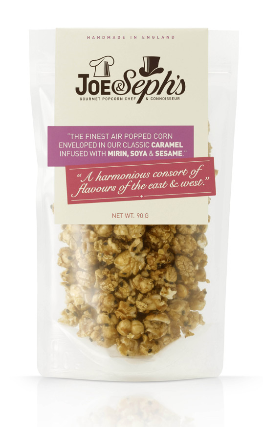
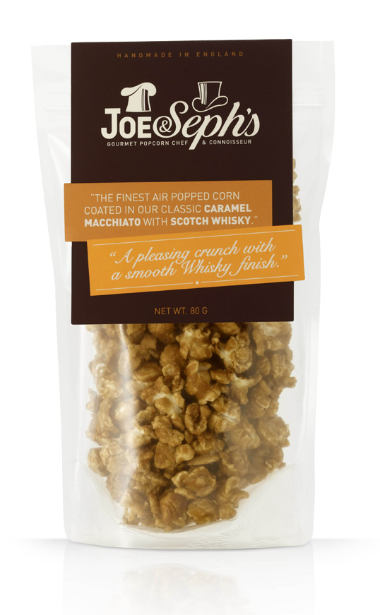
We were approached by Joseph Sopher to create a brand identity for his new range of gourmet popcorn that was to be launched at the BBC Masterchef food show in November 2010. When Joseph approached us he didn’t have a name, the research stage enabled us to create a list of possible brand names, from which the name Joe & Seph’s was chosen, inspired by Josephs mastery of making popcorn and distinguished tasting ability.

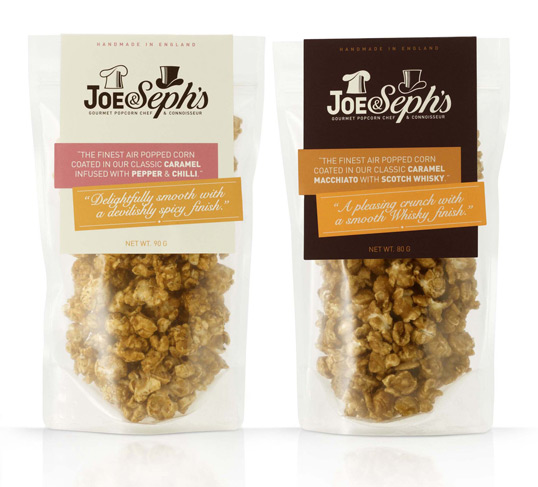
Our solution was inspired by a Jekyll & Hyde like personality, where the chef role is represented by a chefs hat, and with a clever twist, becomes the top hat for role of connoisseur. Both roles were represented in their own typeface.

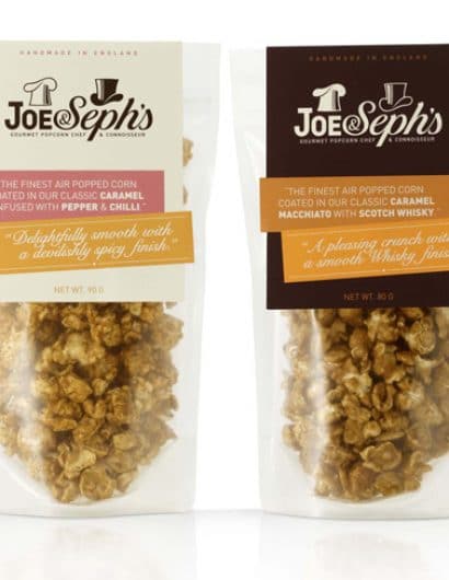
The popcorn is packaged in a clear pouch with a die-cut card header card to give the product a premium feel. The product descriptor continued the dual personality theme, with Joe describing the all natural ingredients and cooking process, while Seph’s description focuses on the sensory experience of the unique popcorn flavours. The copy style is very much in the style of an ‘English Gent’ in reference to the top hat within the logo.

Joe & Seph's Gourmet Popcorn

Joe & Seph's Gourmet Popcorn

Joe & Seph's Gourmet Popcorn

Joe & Seph's Gourmet Popcorn

Joe & Seph's Gourmet Popcorn

Joe & Seph's Gourmet Popcorn


Get the latest packaging design inspiration in your inbox:

Popular designs

D’eyras – Medrono & Olive Oil

What connects D´EYRAS, Medronho, and Olive Oil? They all hail from the same country: Portugal. These trees are indigenous to the region, serving as a testament to the bountiful and diverse Mediterranean flora.

Designed by: PepsiCo Design & Innovation
Country: United States

Joe & Seph’s Gourmet Popcorn

joe1

Joe & Seph's Gourmet Popcorn

Designed by Designers Anonymous | Country: United Kingdom

We were approached by Joseph Sopher to create a brand identity for his new range of gourmet popcorn that was to be launched at the BBC Masterchef food show in November 2010. When Joseph approached us he didn’t have a name, the research stage enabled us to create a list of possible brand names, from which the name Joe & Seph’s was chosen, inspired by Josephs mastery of making popcorn and distinguished tasting ability.

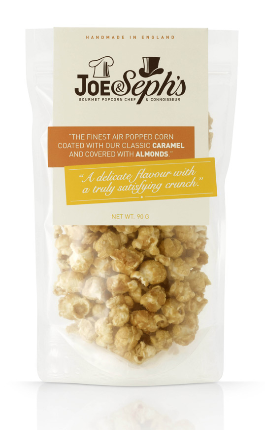
Our solution was inspired by a Jekyll & Hyde like personality, where the chef role is represented by a chefs hat, and with a clever twist, becomes the top hat for role of connoisseur. Both roles were represented in their own typeface.

The popcorn is packaged in a clear pouch with a die-cut card header card to give the product a premium feel. The product descriptor continued the dual personality theme, with Joe describing the all natural ingredients and cooking process, while Seph’s description focuses on the sensory experience of the unique popcorn flavours. The copy style is very much in the style of an ‘English Gent’ in reference to the top hat within the logo.
Joe & Seph's Gourmet Popcorn

Joe & Seph's Gourmet Popcorn

Joe & Seph's Gourmet Popcorn

Joe & Seph's Gourmet Popcorn

Joe & Seph's Gourmet Popcorn

Joe & Seph's Gourmet Popcorn


Previous slide
Next slide
Get the latest on packaging design in your inbox: