Designed by: PepsiCo Design & Innovation
Country: United States

Joe’s Tea Company

Joe’s Tea Company

Designed by Echo Brand Design | Country: United Kingdom

“Joe’s Tea Company is the brainchild of Joe Kinch, a former tea supply chain manager, who identified an opportunity to create a new product that combines high-quality leaf blends from Sri Lanka, with an interesting twist, to appeal to the newfound and more adventurous younger tea drinker: “Its niche is offering organic fine teas without fuss, or any of the bravado or pretentiousness normally associated with premium products.”

Joe’s Tea Company

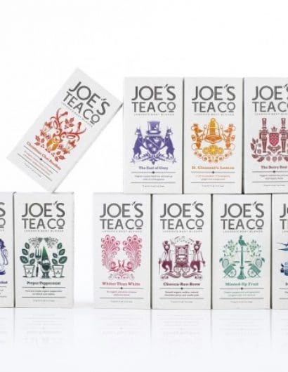
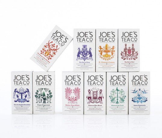
“The design took its inspiration from traditional ‘City of London Liveries’ protecting the professionalism of key trades (e.g. the candlestick maker, butcher, baker) and added a contemporary twist. Led by Echo’s in-house designer and illustrator James Pearce, a range of ‘Joe’s crests’ were created to characterise individual flavours and enhance the expertise behind each blend.

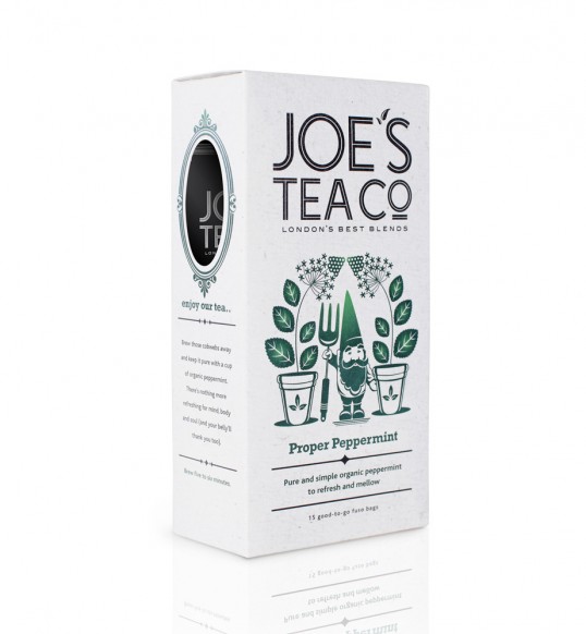
A cut-out on the side of the packaging allows a glimpse of the whole leaves Joe uses to maximise flavour and creates a window into the heart of Joe’s Tea where the illustrations continue with a bespoke ‘Joe’s Map of London’.

The Joe’s Tea Company range consists of ten different blends including quirky re-inventions of Earl Grey and English Breakfast, and flavourful explorations of fruits, herbs and even chocolate. All promise to ‘excite and surprise everyone who loves a brew’.”

Get the latest packaging design inspiration in your inbox:

Popular designs

Designed by: PepsiCo Design & Innovation
Country: United States

Joe’s Tea Company

lovely-package-joes-tea-co-1

Joe’s Tea Company

Designed by Echo Brand Design | Country: United Kingdom

“Joe’s Tea Company is the brainchild of Joe Kinch, a former tea supply chain manager, who identified an opportunity to create a new product that combines high-quality leaf blends from Sri Lanka, with an interesting twist, to appeal to the newfound and more adventurous younger tea drinker: “Its niche is offering organic fine teas without fuss, or any of the bravado or pretentiousness normally associated with premium products.”

Joe’s Tea Company

“The design took its inspiration from traditional ‘City of London Liveries’ protecting the professionalism of key trades (e.g. the candlestick maker, butcher, baker) and added a contemporary twist. Led by Echo’s in-house designer and illustrator James Pearce, a range of ‘Joe’s crests’ were created to characterise individual flavours and enhance the expertise behind each blend.

A cut-out on the side of the packaging allows a glimpse of the whole leaves Joe uses to maximise flavour and creates a window into the heart of Joe’s Tea where the illustrations continue with a bespoke ‘Joe’s Map of London’.

The Joe’s Tea Company range consists of ten different blends including quirky re-inventions of Earl Grey and English Breakfast, and flavourful explorations of fruits, herbs and even chocolate. All promise to ‘excite and surprise everyone who loves a brew’.”
Explore more great package design

Get the latest on packaging design in your inbox: