Designed by: PepsiCo Design & Innovation
Country: United States

Jovial

Jovial

Designed by Pearlfisher | Country: United Kingdom

“Discussing the design of the new packaging for Jovial Cookies, Pearlfisher Creative Director Mark Christou says, “We’ve translated the look and feel of the pasta range for this new category and, in a sector dominated by brown and natural tones, the predominantly white packaging really stands out as an innovative brand equity. We’ve leveraged the illustration style to hero the natural ingredients and combined this with a playful photography style that takes the consumer back to the ‘jovial’ spirit of the brand.”

Jovial founding President, Carla Bartolucci says, “The response at retail to the packaging design has been overwhelmingly positive. The cookie design is not only eye-catching, light hearted and fun but it joyfully conveys the natural beauty of our organic ingredients”.”

Get the latest packaging design inspiration in your inbox:

Popular designs

Pepsi Introduces Limited Edition Peach and Lime Flavors

Pepsi launches its summer BBQ campaign with new limited-edition flavors, Pepsi Lime and Pepsi Peach, designed to complement the festive, smoky essence of outdoor grilling. These vibrant, fruit-inspired designs not only promise a refreshing taste but also stand out with their visually appealing packaging, capturing the essence of summer.

Studio La Regina Designs Zafferano del Re

The “Zafferano del Re” logo features a contemporary depiction of King Alaric’s face framed within an irregular circle, evoking the design of ancient gold coins. Each package enhances this historical connection with a treasure map included inside, tying back to the legend of Alaric’s buried treasure.

Designed by: PepsiCo Design & Innovation
Country: United States

Jovial

jovial

Jovial

Designed by Pearlfisher | Country: United Kingdom

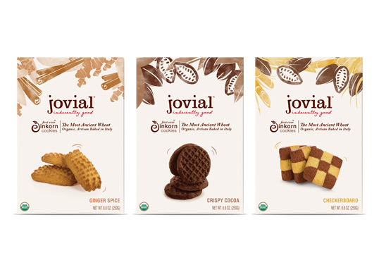
“Discussing the design of the new packaging for Jovial Cookies, Pearlfisher Creative Director Mark Christou says, “We’ve translated the look and feel of the pasta range for this new category and, in a sector dominated by brown and natural tones, the predominantly white packaging really stands out as an innovative brand equity. We’ve leveraged the illustration style to hero the natural ingredients and combined this with a playful photography style that takes the consumer back to the ‘jovial’ spirit of the brand.”

Jovial founding President, Carla Bartolucci says, “The response at retail to the packaging design has been overwhelmingly positive. The cookie design is not only eye-catching, light hearted and fun but it joyfully conveys the natural beauty of our organic ingredients”.”
Previous slide
Next slide
Get the latest on packaging design in your inbox: