Designed by: PepsiCo Design & Innovation
Country: United States

Juniver Vegetarian Soft Drink Packaging Design

Designed by: Inkmark Ltd | United Kingdom

Juniver, a simple vegetarian soft drink, is aimed at professional women. The brand name is a mix of Juni, the owner of the fictional brand, and Ver, a Latin word for truth.

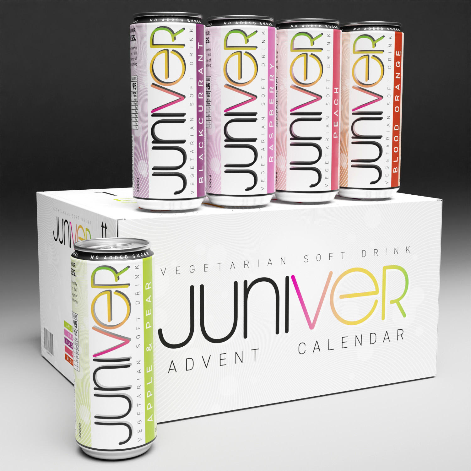
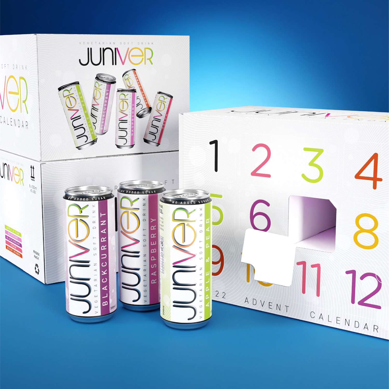
Inkmark, a Bristol-based creative agency, worked on the branding and packaging designs of Juniver. From the logo to the advent calendar packaging, Inkmark’s designs were spot-on.

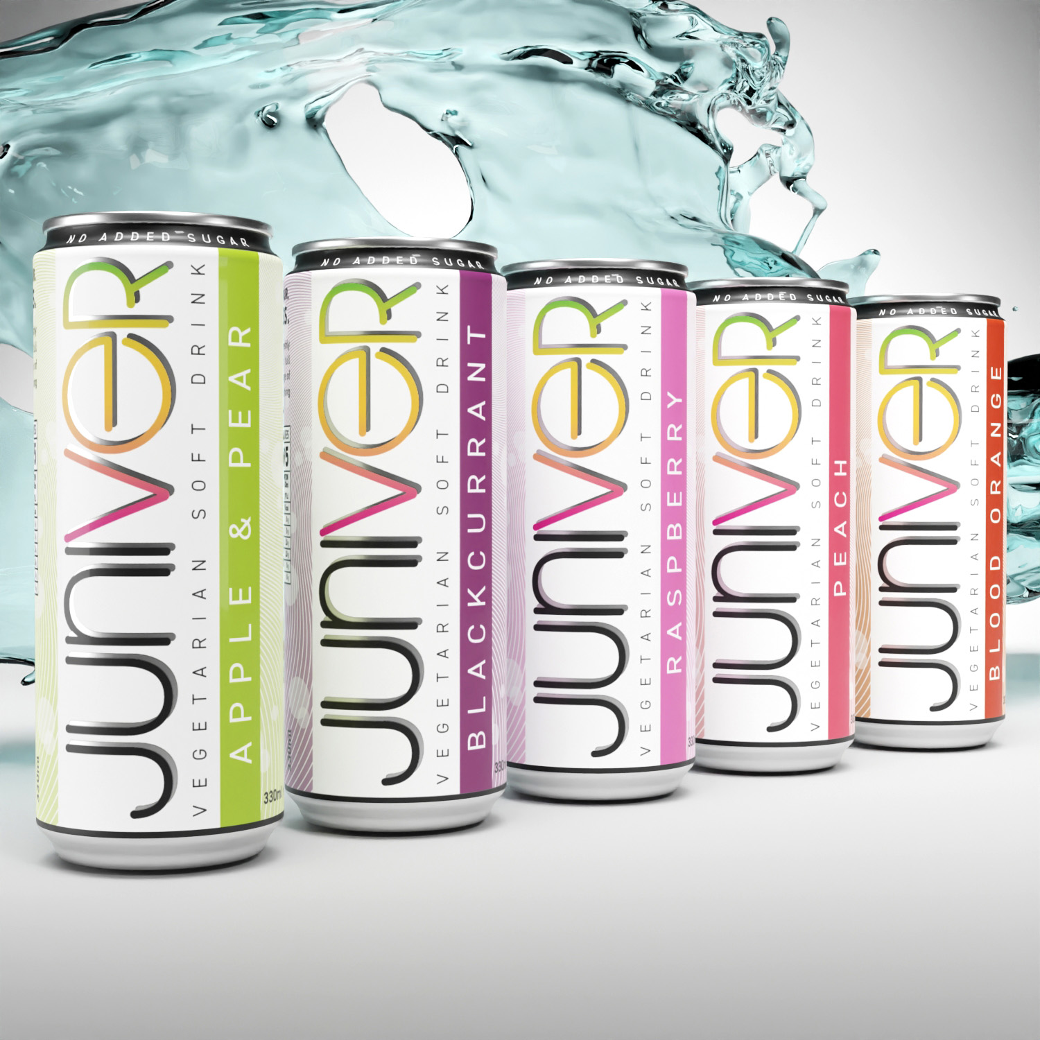
The logo’s font has been altered to soften the edges and make it more user accessible. Some individual letters have also been opened to provide a more distinct feel and improve the modern appearance. The gradient utilized in the logo’s letters VER indicates the variety of current and future flavors offered. Wavy lines and soft circular backdrops have been added to the design of the background, visible only on the back of the can. While the lines indicate the flow of water, the soft circles symbolize the fizziness of the drink and contribute to the packaging’s ‘bling.’ Choosing to position the logo vertically on the product maximizes its visibility while separating itself from the competitors.”  
Juniver Vegetarian Soft Drink Packaging Design

The packaging

Packaging design plays a dominant role in fostering brand awareness. In fact, the packaging usually plays the final role when a customer decides to pick one brand over the other. The packaging of Juniver is simple and attractive—a lethal combination.

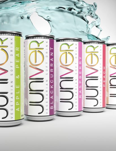
Each flavor is assigned a separate color, making it easier for a customer to pick her favorite drink from the shelf. The fun typography elevates the entire look of the packaging design.

“The back of the tin can has the regular legal requirements as well as a brief summary of the brand’s characteristics. We also foresee a variety of merchandising products with a vertically positioned logo to increase brand awareness. Each flavor is represented by a separate color accent. Because the brief requested for this flavor to be the launch product, the apple and pear variation is given additional prominence.” 

Get the latest packaging design inspiration in your inbox:

Popular designs

Wanderers Vodka: A Blend of Nomadic Heritage and Modern Design

The spirit of freedom and adventure is encapsulated in the design of the Wanderers Vodka. Infused with steppe herbs, the complex flavor and unique aroma transport us straight to the vast plains of the Qazaqstan steppe, where nomad tribes traversed the land for thousands of years, shaping its history.

Designed by: PepsiCo Design & Innovation
Country: United States

Juniver Vegetarian Soft Drink Packaging Design

Juniver 3

Designed by: Inkmark Ltd | United Kingdom

Juniver, a simple vegetarian soft drink, is aimed at professional women. The brand name is a mix of Juni, the owner of the fictional brand, and Ver, a Latin word for truth.

Inkmark, a Bristol-based creative agency, worked on the branding and packaging designs of Juniver. From the logo to the advent calendar packaging, Inkmark’s designs were spot-on.

The logo’s font has been altered to soften the edges and make it more user accessible. Some individual letters have also been opened to provide a more distinct feel and improve the modern appearance. The gradient utilized in the logo’s letters VER indicates the variety of current and future flavors offered. Wavy lines and soft circular backdrops have been added to the design of the background, visible only on the back of the can. While the lines indicate the flow of water, the soft circles symbolize the fizziness of the drink and contribute to the packaging’s ‘bling.’ Choosing to position the logo vertically on the product maximizes its visibility while separating itself from the competitors.”  
Juniver Vegetarian Soft Drink Packaging Design

The packaging

Packaging design plays a dominant role in fostering brand awareness. In fact, the packaging usually plays the final role when a customer decides to pick one brand over the other. The packaging of Juniver is simple and attractive—a lethal combination.

Each flavor is assigned a separate color, making it easier for a customer to pick her favorite drink from the shelf. The fun typography elevates the entire look of the packaging design.

“The back of the tin can has the regular legal requirements as well as a brief summary of the brand’s characteristics. We also foresee a variety of merchandising products with a vertically positioned logo to increase brand awareness. Each flavor is represented by a separate color accent. Because the brief requested for this flavor to be the launch product, the apple and pear variation is given additional prominence.” 

Previous slide
Next slide
Get the latest on packaging design in your inbox: