Designed by: PepsiCo Design & Innovation
Country: United States

Juuri

Juuri

Designed by Werklig | Country: Finland

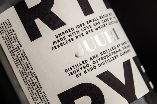
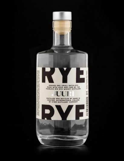
“The distillery is based in the heartlands of Finnish Ostrobothnia. The first batch of the whisky won’t be available until 2017, but an initial product called Juuri (Root) is already in production to be used in cocktails. More products will be developed and made in small batch style as the production evolves. The company also has clear-cut plans for entry into the international market, aiming boldly at global metropolises such as London, Berlin, Hong Kong and Tokyo.

This sort of brand evolution meant that the identity needed stand the test of time and changes: it had to be clean, fresh and easy to use still after a couple of years when the first whiskys are matured.”

Juuri

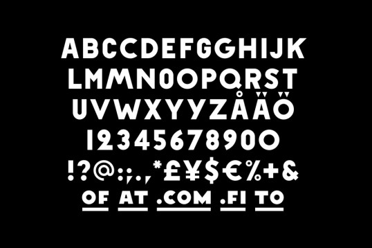
“The solution was to make all visual elements simple but filled with (hidden) stories. Custom typeface called “Napue Sans” was designed from old Napue battle memorial monument engravings (right next to the distillery building), giving a true historical and local flair for the identity. Colors were kept to minimum using only black and white with silver and golden accents – silver for clear unaged spirits and gold for matured ones.”

Juuri

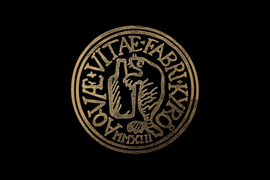
“As the company needed a seal of approval for official documents we created, well, a seal of approval to the letter. The seal is based on Isokyrö town coat of arms that has a bear in it, hugging a tree. In our version bear is replaced with a seal, this time giving a hug to a bottle. The seal is of a faux-style, not actually old but it seems old. This is mainly because all the letters used in seal have been meticulously redrawn from Isokyrö medieval church wall paintings.”

Juuri

“Again, even though the elements may seem simple they include a true, inspiring story with a heritage. 

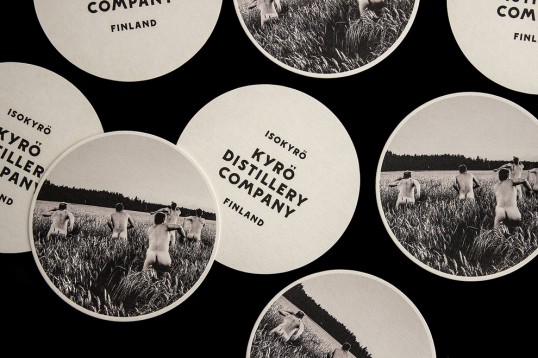
Like distillery’s main product – whisky – the identity is also evolving and maturing, but the first applications have already been launched, incluring Juuri labels and other print materials. A pop-up bar was opened in Helsinki in April 2014 to promote Juuri and the distillery. The bar interiors were naturally fully branded, a separate case study of  this pop-up will be released later.”

Juuri

Get the latest packaging design inspiration in your inbox:

Popular designs

Rebranding Mayawell: A Blend of Mexican Heritage and Healthy Living

Discover Mayawell, a Mexican-owned beverage company that celebrates its heritage with natural, organic, and prebiotic drinks. The rebranding strikes a balance between traditional elements and contemporary design, offering a unique, healthy alternative to traditional sodas.

Designed by: PepsiCo Design & Innovation
Country: United States

Juuri

lovely-package-juuri-1

Juuri

Designed by Werklig | Country: Finland

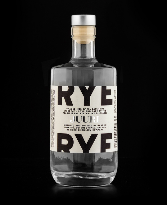
“The distillery is based in the heartlands of Finnish Ostrobothnia. The first batch of the whisky won’t be available until 2017, but an initial product called Juuri (Root) is already in production to be used in cocktails. More products will be developed and made in small batch style as the production evolves. The company also has clear-cut plans for entry into the international market, aiming boldly at global metropolises such as London, Berlin, Hong Kong and Tokyo.

This sort of brand evolution meant that the identity needed stand the test of time and changes: it had to be clean, fresh and easy to use still after a couple of years when the first whiskys are matured.”

Juuri

“The solution was to make all visual elements simple but filled with (hidden) stories. Custom typeface called “Napue Sans” was designed from old Napue battle memorial monument engravings (right next to the distillery building), giving a true historical and local flair for the identity. Colors were kept to minimum using only black and white with silver and golden accents – silver for clear unaged spirits and gold for matured ones.”

Juuri

“As the company needed a seal of approval for official documents we created, well, a seal of approval to the letter. The seal is based on Isokyrö town coat of arms that has a bear in it, hugging a tree. In our version bear is replaced with a seal, this time giving a hug to a bottle. The seal is of a faux-style, not actually old but it seems old. This is mainly because all the letters used in seal have been meticulously redrawn from Isokyrö medieval church wall paintings.”

Juuri

“Again, even though the elements may seem simple they include a true, inspiring story with a heritage. 

Like distillery’s main product – whisky – the identity is also evolving and maturing, but the first applications have already been launched, incluring Juuri labels and other print materials. A pop-up bar was opened in Helsinki in April 2014 to promote Juuri and the distillery. The bar interiors were naturally fully branded, a separate case study of  this pop-up will be released later.”
Juuri

Previous slide
Next slide
Get the latest on packaging design in your inbox: