Designed by: PepsiCo Design & Innovation
Country: United States

Student Work – John Dodd

kswiss1

Designed by Jon Dodd | Country: United Kingdom

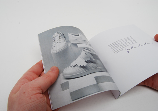
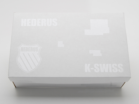
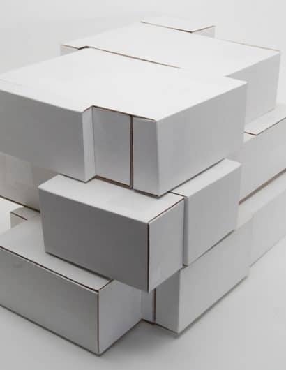
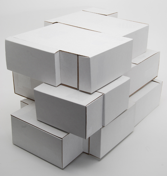
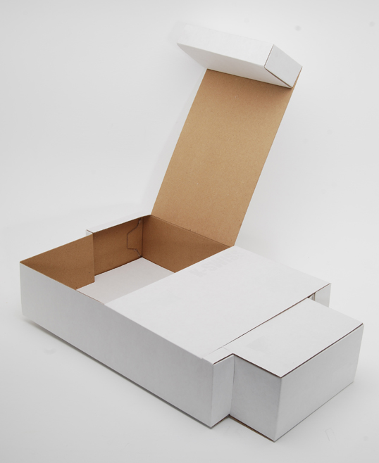
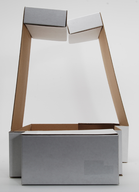
“A self set brief to design the packaging and catalogue for the Hederus range of K-Swiss released the tail end of last year by Swedish designer Julia Hederus. I spoke to Julia and K-Swiss directly about the project and they were keen to seen what my outcomes would be, to which I have now sent off to them.There were 3 different limited edition boxes created for the series of three shoes she designed, I also designed a non limited edition ‘classic’ box. I wanted the packaging to reflect the cubist and pure white nature of the shoes, so created the nets so that the 3 different boxes would tessellate indefinitely and form a velcroed to the wall P.O.S. The design of the box was a pure white design with only a white spot varnish applied to form logos and text. The spot varnish can be seen on the classic box but the images of the limited edition boxes seems to not show up well so I am currently waiting for the right camera equipment to retake the photos to show this.”
kswiss2

kswiss3

kswiss4

kswiss5

kswiss6

Get the latest packaging design inspiration in your inbox:

Popular designs

Pure Persian Honey

When we look closely at honey packaging, they are almost all in the usual format, and the ultimate in creativity is that

Over the wave

This Kombucha originates in Lombok, Indonesia, where its paradise beaches attract hundreds of surfers eager to ride the waves. When you surf,

The Bra Guru

Most women are wearing the wrong size bra and that is a fact. The Bra Guru® is the first and only professional

Designed by: PepsiCo Design & Innovation
Country: United States

Student Work – John Dodd

kswiss1

kswiss1

Designed by Jon Dodd | Country: United Kingdom

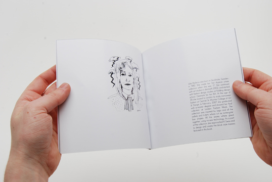
“A self set brief to design the packaging and catalogue for the Hederus range of K-Swiss released the tail end of last year by Swedish designer Julia Hederus. I spoke to Julia and K-Swiss directly about the project and they were keen to seen what my outcomes would be, to which I have now sent off to them.

There were 3 different limited edition boxes created for the series of three shoes she designed, I also designed a non limited edition ‘classic’ box. I wanted the packaging to reflect the cubist and pure white nature of the shoes, so created the nets so that the 3 different boxes would tessellate indefinitely and form a velcroed to the wall P.O.S. The design of the box was a pure white design with only a white spot varnish applied to form logos and text. The spot varnish can be seen on the classic box but the images of the limited edition boxes seems to not show up well so I am currently waiting for the right camera equipment to retake the photos to show this.”
kswiss2

kswiss3

kswiss4

kswiss5

kswiss6

Previous slide
Next slide

Explore more great package design

Get the latest on packaging design in your inbox: