Designed by: PepsiCo Design & Innovation
Country: United States

Kidfresh

kidfresh1

Designed by Landers Miller | Country: United States

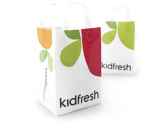
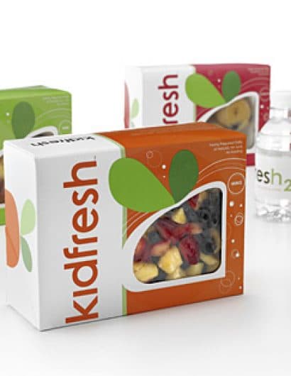
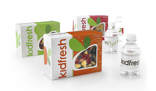
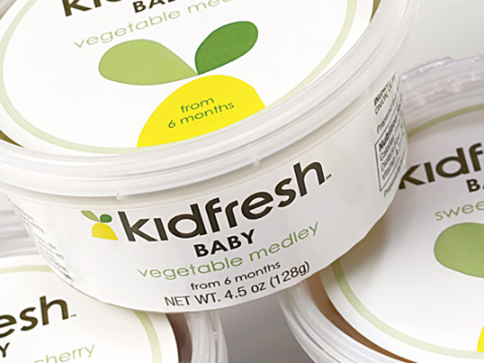
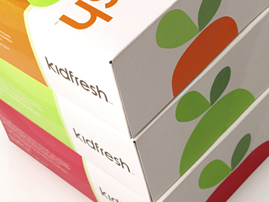
“Kidfresh is a brand new lifestyle concept store that provides fresh, healthy foods especially for kids. The unique color-coded system of the products was our inspiration in creating the packaging, store graphics, signs, print collateral and website. As a startup store, we were involved not only in the strategy and visitor experience but also the naming of items such as “kidfresh2o,” the “kidchen” and the “Kidfresh Dough Card”!”
kidfresh2

kidfresh3

kidfresh4

kidfresh5

Get the latest packaging design inspiration in your inbox:

Popular designs

Far Out Bar

Description: Far Out Bar is a cutting-edge packaging design project created for High Life Farms’ macrodose THC chocolate bars. This project involved

Over the wave

This Kombucha originates in Lombok, Indonesia, where its paradise beaches attract hundreds of surfers eager to ride the waves. When you surf,

The Port Vodka Lemon Water

Overview: In response to my client’s vision for a Cape Cod themed beverage brand, I embarked on the journey to create The Port

Designed by: PepsiCo Design & Innovation
Country: United States

Kidfresh

kidfresh1

kidfresh1

Designed by Landers Miller | Country: United States

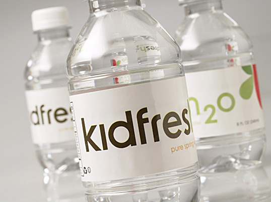
“Kidfresh is a brand new lifestyle concept store that provides fresh, healthy foods especially for kids. The unique color-coded system of the products was our inspiration in creating the packaging, store graphics, signs, print collateral and website. As a startup store, we were involved not only in the strategy and visitor experience but also the naming of items such as “kidfresh2o,” the “kidchen” and the “Kidfresh Dough Card”!”
kidfresh2

kidfresh3

kidfresh4

kidfresh5

Previous slide
Next slide

Explore more great package design

Get the latest on packaging design in your inbox: