Designed by: PepsiCo Design & Innovation
Country: United States

Kiki Health

lovely-package-kiki-health-1

Designed by Studio h | Country: United Kingdom

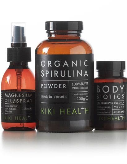
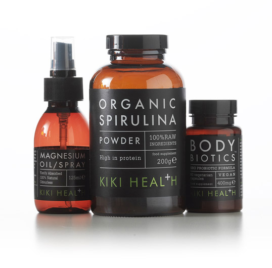
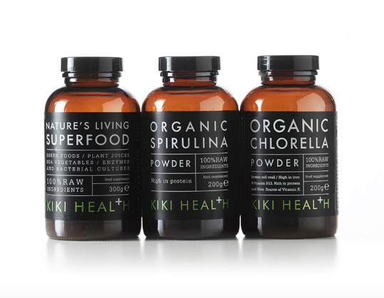
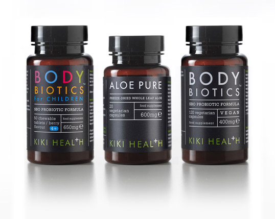
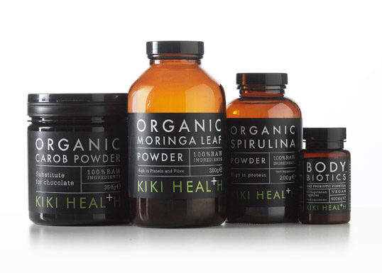
“Studio h has redesigned the brand identity and packaging design for Kiki Health natural foodsupplements. With a range of over 40 premium supplements, the challenge was to give Kiki Health astrong voice and clarity of product communication in the confusing and crowded supplements market.”The tabular format with science lab typography was designed to complement Kiki’s apothecary stylebottles. The flexibility of the system also makes it easy to add products to their fast growing range”says Rob Hall, Creative Partner, Studio h. The cross/plus icon replacing the T gives a playful dynamicto the understated brandstyle and emphasises the efficacious nature of the brand.”
lovely-package-kiki-health-4 lovely-package-kiki-health-5 lovely-package-kiki-health-2

Get the latest packaging design inspiration in your inbox:

Popular designs

Introducing Nasbah: Egyptian Product Packaging Design

Uncover how the Egyptian product “Nasbah” is taking a contemporary approach to package design, making a mark in the local market. Learn how the design strategy influences consumer perception and enhances product appeal.

Luxurious Packaging Design for Saudi Chocolatier Fahda by TOLD

Discover how TOLD transformed the packaging of Saudi chocolate brand Fahda, creating an opulent unboxing experience with liquid gold lettering, cheetah iconography, and intricately embossed jungle landscapes. A luxury experience even before tasting the chocolate.

Designed by: PepsiCo Design & Innovation
Country: United States

Kiki Health

lovely-package-kiki-health-1

lovely-package-kiki-health-1

Designed by Studio h | Country: United Kingdom

“Studio h has redesigned the brand identity and packaging design for Kiki Health natural foodsupplements. With a range of over 40 premium supplements, the challenge was to give Kiki Health astrong voice and clarity of product communication in the confusing and crowded supplements market.”The tabular format with science lab typography was designed to complement Kiki’s apothecary stylebottles. The flexibility of the system also makes it easy to add products to their fast growing range”says Rob Hall, Creative Partner, Studio h. The cross/plus icon replacing the T gives a playful dynamicto the understated brandstyle and emphasises the efficacious nature of the brand.”
lovely-package-kiki-health-4 lovely-package-kiki-health-5 lovely-package-kiki-health-2

Previous slide
Next slide
Get the latest on packaging design in your inbox: