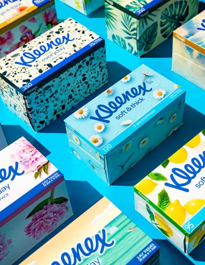
Designed by: Hulsbosch | Country: Australia
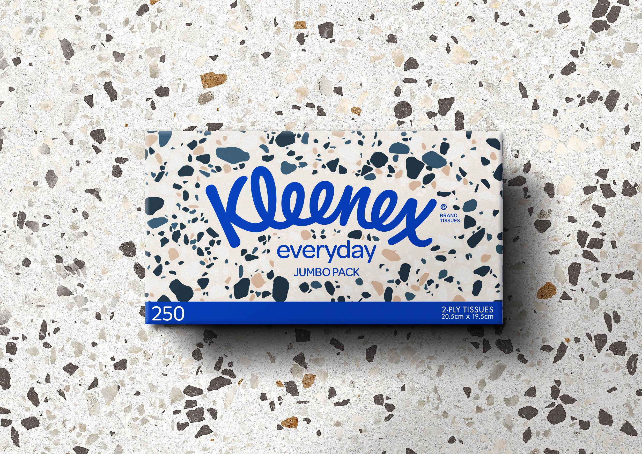
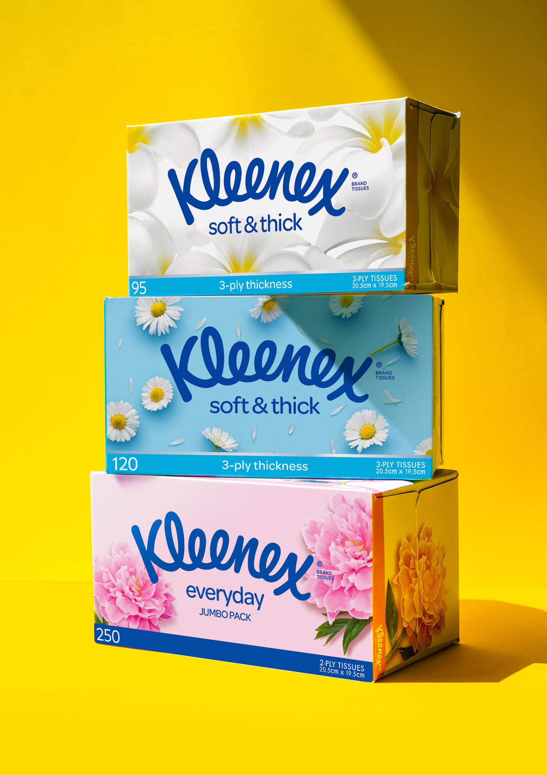
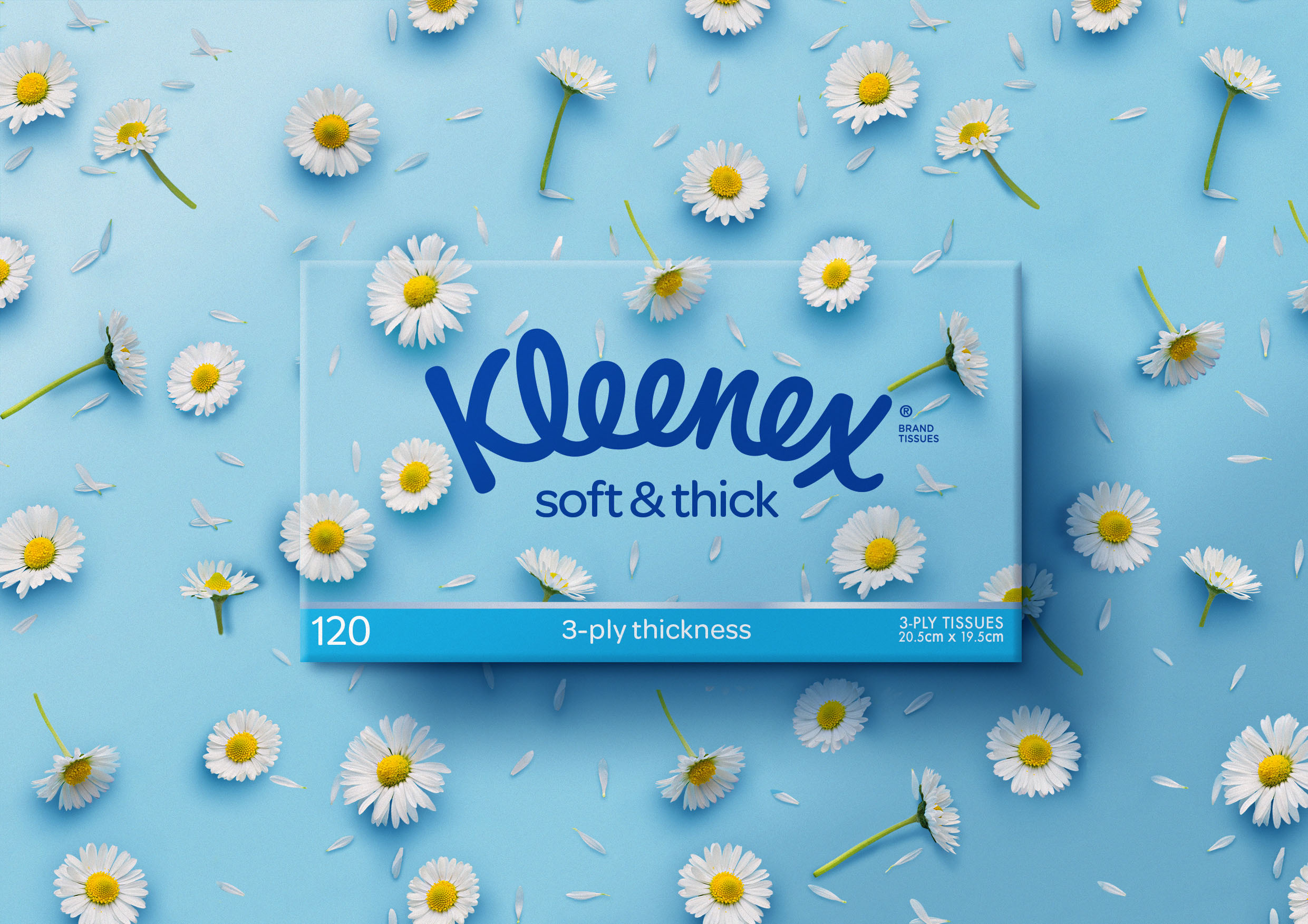
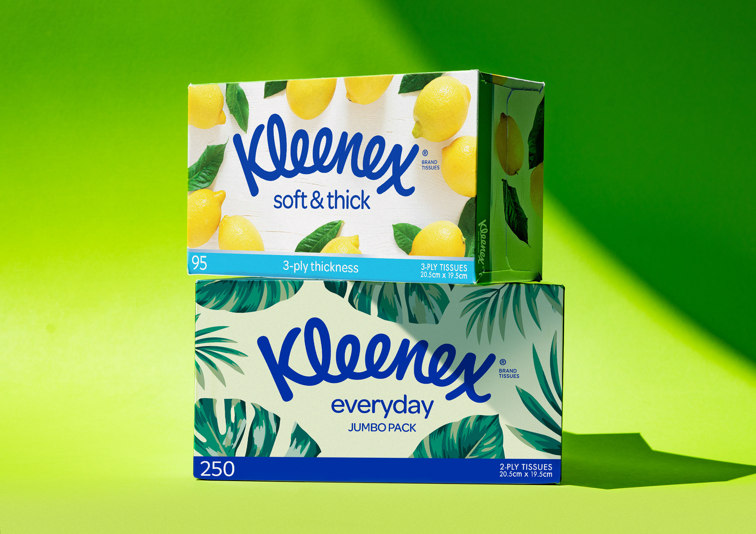
Kleenex, an Australian household essential brand, recently refreshed its look. The idea behind the packaging redesign was to improve a shopper’s navigation. The packaging makes it easier for customers to spot the “premium style face tissue range.”
Mikey Hart, Creative Director at Hulsbosch said, “This project was a welcome return to a partnership with Kimberly-Clark, which has come full circle. In 1995 Hulsbosch designed the original pack designs for Kleenex’s Wellbeing range, then called Kleenex ExtraCare. Today, consumers are working from home more or simply staying at home more and are looking for a little luxury that helps style their home and can elevate their living spaces. We have reimagined the Kleenex range to enhance preference and engagement as a desirable domestic item.”
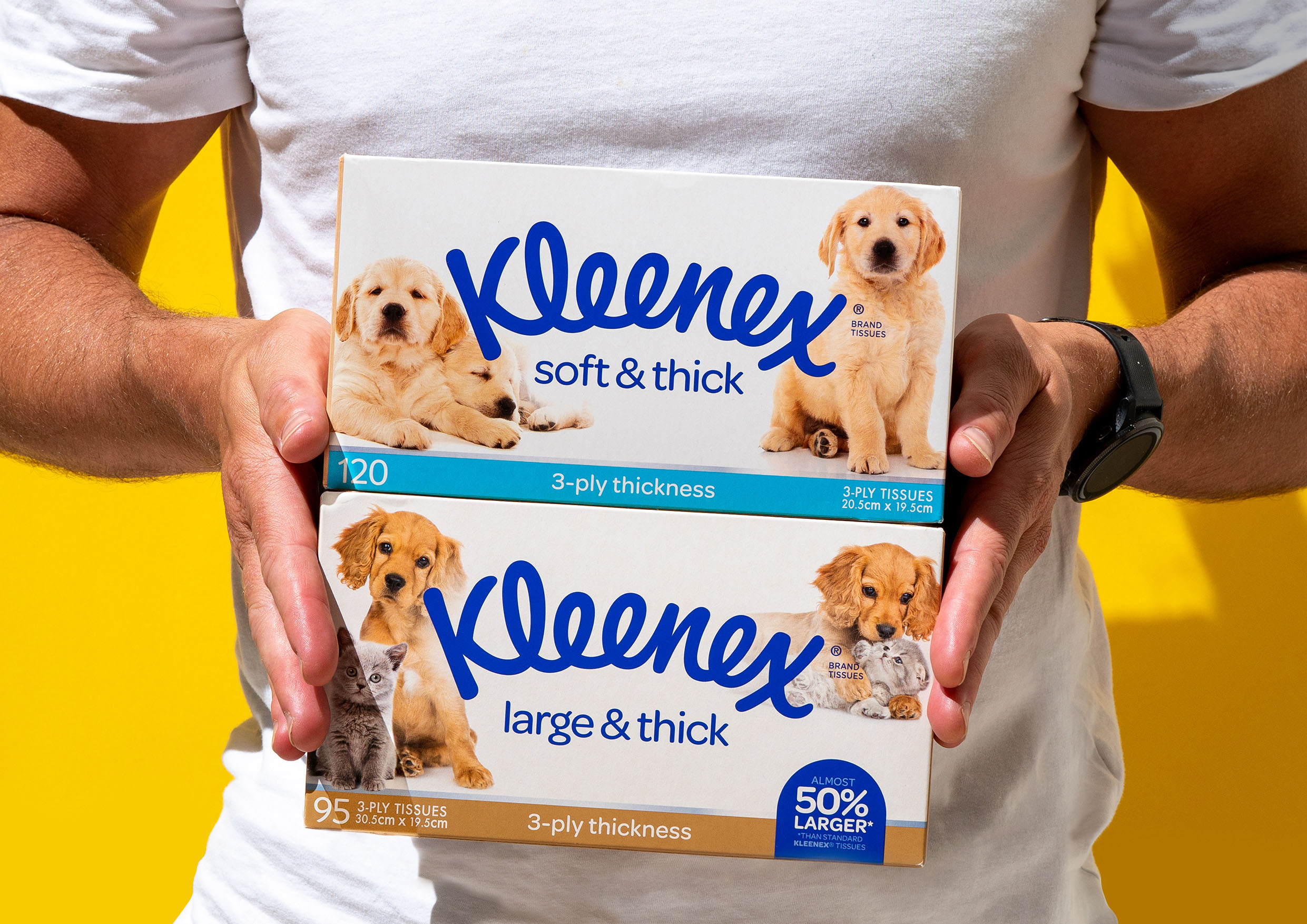
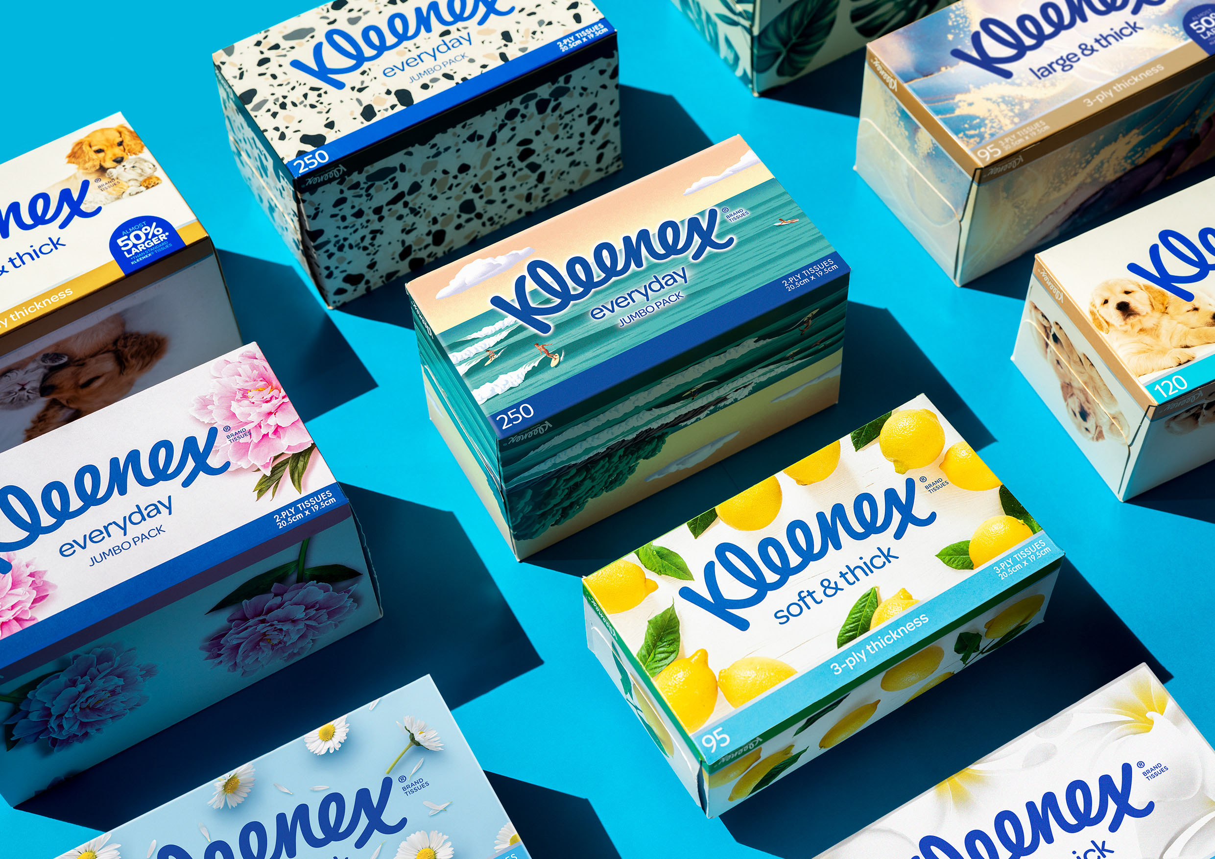
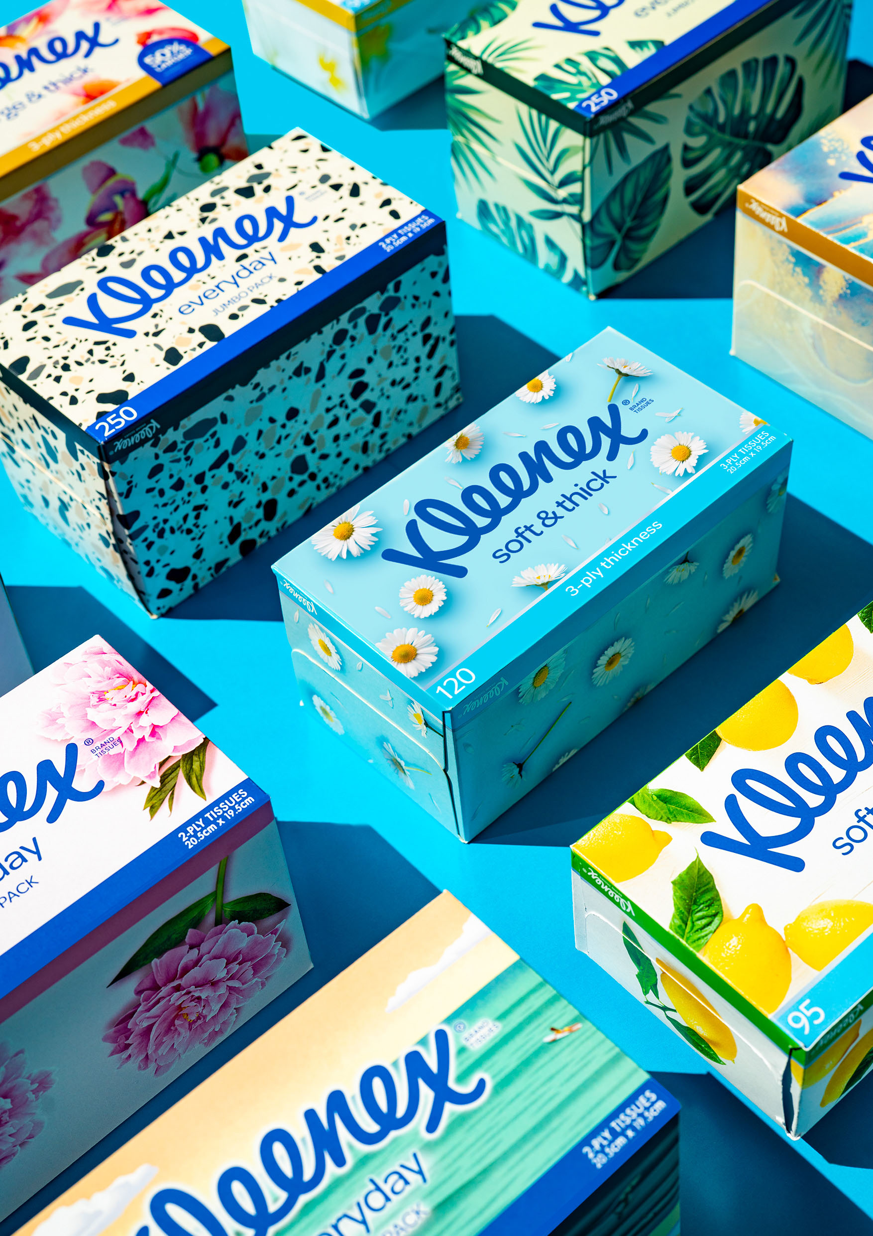
The packaging
Kleenex teamed up with Hulsbosch, a Sydney-based branding agency, to create packaging redesigns that would highlight the premium quality of the tissue range. In addition to using natural stone textures, the branding agency used decorative designs to elevate the shelf value of the products.
“Belinda Driscoll, Vice President & Managing Director ANZ at Kimberly-Clark Australia said, “Hulsbosch is very much part of the remarkable story of the Kleenex brand in Australia, and we are delighted to be working with them again at the start of another chapter of the brand’s journey.
We are building upon our current strategies that always address the changing needs of our customers and also, intend to drive new ones for the Kleenex brand. We have a commitment to secure a sustainable, commercial future for the iconic and enduring brand that is Kleenex.”


